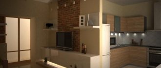
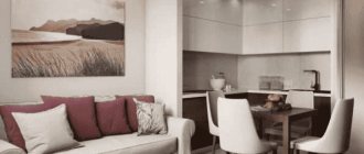
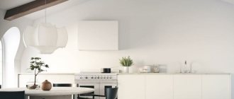
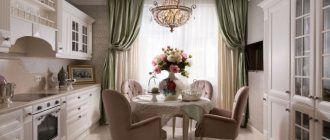
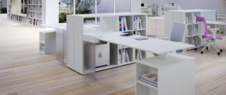
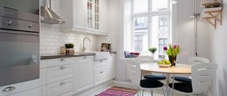
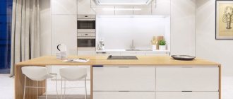
The interior style of the countries of the Scandinavian Peninsula is famous for its special coziness, abundance of light, warmth and impeccable comfort. Such features attracted the attention of residents of other countries, so today you can often see a similar design in houses in different hemispheres of the planet.
It is most popular in arranging living rooms and adjacent kitchens, because these are the most functional and most visited rooms in any apartment. The kitchen-living room in the Scandinavian style is an example of functionality, cleanliness and comfort. Taken together, this interior inspires confidence in the future and has a prosperous and calm character.
Features of the Scandinavian style
There is a widespread belief about the Scandinavian style - it includes ethnic motifs of the northern countries, elements of mythology and the effect of antiquity. This is not at all true; ethnic themes are not needed to decorate a kitchen-living room in Scandi style.
The main features of the Scandinavian style involve the arrangement of space:
- An abundance of white and light tones: beige, cream, gray, ocher, olive. The dominant color should be white.
- Simplicity and practicality. Scandinavian style does not like unnecessary, useless details. Vases, figurines, napkins - they should not be there at all, or to a minimum. Furniture of simple shapes, without pretentiousness.
- Good lighting. It is better not to hang curtains on windows. In addition, the kitchen-living room should have many additional light sources.
- Environmental friendliness. This is an abundance of wood and other natural materials: ceramic tiles, metal, stone.
- Space. A Scandinavian-style kitchen-living room should not be filled with furniture that visually overloads the space.
Scandinavian style in the interior of the kitchen-living room requires a minimum of decor and a maximum of free space. This does not mean, however, that the decor will turn out to be meager and boring - correctly placed color accents and accessories will enliven the atmosphere, but will not disrupt the overall harmony of simplicity and light.
Should not be in a combined kitchen-living room in a Scandinavian style:
- bright walls (as a last resort, you can paint only 1 wall in a rich tone, as an accent);
- stucco molding, carvings, patterned carpets for the whole room, bright carpet;
- highly decorative picture frames;
- colorful curtains;
- doors and furniture made of dark wood.
Advice! Elements of hygge style will bring more warmth and comfort to the interior of the kitchen-living room. It is an offshoot of the Scandinavian style: knitted blankets, vintage or retro posters (without folds - 1-2 pieces), candles. The main thing is to know when to stop.
How to organically fit a kitchen set, sofa and other furniture into the interior
The interior, which came from the northern countries, is consistent and even strict. Lightness of form reigns in it, so furniture of elaborate shapes, with an abundance of details or carvings is not used. Preference is given to simple kitchen sets without frills.
To prevent the overall picture from turning into a continuous “white spot”, the furniture and dining group should have a color that contrasts with the light one. Black and dark gray shades are suitable for this; special attention is paid to natural wood, since its use adds not only beauty, but also the very Scandinavian spirit. Do not forget that functionality comes first, so for a small kitchen, the winning solution would be to use a glossy finish for furniture that will reflect light. The headsets should have simple metal handles; if necessary, they may be completely absent.
Scandinavian diluted decor
Advantages and disadvantages of association
The advantages of combining the kitchen and living room include:
- Instead of two small rooms, you get one spacious one that is not overloaded with furniture. It creates a light and comfortable atmosphere.
- The dismantled wall makes the interior lighter by increasing the space. This place is used to place furniture.
- If each room had a window, the combined kitchen-living room would receive more light.
- In a combined kitchen-living room, it is easier to watch small children without being distracted from preparing food.
There are fewer disadvantages to such an association, but they do exist. Firstly, the connected kitchen-living room is becoming a noticeable change in small one-room apartments. Not everyone likes to sleep in the same room where food is prepared and stored.
Secondly, even if the kitchen hood works well, when cooking some dishes with a strong aroma, the smell will inevitably spread throughout the room. This will cause a number of inconveniences for people sensitive to odors.
Decoration of the dining area
In Nordic countries, it is customary to gather with family and friends at the table, share news, and enjoy delicious home-cooked meals, so very often there is not just a kitchen, but a living room combined with a Scandinavian-style kitchen. And in the dining area there are large, massive tables. They can be made of wood or materials imitating it. Along the table there are chairs of the same shade as the table. It looks interesting when the dining area matches the color of the tabletop set.
Photo from source: pinterest.es
Tabletop Cedar 2032/M Rigoletto light
If the kitchen area does not allow for such a large and spacious dining area, the furniture in it should be compact. In this case, the table and chairs can be made in contrasting colors. Wood texture is optional. For example, a table with a white top and wooden legs and black chairs with a varnished wooden base and wicker seats. The gray “marbled” countertop harmoniously combines these two colors and makes the transition less harsh.
Photo from source: Catherine Lazure, Alvhem
Countertop Cedar 2341/Pt Nuvolato Marble
Plastic furniture in the dining area is also appropriate. White round table, black chairs on metal legs, combined with black service on the table and kitchen utensils on the countertop. At the same time, the tabletop is in harmony with the floor in color and texture, thereby helping to dilute the bright black and white contrast and support the natural direction of the style.
Photo from source: cocolapinedesign.com
Table top Cedar 521/Pw Birch sandalwood
The current non-standard solution is chairs of different colors and configurations:
Photo from source: interyerdizayn.ru
Space zoning
The main feature of the design of a kitchen-living room in the Scandinavian style is competent and clear zoning, which harmoniously separates the relaxation area from the dining room. Different methods and tricks are used for separation:
- Partial partitions. You don’t have to completely dismantle the wall, but leave part of it for decoration. For example, they leave the lower part of the wall untouched, which is used as a work area or mini-dining area. Also suitable are false walls and wooden partitions, which will be used in the form of shelves for books and accessories.
- Furniture is used as zoning elements for a kitchen-living room in a Scandinavian style: a bar counter, a sofa, a shelving unit.
- We should also highlight the large dining table as a zoning element in the Scandinavian kitchen-living room. It divides the space into 3 parts - a relaxation area, a dining room and a kitchen.
- If the room is small even after combining, it is recommended to separate the living room from the kitchen using a bar counter, which is used as a dining area. Also a good option is to install an extendable table.
- If there are two windows in the kitchen-living room, then they should be decorated differently. At the same time, the common color scheme is observed.
- Light sources also help to zone the kitchen-living room. For example, local lighting of work surfaces is installed in the kitchen, and a chandelier and wall sconces are placed in the recreation area.
- Flooring is one of the most unobtrusive but effective ways to divide the space in a Scandinavian kitchen-living room. Use different materials with a similar color palette or, conversely, zone the room with color. For example, the kitchen floor is covered with ceramic tiles, while parquet is laid in the living room.
- Different coatings are also used for walls. One zone is covered with imitation white brick, and the other with wallpaper or paint.
Important! The division in a Scandinavian-style kitchen-living room should be clear, but not sharp. Whatever material is used to divide the space, you need to maintain the lightness and simplicity of the interior.
Finishing
Walls in the Nordic style can be decorated in different ways, provided that light colors are used. Patterned wallpapers are also suitable, but it is better to opt for textured coatings, which are more functional if there is sufficient lighting. If the room is flooded with light, the patterns on the wallpaper will become less noticeable.
Floors are made from wood components - parquet, laminate or boards. Ceramic tiles are used less frequently. This material is best used when decorating a workspace.
The best option for the Nordic style is a suspended or suspended ceiling. It is easy to install, lasts a long time and looks impressive.
Color spectrum
The color scheme for a Scandinavian-style kitchen-living room is drawn up taking into account the following rules:
- The main color is white. It is advisable to decorate the walls in white or beige tones.
- Additional colors that are used to dilute white: linen, smoky, ivory, ecru and marshmallow shade.
- A bolder solution would be large inserts of light blue, pink and olive flowers. In particular, a combination of white or beige walls and olive furniture looks good together.
- The second most popular color is light wood.
- Accent colors: brown, red, orange, yellow. They are used in small quantities and placed pointwise in space. For example, white walls and a light floor will be perfectly enlivened by a brown lampshade. It is advisable that accent items do not contrast with each other. Yellow inserts are popular in Scandinavian style.
- Black is a common element in Scandinavian design, but it should not be the main color. Lamp shades, chairs, and a coffee table can be black.
Do you need curtains for Scandinavian cuisine and what kind?
No, because in Scandinavian countries sunlight is a “scarce phenomenon”. But if you need curtains, use Roman blinds or light tulle floor-length curtains. Read about fashion trends in the design of curtains for the kitchen in 2022 here.
Selection of furniture
Furniture for the kitchen-living room in the Scandinavian style is selected according to the following principles:
- simplicity of form;
- natural material;
- monochromatic (maximum 2 colors, variegation is not welcome);
- practicality, functionality.
The color scheme of furniture is selected taking into account contrast. For example, a bar counter or a kitchen floor set in light colors will look good on a floor of darker colors.
A dining table will help to combine and divide the space of the kitchen-living room in a Scandinavian style. The division occurs through placement. Unification - thanks to the material and colors, which echo other elements of the decor.
Kitchen chairs can be of two types - merging with the space, which is suitable for expanding small spaces, or accent. The latter type helps to dilute the atmosphere and give it color without piling up a lot of decorative elements.
The sofa will be complemented by a light coffee table, possibly with a glass cover. Simple shelves on which you can place bright decorative elements or put books will fit into the Scandinavian style interior. A soft pouf is also suitable as an addition to the relaxation area. It is better not to place a chair next to the sofa; in extreme cases, a rocking chair, which has smaller dimensions.
Finally, the main rule for selecting and installing furniture in a Scandinavian-style kitchen-living room: do not crowd the space with poufs, massive armchairs, bookcases, cabinets and coffee tables. You should leave what you need without giving up comfort. Ideally – 1-2 poufs. Poufs and an armchair are overkill.
Important! Furniture upholstery in a Scandinavian kitchen-living room should be made of cotton, linen or leather.
How to properly arrange lighting?
Place functional and easy-to-use lighting wherever it is needed: above the work surface, near the dining table and even in the kitchen cabinets. These can be spotlights or low-hanging lamps on long cords. Instead of chandeliers, use modern metal and glass structures.
Textiles and curtains
There are no curtains in the Scandinavian-style kitchen-living room or they are light and simple. In the first case, instead of traditional textile ones, wooden roller blinds (or blinds), most often made of bamboo, are used. They fit into the general atmosphere of simplicity and conciseness.
If you still decorate the windows with ordinary curtains, then take plain ones. You can choose the color so that they blend in with the walls or echo the decorative elements of the Scandinavian kitchen-living room.
Advice! Textile elements are a good way to liven up understated Scandinavian design. Colored pillows, potholders, and blankets are suitable for this. The main thing is not to overdo it in your desire to decorate the room.
Share with friends
- 10
If you are still in doubt about what style to decorate your kitchen in, then there is an option that you simply can’t help but like. An option that involves a combination of environmental friendliness, simplicity, functionality, convenience and beauty. For those who consider country style too decorative, and minimalism too boring and empty, a Nordic-style kitchen is an excellent compromise!
Many designer forecasts predict the wild popularity of this style, but what is its secret? Let's find out!
Decor and accessories
The following decorative items are used as decorations for the interior of the kitchen-living room:
- paintings (necessarily in simple frames, without carvings or stucco);
- indoor plants, including outdoor ones;
- photos;
- decorative lamp shades;
- a mirror of an unusual shape or design;
- warm blankets;
- wooden decorations of simple shapes.
To decorate the kitchen-living room, any thing made of natural material is suitable - most often it is wood. The main thing is that the decorative element is quite simple, without pretentiousness.
White and clutter are incompatible: how to make your Scandi kitchen space as ergonomic as possible?
Here's how to make the most of all the storage space in your kitchen:
- narrow shelves that slide out
— convenient to store, for example, jars of spices;
Photo from source: eboss.co.nz
- roof rails
- you can hang hooks for hanging skimmers, spatulas, baskets, frying pans;
Photo from source: homestratosphere.com
- drawers;
Photo from source: pinterest.ru
- open shelves in the lower modules or kitchen island
- it is better to place beautiful and at the same time frequently used things. For example, books with recipes;
Photo from source: mydizajn.ru
- cabinets and furniture
— if the doors are made of opaque material, it is convenient to hide behind them everything that does not fit into the style. Modules with transparent glass inserts will make an elegant set decorate the interior, while protecting it from dust;
Photo from source: ikea.com
- open shelves
- an excellent solution for making the space more airy, and if you place decorative objects, dishes, glasses on them, it will also be more beautiful.
Anything that is not particularly aesthetically pleasing - lids, frying pans, pots - is best placed in wicker baskets. They will harmoniously fit into the Scandi interior and hide from the eyes everything that can visually “overload” the space;
Photo from source: shelterness.com
Photo from source: pinterest.ru
Light milky shelves that match the color of the wall on which they hang give the kitchen space maximum lightness. It is appropriate to complement them with a light wooden floor of a similar shade.
An apron lined with white tiles imitating brickwork is typical of Scandi. And thanks to the combination with a white set, walls and ceiling, it also helps not to overload the space.
Bright, but at the same time calm accents in the form of a dark brown tabletop imitating wood and wooden folding chairs of the same color in the dining area make the interior less monotonous.
Tabletop Cedar 7053/FL* Taxus
One of the chairs can be hung folded on the wall above the dining table. This is a very original design move that will not only add personality to the kitchen, but also help save space. If necessary, it can always be removed and used for its intended purpose.
— in the drawers under the very ceiling it is better to place everything that is needed, but is used very rarely;
Photo from source: pinterest.co.uk
- magnetic strips
- are very relevant in this case, because many kitchen utensils are made of metal.
Photo from source: pinterest.ru
Lighting rules
Lighting the space in a Scandinavian kitchen-living room should be based on one of the following schemes:
- Spot lighting is placed above the work areas;
- above the dining area you can place pendants in the form of bare light bulbs on cords;
- You can add light to the living room using wall sconces or a floor lamp next to the sofa.
Advice! You can add an accent to a bright Scandinavian-style interior by installing brown, red or black lampshades. They will stand out against the background of white tones.
Small kitchen-living room in Scandinavian style
The Scandinavian style in the house is ideal for a small kitchen-living room, which, even after combining, has little space. Light colors expand the interior, and when combined with minimalism, the effect is enhanced.
It is recommended to give preference to a finish with a semi-gloss or glossy surface. Due to the reflection of light, the kitchen-living room space will be visually larger.
It is also better not to place large dining tables in small kitchens. For limited spaces, a bar counter or a table-book with a folding tabletop is suitable.
Ideas for a Scandinavian kitchen interior
No upper cabinets - a mistake
Many photographs show kitchens without wall cabinets, but with open shelves. And this is the standard for Scandinavian style and looks stylish and easy.
But I’m always for maximum practicality, so here are a couple of ideas to think about:
- The best hood is built-in because... does not take up space, does not collect dust, and is cheap. But when there are no cabinets on top, problems begin: how to hide the pipe outlet from the hood, which model will look good on an empty wall, etc. In some photos there is no hood at all, which cannot be called a thoughtful solution.
- A wall cabinet with a drying rack for dishes is usually made without a bottom wall so that dampness does not stagnate. Where to store wet dishes when there is nothing on top?
- Under cabinet lighting looks cool. Especially when the backsplash is made of tiles, because... gives beautiful shadows. Do we refuse?
- The apron usually goes under the hanging drawers; without them you will have to somehow decorate the ends of the tiles.
- Are you sure that there is enough storage space and are you ready to give up the most convenient ones? After all, constantly bending over to get something from the bottom drawers is a dubious pleasure.
In general, if you like more austere options, look at a bunch of photos in the article about a kitchen in the neoclassical style - there is less wood, but the perception is similar.
Briefly speaking:
I advise you to do it with a full-fledged top, at least over the stove and sink, and open shelves according to the residual principle. And if you’re not convinced, read my article on how to choose a kitchen - it’s also about the tempting cost of hinged fittings with closers for upper cabinets and the lack of need for handles. You can also see a bunch of built-in minimalist options in the material about high-tech kitchen design.
Adaptation for the kitchen-living room
A typical apartment usually has a small kitchen, and the Scandinavian style, which is undemanding in terms of space and budget, is ideal.
But now the trend is to create a combined kitchen-living room (and this is the right decision), but there are problems with it:
- You probably don't want to see kitchen utensils and clutter when you're in the living room area.
- There is rarely dust in the kitchen because... There are only curtains made of textiles (about curtains in the kitchen and how to hang them on a window with a balcony), and people spend little time. But the living room generates dust. And it will settle on all open objects.
If you do not deviate from the canons of the Scandinavian style, all that remains is to make the kitchen a corner, organizing parking for equipment and utensils:
But because We don’t have the task of pedantically following the rules; we can borrow total built-in features and closed storage areas from modern kitchen design.
Open options (but keep in mind that in reality all the jars and mugs are not exactly the same at an equal distance from each other):
Closed options:
Clear doors give the same open effect while being more practical, although I wouldn't use them in other styles.
But the coolest option is in the next paragraph.
Scandinavian style kitchen up to the ceiling
Yes, in almost every material, starting with kitchen renovation in Khrushchev, I advise you to do it up to the ceiling.
This is the optimal solution for many reasons. Plus, you understand that modern kitchens in Scandinavia often differ from what we see in the photo and may look like this:
If you like this design, you will find many examples and ideas in the article about a white kitchen with a wooden countertop.
You can always implement:
- Low ceiling - extend the upper cabinets all the way.
- The ceiling is 2.7-3 meters - we add 1 more line of drawers (based on the mezzanine principle) or make a step in the headset area.
- High ceiling - we make a niche and build it into it.
With bar counter
For some reason, counters are rare in Scandinavian kitchens and this is an oversight. I have already described a ton of advantages of a kitchen with a bar counter.
A wooden or wood-look chipboard tabletop will fit perfectly into the interior and there are a bunch of bar stools with thin legs.
Even in a small room, you can place a bar counter at an angle on a wall with a window, creating an unusual place for eating. Visually it also matches the style. In general, I recommend it.
Kitchen-living room design ideas in Scandinavian style
There are many options for decorating a kitchen-hall in a Scandinavian style. The photographs below can serve as an excellent source of inspiration when selecting materials and color schemes for the kitchen-living room.
What should the dining table be like?
Whether you need a dining table in your Scandinavian kitchen depends on its size. But the dining area is not a must have for the Scandinavian style.
If the dimensions of the room allow you to place a table in it, then choose modern models made of natural wood, laconic and simple in shape.

