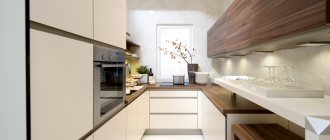
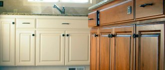
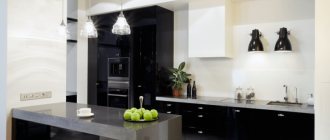
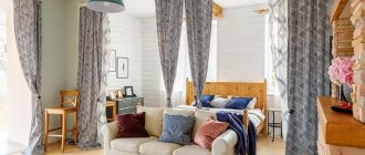
The Ikea “Budbin” method has become widespread among buyers, as it meets their needs for the parameters and features of the kitchen. Nowadays, simplicity in interior design and clothing has become fashionable, which is why this option has become popular. It is installed not only by the average consumer, but also by those with above-average earnings.
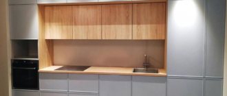
Ikea “Budbin” kitchens, made in warm white or noble gray, are an excellent solution for a stylish home.
What is the essence of the Budbin method?
The main idea of Budbin is to create the optimal option for different types of kitchens. That is, this is an elegant, but simple way to decorate a room, using the surface of kitchen cabinets and panels as a base, focusing on other details. This creates a budget design project with the opportunity to make it as different as possible from others using this method.
The universal Ikea Budbin kitchen will fit well into the interior of any home. The main thing is to pay attention to accessories.
Ikea’s “Budbin” kitchen is called the basic kitchen in the interior (photo) because it assumes neutral shades: white with a milky warm tint, gray.
The basic character of Ikea Budbin kitchens is achieved by the predominant use of white and gray colors.
Often the panels are all made in the same color, but bold and successful solutions are also based on the proper combination of these colors. For example, often a gray palette is used on the lower part of the facades, and white on the upper part.
A white kitchen from Ikea with a beige countertop looks harmonious.
Or there is an option to make the internal zone, the frame, white, and the facade panels in a second color.
Layout options
There's essentially nothing new here. “Ikea” kitchens are suitable for any of the existing types of furniture placement:
- Linear - modules are located on the same line along the wall;
- L-shaped (angular);
- U-shaped;
- two-line (parallel);
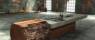
- with an island or peninsula.
For greater clarity, here are a couple of photos of a corner gray IKEA kitchen. And this is what a kitchen island looks like.
It is believed that the first two methods are suitable for small kitchens, but with proper organization of space this opinion is easily refuted. An example of this is a small kitchen with a bar counter that acts as a small island. If the module located in the middle of the kitchen is equipped with internal drawers, it can free up space on the walls. And, as you know, a wall-mounted set weighs down the room.
When arranging the necessary modules, apply the working triangle rule, i.e. Place everything you need for cooking as close to the work surface as possible. Think about the route you will take, what equipment you will need, whether it can be put away in a drawer and whether it will be tiresome to get it out every time.
There is also the concept of a drying-washing triangle, the essence of which is not difficult to guess. The smaller the kitchen, the more rationally you need to manage the space - use a vertical space, a place under the sink or above the hood, which is also difficult for children to reach. It is very convenient that the online layout is available on the Russian-language IKEA website, and all you need is to specify the correct dimensions.
Characteristics of the Ikea “Budbin” kitchen
The Ikea “Budbin” kitchen looks great for both a spacious room and a small one. By changing the location of the cabinets, you can create your own unique design.
The main idea of such a kitchen is to have a large number of layout variations. There are no clear restrictions on placement and size, you only need:
- plan where the kitchen will be, how much space it will take up - the main parameters;
- based on these dimensions, it is already possible to determine cabinets and drawers, their orientation and method of extension;
- make sure that the order and rules of the organization are not violated, this is important for ease of use (make sure that the surfaces, from the refrigerator to the finished dish, follow one another).
"Budbin" is characterized by wide frames, creating a classic style, this is especially beneficial when creating a Scandinavian kitchen style. The surface is smooth and matte, monochromatic, this creates a warm atmosphere and psychologically contributes to a calm atmosphere in the room.
Matte kitchen facades give the room a special coziness and create a real home environment.
It is coated with varnish, which allows the material to retain moisture and be resistant to all kinds of dirt. This also makes it possible to care for surfaces, use water and detergents, but without abrasives.
The varnish coating of the facades ensures ease of maintenance and resistance to stains. By following simple rules, you can easily keep your kitchen clean.
The doors are designed for variable installation, that is, they can be made to open both to the right and to the left. The sizes of the elements and their shapes can be different - square, rectangular, wide and narrow, but no more than the classic style would allow.
Doors for cabinets can be mounted in different ways, depending on the convenience of the kitchen owner.
Select Sizes
The paneled door BUDBIN with a wide frame will emphasize the traditional style of the kitchen. The warm shade of the facades will create a cozy, inviting atmosphere in the kitchen.
Smooth lacquered doors are resistant to moisture and dirt and are easy to clean.
Free 25 year warranty. Read more about the terms of the warranty in the warranty brochure.
The door can be installed on the right or left.
Complete with hinges with built-in stopper UTRUSTA 110°, sold separately.
Needs to be completed with 3 loops.
Can be completed with FORBETTRA overlay panels and plinths.
IKEA METHOD kitchens are furniture that meets three main principles - versatility, mobility and practicality. This is a construction kit that allows you to independently assemble a kitchen set of any layout and functionality.
Kitchen "Hitarp"
On the official website you can find the modular parts of this system in the section “Cabinets and facades METHOD”. Link to catalog 2022 ‑ https://www.ikea.com/ru/ru/catalog/categories/departments/kitchen/24254/
A huge advantage of the METHOD system is the availability of a free online designer. Any buyer without special skills in working in such programs can assemble a kitchen by independently choosing the type of cabinet, frame, front panel, etc.
Advantages and disadvantages of Ikea “Budbin” kitchens in an apartment
The Ikea Budbin kitchen looks stylish, especially if you add a few bright elements.
“Budbin” in white and gray shades, the photo in the interior of which looks as stylish as in reality, has many advantages:
- Pleasant and universal design, distinguished by aesthetics and lack of pretentiousness or deliberateness. This option allows you to bring different fantasies to life and make them the best version.
- Reliable manufacturer - Ikea. This is no less important, since durability, build quality and conscientiousness in execution depend on it.
- Functionality. The products are different in this way, since assembly defects or flaws in the headset are extremely rarely noticed. This is also the technical equipment of the kitchen, the ability to make it not only for a spacious room, but also very compact options.
- Practicality. During operation, under strong mechanical stress, the structure is difficult to damage and compromise its integrity.
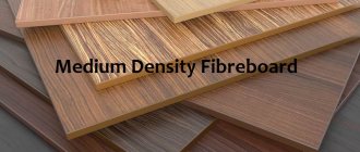
- Safety, environmental friendliness. The materials are mainly chipboard, fiberboard, they do not harm the body, are non-toxic and are strong enough to be considered safe to use.
An Ikea “Budbin” kitchen can look monotonous and boring if you don’t think through its style and design nuances in advance.
But you can find some disadvantages in this method:
- The basic design does not allow for individualization of the kitchen without additional elements. That is, “Budbin” is rarely used in design on its own, otherwise the risk of boring design increases.
- The palette of facades is meager; sometimes you want to add some color to a successful project, but this option is not provided; you will have to refresh the interior yourself.
- The surface of the materials is prone to scratches and does not tolerate high temperatures.
In general, Ikea produces successful kitchens using the Budbin method; they become a feature in the skillful hands of designers and do not pose a problem for neat housewives.
Good design taste can transform a basic Ikea kitchen into a stylish, functional space.
Kitchen furniture in Ikea
What is good and what is bad
IKEA kitchen furniture has characteristic features that distinguish it from other manufacturers. They are as follows:
- Frameless technology. For the manufacture of furniture facades, high-strength and high-quality fiberboard is used. To make the structure reliable, fastening occurs using special valves and dowels.
- Depending on the collection, the structure and color are selected and a coating of high-quality wood sheet (veneer) is applied.
- A very wide range of fastenings, which allows you to make drawing out drawers easy and eliminates breakdowns.
- Legs for kitchen modules are distinguished by their wear resistance and ability to withstand heavy weight.
- The sizes of IKEA furniture are convenient due to their standard nature.
- Kitchen sets cannot be called expensive or cheap; everyone can choose something they can afford.
Types and sizes of Ikea “Budbin” kitchen modules
The overall picture and functionality depend on the models and their sizes, so it is important to choose them correctly and take into account every millimeter. Usually this is done together with masters and specialists; they should not miss these moments. But a lot depends on the customer - the choice of parameters and their arrangement (preferably together with a professional).
Before buying a kitchen, you need to carefully calculate the number and size of the necessary cabinets, so that in the future it will be convenient and ergonomic.
Cabinets come in the following types:
- Floor-standing – located at the bottom, usually placed on the floor surface;
- Mounted - suspended at head level, can reach the ceiling or be at a distance from it. There are also mezzanines.
- Corner - often made without doors and with a rounded outer corner to leave the impression of completeness of the interior, but not take up extra space or create inconvenience. Their standard width is 67.5 cm, and their depth is 38.6 and 38.9; the height can be chosen - 40, 60, 80 or 100 cm.
- Pencil cases are narrow cabinets with or without shelves, and the presence of doors is not necessary. Usually their depth is 61.6 or 61.9 cm, and their height varies from 148 to 248 cm according to standard parameters, width - 40 or 60, less often - 80.
But the last two options are usually used as an addition if necessary, based on the characteristics of a particular interior and the needs of the owners.
The Ikea “Budbin” kitchen contains both floor and wall cabinets, in addition to which you can choose convenient corner ones.
Floor-standing
This option of cabinets is located on the floor surface, which simplifies mounting and provides many other advantages.
The basis of any kitchen are floor cabinets. Depending on the size of the room, the required dimensions are selected for them.
Varieties:
- Simple, they are most similar to a cabinet, so they can include shelves or drawers, as well as appliances or various combinations. Sometimes they double as pencil cases.
- Corner cabinets are made with shelves or simply hollow for a trash can, for example. Sometimes a rotating section or retractable structure is placed there.
- Tall cabinets designed for built-in appliances.
Their parameters: width is usually offered from 20 to 80, average values are 40 and 60 cm; their depth can be 61.6 or 39.2 cm; but the height, if this is the type of bedside table, is 88 cm. Please note: built-in appliances allow you not to disturb the design, because they are often selected earlier, without taking into account the style of the kitchen. And the front panels will make the design complete.
Mounted
In addition to floor-mounted ones, various options for wall cabinets are offered for the Ikea “Budbin” kitchen. A large number of shelves and compartments in them will please any housewife.
Cabinets hanging on the wall, located at head level, can be divided into types.
- Corner, it is made with a slightly smaller door than the others, made of the same material or glass.
- With a blank facade, shelves and drawers are placed there, often combined with each other.
- With a glass door - as an additional decor, the contents usually also become decoration. If the housewife is neat, then there is also lighting inside, which looks impressive in dim light from outside.
- Combined option. Can include all options in any variation.
Size standards: their height varies from 40 to 100 cm, average values are 60 and 80 cm; depth comes in two parameters - 38.6 and 38.9 cm; and the width is 20, 40 cm, large options are 60, 80 cm.
Glass doors of wall cabinets, made decoratively, add a special charm to the kitchen.
Gray kitchen interior design
The success of any interior design project depends on how harmoniously the finishing materials were selected in color and style. Let's talk about what finishing options for a gray kitchen will be the most successful, as well as what role curtains can play.
Decoration of walls, floors and ceilings
The design of finishing materials should be selected at the design stage. At the initial stage of planning a renovation, it is recommended to draw up a project that will indicate what color each interior element should be. This is the only way to create a harmonious color scheme.
Here you can consider the following recommendations.
- Stick to a balance of dark and light shades. For example, if the set is dark gray, then it is better to decorate the walls in light colors. And vice versa. Do not use more than three colors at the same time in the interior. And at the same time, it is not forbidden to play with their shades.
- Determine what kind of interior you want to get in the end: calm, in pastel colors, or brutal, bright, cheerful? Based on this, choose colors of appropriate saturation.
- For very bright accents, choose non-volumetric objects - curtains, vases, chairs, etc.
A white matte ceiling is always a universal solution. If there is no need to highlight it from the general background, then you should give preference to the win-win option in all cases.
You can focus on the ceiling if the height of the room allows
You shouldn’t choose flashy bright shades for it, because even a gray textured concrete insert in a suspended structure, complemented by a beautiful lamp, can attract attention
As for floor finishing, the following options will be most successful for a gray kitchen:
- parquet, laminate, porcelain stoneware or PVC tiles in a natural wood shade;
- gray tiles from light to dark shades;
- light poured floor;
- marble-effect tiles (natural marble is impractical for the kitchen);
- tiles in pastel neutral tones.
For wall decoration, you can choose any color depending on the design concept:
Gray wallpaper or paint is an excellent overall background. Choose light shades for small kitchens or when you need to create contrast against dark furniture;
In a monochrome interior, wallpaper can be embossed, imitating decorative plaster. And from gypsum plaster, using simple techniques, you can make an imitation of concrete.
beige walls or white with a slight warm tint will add warmth and comfort;
You can make only one wall bright;
Yellow walls against the background of dark facades attract attention, and the absence of upper cabinets allows you to make a small kitchen visually freer
Wallpaper with a pattern is also suitable, for example, floral or with a graphic pattern.
Light gray set against a background of floral wallpaper. In the apron area the wall is covered with tempered glass
Tabletop
The ideal universal tabletop for a gray set is wood, light shades or snow-white.
An unusual option is a thin tabletop to match the gray-beige set.
And if you want bright colors, then you can place the main bright emphasis on this detail. As, for example, the designers of the “Housing Question” program did it in the project in the photo below.
Apron
Gray facades allow you to be bolder in choosing your apron design. Bright tiles or skins will help make a bright accent.
Depending on the style of the kitchen and the overall color scheme, a textured apron imitating stone, brick or concrete can look interesting.
An apron with a small pattern will always look good with neutral facades.
A universal solution is light hog tiles and pentagonal tiles. With contrasting grout, these backsplash options look very stylish.
Curtains and textiles
Curtains traditionally set the mood of the interior. Bright short curtains, roller blinds or Roman blinds in rich yellow, red, blue, green tones can look great with a gray kitchen.
If the accent is already any other element of the interior, then it is better to choose curtains in the general color scheme of the room: light or dark gray.
Designer's advice Irina Irina Polyakova is the founder of an interior studio, architect and interior designer. The main direction of work is kitchen design. In addition to curtains, kitchen towels, upholstery of dining chairs, curtains on kitchen cabinets or doorways can play a role in the design.
Colors and styles of Ikea “Budbin” kitchens
By showing your imagination, it’s easy to give the Ikea “Budbin” kitchen a special style, for example, country.
The style of the kitchen created by this method is the same and basic, which means it can be adjusted to the intended design. Typically designers resort to the following types:
- Scandinavian - white background and some multi-colored cheerful elements that serve as an accent;
- country – rustic style, indicating the owners’ preference for comfort rather than innovative innovations;
- loft - an industrial style that is not distinguished by the usual comfort, but has a special atmosphere and a modern approach;
- Provence - differs from country in its French notes and colors, many floral prints and images, soft lines, lightness of materials.
Bright details in the white Ikea Budbin kitchen will help create a special Scandinavian style.
The colors of “Budbin” are warm white and gray, there are variations of them, you can choose light tint options, but in general this is what the offer is limited to. This allows you to emphasize other elements in the interior.
The Ikea Budbin kitchen is usually done in gray or warm white. By complementing the interior with bright details, you can bring interesting room design ideas to life.
Hitarp
Shabby chic, Provence, country, classic, retro - lovers of these trends will be pleased with the simple and functional “Hitarp” series, which has already become a sales favorite. Its advantage is a new convenient system for attaching wall cabinets.
Simple lines, panels and glass inserts on the facades and charming “antique” wall cabinets, as if made by hand, will provide a comfortable and calm interior. Light shades and vertical stripes tend to expand and stretch the space, so the series is suitable for both spacious and small kitchens.
The material used is chipboard or fibreboard, coated with acrylic and polyester paint; the glass is made using tempering technology. The monotony of the white kitchen interior provides endless opportunities for creativity and flight of fancy.
There is one more tricky design maneuver. The fact is that the composition and design of the Hitarp series is similar to the headsets of the Filipstad, Budbin, Kallarp, Albru and Knoxkhult series. Therefore, some elements - table top, handles, etc. can be borrowed from them.
Thanks to the modular system, you can easily combine different colors of the facades, make a black top, white bottom, or complement a bright red corner set with black horizontal surfaces.
Ikea kitchen facades “Budbin”
The main feature of this method lies in the facades, because they must be neutral, in a classical style. That’s why they were made invariably light in color, with wide frames and a matte finish.
The neutral-colored facades in the Ikea Budbin kitchen allow the designer to show his creativity by decorating the room with interesting details in bright colors.
This varnish additionally helps to protect the surface from unnecessary mechanical stress in order to preserve the original appearance of the product longer.
Review of kitchen series Method
The IKEA kitchen has taken modular furniture to a new level: you can choose types, sizes, number of cabinets, their contents, type/color of the facade and assemble your own unique set. The manufacturer provides a 25-year warranty for all kitchens of the Method system, so you don’t have to worry about quality.
Budbin
Available in 3 colors: white, gray and green. Matte facades with a wide frame will fit into both classic and scandi styles. The additions to the standard set include glazed doors, open cabinets, wall shelves, decorative plinths, legs, and cornices.
Ringult
Light gloss is an excellent choice for a small area. It reflects light and makes the room visually larger. The outer film is moisture resistant and easy to clean.
Pictured are gold furniture handles
Callarp
Bright glossy kitchen, in 2022 presented in a noble red-brown shade. A dark color will decorate a large room, such as a studio.
Voxthorpe
Looks equally good in both glossy and matte films. It features rounded, integrated handles, making it suitable for minimalism or modernism.
Häggeby
Matte, white, minimalistic - what you need for a simple, functional interior. The surface made of melamine film is easy to clean, protected from moisture and mechanical influences.
The photo shows inexpensive kitchen furniture
Bodarp
For those who care about the environment: the film was created from recycled plastic, and the facades themselves are produced in a plant that runs on renewable energy. The color is a matte gray-green and looks ultra-modern.
Kungsbacka
The anthracite matte film is also made from recycled materials. Make your home more environmentally friendly!
The photo shows cabinets in anthracite color
Lerhyttan
It couldn't get any darker! The black Ikea set is both a little rustic (due to the tall glass cabinets) and classic (thanks to the traditional shapes). Pairs perfectly with the black island of VADHOLMA. Made from solid wood and ash veneer.
Edserum
Classic doors with frames covered with wood imitation film. It looks traditional, and thanks to the film coating it is easy to clean.
Sevedal
An example of an IKEA kitchen that captures the essence of Swedish design. Laconic, but with a twist in the form of simple wide frames along the contour.
Hitarp
Matte white fronts with grooves seem to make the kitchen taller. If your apartment has low ceilings, this option is what you need!
Tingsrid
The ebony-look melamine film creates a realistic imitation of natural material, making the kitchen look noble and expensive. If desired, add a bar counter or Sturnas table. A light analogue is Askersund with a figurative imitation of the light wooden texture of ash.
Thorhamn
Solid wood doors with ash veneer panels. Each façade is unique, which adds luxury to the overall look of the set. Unusual glass with mesh is ideal for a loft-style kitchen.
What is the cost of Ikea “Budbin” kitchen sets?
Prices depend entirely on the type of order:
- sizes;
- materials (glass, chipboard, etc.);
- quantity;
- headset
But there are three categories, conditionally divided and designated by price categories to indicate the approximate cost. For a small order of 1.2-2.5 linear meters, the cost starts from 80 thousand rubles. 2.5 – 4 linear meters will cost about 140 thousand rubles. And for large orders prices start from two hundred thousand rubles.
A small Ikea “Budbin” kitchen will not cost much, since its production costs less.
Important: Each case must be counted separately; these are only approximate figures.
Options for planning furniture solutions for the kitchen
Corner layout
One of the most versatile variations in the arrangement of a kitchen ensemble. The L-shaped layout allows you to place a sufficient number of storage systems with integrated household appliances in rooms of various shapes and sizes.
In short, the corner layout allows you to create a full-fledged working and dining area, without compromising the capacity of storage systems or the size of household appliances.
In a corner layout, it is easy to create a “working triangle” by placing the stove or hob on one side of the unit, and the sink on the perpendicular one. The refrigerator can be installed separately or integrated next to the sink.
with kitchen island:
with a peninsula:
Linear layout
The layout of a kitchen ensemble in one row is convenient for small kitchen spaces or families that do not need to install a large number of storage systems and integrate several household appliances into a furniture set.
with kitchen island:
with dining table:
U-shaped arrangement of the furniture ensemble
The layout of the kitchen set in the shape of the letter “P” is advisable if you need to arrange a large number of storage systems with integrated household appliances. In this case, the upper tier of kitchen cabinets can be partially or completely replaced with open shelves (it all depends on the size of the room and your personal preferences).
- In a large kitchen, the shape of which is close to a square, there will be enough free space to install a dining group or kitchen island in the center of the room.
- If the kitchen space is very elongated or has a small area, then the dining segment will have to be moved to the living room or arranged in a separate room.
with kitchen island:
Parallel layout
With a parallel layout, kitchen modules are arranged in two rows opposite each other. This method of organizing a work area is advisable in kitchens that are walk-through rooms or have a large panoramic window, balcony block or door (exit to the backyard in a private house).
- If the room is very elongated, then most likely there will be no free space left to install a dining group or kitchen island.
- If the shape of the room is square or close to it, then a small (preferably round or oval) dining table can be installed without consequences for the ergonomic flow of all work processes.
With a parallel layout, it is easy to use the rule of the “working triangle”, placing its two imaginary vertices that “conflict” with each other, the sink and the stove, on opposite sides.
Useful tips for kitchen care
By following the Ikea kitchen care recommendations, it is easy to keep it clean and shiny.
- Do not use aggressive detergents. They can leave stains and damage the front, ruining it. Such products are applied only to designated surfaces.
- Avoid abrasives when washing and wiping cabinets.
- Clean from dirt, food and liquid residues in a timely manner, and avoid old stains. Do this using a soft microfiber cloth or linen or cotton material, but do not scrape or use the hard side on the dish sponge, otherwise there will be scratches.
- Periodically use professional surface care to better keep it clean and maintain a presentable appearance longer.
What should we take note of?
1. Win-win combinations: gray “Budbin” + apron made of “hog” tiles + wood-look countertop + black sink, black handles and rails.
This design option has already become a kind of classic. And for those who are not sure of their taste, but do not want to spend money on expensive designer services, they can simply adopt the idea.
By the way, Evelina Khromchenko’s kitchen (you can’t help but know her?) is made in a similar design. Look what the TV project “Perfect Repair” did to her? poke.
In my opinion, the owners of this kitchen did it many times better than the designers of this program.
2. Dining area in natural wood shade
It often happens that there are no problems with the design of the set, the apron and the sink, but an unsuccessfully chosen dining area spoils the whole result. Did the owners of this modern kitchen make this mistake? look. In this case, the owners were not mistaken: for the Scandinavian style, you can’t imagine anything better than natural wood in the interior. This dining area looks very harmonious. It was supported by a wood-look tabletop and a wicker chair on the loggia.
Examples in real interiors
Thoughtful design and excellent taste of the home owner are the key to creating a uniquely designed and functional kitchen.
Much depends on the style in which the owners decided to make the kitchen. If this is a Scandinavian style, then it is important to choose dishes in a bright color - preferably burgundy or mint, ultramarine is also suitable. You need to come up with a few more small elements of the same shade in the interior - a vase, chairs or curtains, for example.
It is relevant to use “Budbin” for Provence or country, because the milky color of the facades allows you to create an unforgettable combination of similar colors and different textures in a rustic style.
By adding accessories made from natural materials, you can create an amazing country-style kitchen.
So, the Budbin method from Ikea is a universal way to decorate a kitchen to suit your needs and tastes, because it is an excellent basis for implementing bright and bold ideas. It will not become an accent, but will not interfere with the accentuation of interesting and original objects, dishes and other interior elements.
A gentle combination of basic white color and pink floral motifs will create a unique Provence style.
You just need to choose the right set so that it is convenient to use and store dishes, kitchen utensils inside, and decorate outside.
How to choose for the interior?
A kitchen set is either selected to match the existing interior of the room, or vice versa, the surrounding space is created to suit it.
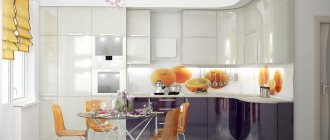
Kitchens with bright accents have become very popular in recent years. Gray color with cool blue walls looks unusual and very modern. A darker shade of gray will pair amazingly with a marble floor and countertop. Brass or any other metal-look lamps will complete the kitchen decor. The dark gray color of the set goes well with silver, steel or white walls. This combination is great for small spaces as it gives the feeling of extra space.
When you want a bold, interesting design, then you should choose a gray-violet or gray-lilac set. In this case, the countertop or island can be finished with stone, but not with marble, since, despite its strength, this material is very porous and difficult to remove stains from. The walls can be painted lilac, but be sure to choose a shade a tone higher or lower than what is present in the set.
Silver wallpaper looks simply stunning on the walls, which, with enough natural light and the right artificial lighting, will play with different colors throughout the day. In such a kitchen it is best to use a cool gray set.
A small space can be visually stretched in height if you use dark gray furniture. If this option seems too gloomy, it can be diluted with white on the walls and ceiling. The warm tones of the wooden lamps also strike the right balance.
The warm tone of pink or drapery of any other delicate color well compensates for the cold shade of gray of the set. The room will not look too glamorous or romantic; on the contrary, this combination gives the design a modern look, bold and effective.
Gray and brown are ideal partners in a simplistic rustic style. Warm and cold tones complement each other so that the room looks traditionally decorated, even a little primitive, but at the same time modern. If you use such a set with green shades of the walls, then a feeling of light and airiness is created, a feeling of lightness appears inside. It is better if with this design there is enough natural light in the room.
Soft gray with brown shades allows you to make the kitchen cozy, welcoming, the atmosphere is charged with positive energy, you want to spend more time in this room.
Gray wallpaper in the kitchen in combination with a set of the same color, but of a darker shade, makes the design elegant. You can use a similar combination when decorating an interior in a classic style.

