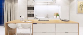
Choosing an apron for a white kitchen is simple and difficult at the same time. There are many options for designing such a space. We must not forget that the apron is one of the central elements of decor. The overall style and mood of the interior depend on its execution. Designers advise paying attention to the materials and texture of coatings.
A light apron in a white kitchen looks fresh and original
Color range of aprons for a white kitchen
It is believed that white is the color chosen by confident people. According to the findings of numerous psychological studies, a light shade improves the emotional state, improves mood, self-esteem, and has a positive effect on the creativity of the owners.
Snow-white surroundings give a feeling of novelty, lightness, and freshness. It is especially important to get such a “charge” in the morning, at the very beginning of the day.
From a designer's point of view, white is a universal color. It can be used as a main or additional one. The only point is the choice of shade of the apron, which largely depends on the material.
Yellow
Yellow is associated with different things - prosperity, wealth, gold, optimism, brightness, autumn. It is believed that even minor elements of this shade can speed up brain activity.
There shouldn't be too much yellow. An apron of solid color will quickly tire you and will not allow you to rest. Therefore, you should carefully study possible design options and not overdo it.
The sunny shade can also increase appetite, so people with problematic weight should not use it.
Yellow should be used carefully so as not to overdo it
Combined black and white
Black and white are the main colors, although they are located on different sides of the palette. In combination they give a unique eye-catching effect. When using, it is important to follow the rules for handling details and colors in the interior.
The contrasting combination is considered universal and is used in small and large kitchens. Suitable for decoration in classic and modern styles. It is important to consider the following:
- if the kitchen is large, the apron can be made completely black;
- wooden elements will help “soften” the interior;
- It is permissible to use blinds on the windows.
To diversify a light kitchen with a dark apron, use bright accents - red vases or pillows, for example.
Concrete-look tile splashback
The option of decorating a kitchen interior with concrete-look tiles has been used by designers for a long time. In a bright space, this combination looks especially advantageous - the grayish tint softens the overall impression of white and “calms” it a little.
Positive points - shock resistance and moisture resistance. The negative side is that traces of drying water may accumulate near the sink; you will have to constantly monitor this nuance, otherwise the kitchen will look sloppy.
A concrete-look kitchen apron emphasizes the light color of the kitchen
Mosaic
The mosaic pattern uses a combination of different colors - contrasting (for example, black and white) or pastel. The following variations are suitable for design:
- squares;
- circles;
- diamonds;
- trapezoid;
- ovals;
- speckled.
It is important to choose an apron with a pattern that will highlight the overall style. For a white kitchen it is better to use contrasting shades.
Dark shade
A dark apron in the kitchen is a non-standard solution. Shades of cherry and wenge are often used, which perfectly emphasize the overall style of a bright space. The introduction of dark colors allows you to complement the kitchen with interesting marble details; combinations with glossy or matte sets look good.
Designers advise relying on the following recommendations:
- uniform tonality - it is important that the shades of the apron and the main color are combined with each other;
- combination of styles - furniture and other interior elements must correlate with each other, styles and range of shades can be intertwined, repeated or different;
- contrast is an excellent solution, considered the most common option;
- a dark panel goes well with light furniture, the contrast is regulated by the degree of saturation.
You should not choose harsh combinations; conflicting elements will introduce dissonance into the classic interior.
Green
Green is the most natural of all possible colors. It is pleasant to the eye, has a long-term beneficial effect on the psyche, relaxes and calms. Therefore, the use of green shades is one of the most popular solutions in kitchen interior design.
Green color makes the kitchen fresh and light
The white and green combination creates a special atmosphere of lightness and elegance. It is important to select the optimal combination of colors in terms of saturation and tonality. Advantages:
- the variety of shades allows you to choose colors “to suit your mood” - for example, pistachio gloss will add warmth and comfort;
- white expands the space, and green adds freshness;
- the combination is suitable for kitchens of different sizes;
- In the evening, green calms you down, in the morning it gives you vigor.
And most importantly, the combination of green and white in the right tone looks fresh, modern and aesthetically pleasing.
Beige
The combination of beige and white allows you to create a cozy, harmonious interior. The color is universal, combined with different styles, other shades - contrasting, calm. The main thing is not to overdo it with beige variations. The equipment is chosen to be light so that it does not stand out against the general background of the room.
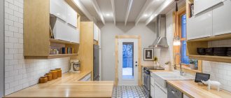
Natural simplicity of wood
A kitchen apron made of wood makes the kitchen truly homey and cozy. It is important to consider the main mistakes:
- excessive amount of wooden elements - there should be more white in the kitchen;
- if it is decided to make the apron and tabletop wooden, the material should be the same, wood with different textures will make the interior miserable;
- The floor can also be made of wood, the main thing is that the shades match.
In a white kitchen with a wooden apron, the presence of glossy and matte surfaces is allowed. The former have a significant drawback - they quickly get dirty, even from a light touch with your fingers.
Wood adds coziness and warmth to the interior
Blue
The combination of blue and white in the kitchen is still recognized by designers as an unusual solution. Blue evokes a feeling of calm, but the wrong shade makes the interior cold and unpleasant. The emotional load depends on the warmth and richness of color.
It is allowed to use several shades of the same type, different patterns on the apron.
Scientific research shows that too much blue in living spaces has a negative impact on older households.
Blue and turquoise
Blue and turquoise are bright shades, but unobtrusive.
Delicate colors help to relax household members, create a feeling of tranquility, and remind of the sea and summer. This design is especially relevant in the kitchen, the windows of which face the sunny side.
When using turquoise and blue in a bright kitchen, it is important to remember the lighting. Lamps choose calm white light; cold options will make the space lifeless and uncomfortable.
Artificial stone “like brick”
Designing a work area “like a brick” has been used for several decades. The apron should be harmoniously combined with the surrounding elements. In a white kitchen, such a design will highlight the interesting choice of the owners; the main thing is to choose the right shade and material of manufacture. Advantages:
- Suitable for different styles;
- helps hide wall defects;
- practicality - the textured coating will hide minor dirt;
- variety of design options - materials, colors, textures vary.
In addition, the coating is affordable and durable. In a white kitchen, the brown brick pattern especially stands out.
The main thing in such an interior is practicality.
Dark kitchen design with different accents: gold, lighting, emerald
A dark kitchen is a very successful way to emphasize the originality of your interior. A black or dark brown set will look luxurious with gold accents, neon lighting and an emerald or malachite backsplash.
Art Deco Dark Kitchen Interior Design with Gold Accents
Accents in a dark kitchen play two very important roles at once. For example, they add depth to the interior and make it detailed. But even more significant is diluting the dark background and brightening the interior. After all, a dark background looks good only in some styles, for example, minimalism, and in art deco it needs additional decorative elements.
Interior of a black kitchen with gold accents in the design of bas-relief half-columns
Kitchen interiors with gold accents can vary. Classic, Baroque and Rococo are characterized by massive wooden kitchens with carved details, bas-reliefs, modules and medallions in the design of the facades. Here you can find half-columns, friezes and crowns. Some of these parts may have patination or gilding.
Two-tone beige and brown kitchen with a trendy emerald splashback and black appliances
A beige kitchen with an emerald accent is a super trendy option for a modern kitchen. In the photo above you see a two-tone beige and brown set with wood trim, Moroccan tiles on the backsplash and black built-in appliances.
Dark brown kitchen with marble countertops and backsplash and gold accents in the dining room
This brown kitchen is complemented by gold accents not in the design of the unit itself, but in the design of the dining room. Metal frames of semi-chairs and tables, lamps and zoning screens play the role of spectacular gold accents here.
Gloss black kitchen with gold accents and gray splashback with gold accents
The black kitchen with gold accents in the rendering above has an interesting feature: the backsplash design uses gold metallic accents, which look very glamorous. By the way, black kitchens with a bright color accent do not look as stylish as those with gold, silver or dark accents.
Pros and cons of a white apron in the kitchen
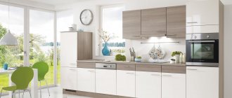
Designers call the use of only white Total White. Every year the trend becomes more and more popular. A kitchen with a white apron looks fresher and lighter. The advantages of this design:
- suitable for any style;
- expands the space, so is great for small kitchens;
- monochrome remains relevant for a long time and does not go out of fashion;
- It is allowed to use accents of any color;
- The lighting elements look good.
The main disadvantage of white is the need for care and thorough cleaning. A white kitchen, the apron of which is also white, requires care and consistency.
Kitchen design in gray colors: about styles
Gray is the perfect companion to other colors in the palette, so it can be used in almost any style. However, there are some directions in which gray will look most appropriate.
Minimalism
Gray here is monochrome. Looks great in duets with white and black. As a result, the kitchen creates the impression of a rather ascetic space, which you just want to complement with brightly colored details. However, the only decorative details that are appropriate here will be textures: wood, marble and other natural stones.
Facades with hidden handles or without them at all will help not to violate the canons of minimalism.
Loft
A gray set with a paneled or smooth facade will look perfect in this case.
Dark colors will add brutality to the kitchen. If the room is small, then it is better to abandon them in favor of light gray tones or simply leave dark colors to decorate the facades of the lower cabinets, and make the upper ones light.
Neoclassical
Modern classics in gray tones are a fashionable alternative to beige classics. It goes well with accessories in the form of gold handles, designed to look like antique bronze, brass, forged items, etc.
What material can be used to make a white apron in the kitchen?
Various materials are used for a white apron in the kitchen. The main thing is compliance with certain requirements. The working coating should:
- withstand high temperatures (boiling water, splashes of oil, for example);
- be moisture resistant (especially in the area where the sink is installed);
- easy to clean with a sponge or brush (the kitchen space constantly needs cleaning).
Despite the large number of requirements, white aprons for light kitchens are made from many materials. Each has its own advantages and disadvantages.
The most common is ceramics. The tiles are quite durable, easy to clean, and do not deteriorate over time due to large amounts of fat and high humidity. You can lay out ceramic panels in different ways - brick, combined, even, herringbone or zigzag.
Textured tiles that imitate stucco, stone, brick, geometric or floral patterns look interesting. It looks unusual and luxurious, but may be difficult to clean.
A glass splashback for a white kitchen is becoming an increasingly popular option. The glossy surface looks great and can withstand moisture and high temperatures. The surface can be shiny, matte, textured or translucent.
Wood is an excellent material for decoration; treatment with paint or other means is important. It is unacceptable to install such panels near stoves, especially gas ones. Such parts are highly flammable.
A combination of several options looks interesting - for example, stone and mosaic
What colors go with a white apron in the kitchen?
A white apron in a bright kitchen can be combined with any colors and shades. Completely white or Total White looks original, impressive and unusual. In such an interior you can install furniture of almost any style and texture. The equipment can be very diverse - chrome-plated, dark, modern and not so modern.
Neutral white can act as a space divider—for a smooth transition from the kitchen to the living room, you only need to change some furniture details. Typically, techno, patchwork, fusion, industrial and other styles are used to decorate a bright room. The combination of white and gray looks stylish.
5 layout options for a modern kitchen in gray
The first step in creating any design is, first of all, the choice of a set, its components, configuration, arrangement of furniture in the kitchen as a whole.
The layout can be:
- straight;
- corner;
- in the shape of the letter “P”;
- with a peninsula/island;
- with a bar counter.
Trends characteristic of a gray kitchen in a modern style
Surely, when looking at the design of a gray kitchen in a modern style in references or photos, you noticed that sets with handles in this case are presented quite rarely. And they are almost all with upper cabinets up to the ceiling, or without them at all. And, of course, a frequent guest here is built-in appliances.
These are the trends that are a priority now. Therefore, take them into account if you want to create a truly fashionable interior.
Beautiful examples in the interior
The use of light colors in the interior begins with familiarization with examples. Any photos are in the public domain. To create the right atmosphere, it is important to study possible options and mistakes, and advice from designers.
Small accents will add originality to a white kitchen
A glossy apron will add light and shine to a bright kitchen
Glass cloth with imitation stone will slightly “mute” the white color
Tiles or tiles are practical materials, and an unusual pattern will add originality
Mosaic is one of the most popular apron design options.
The panel can be made of different colors and materials
A light apron for a white glossy or matte kitchen will diversify any interior. Colored elements will make the design more vibrant and interesting. It is important to consider certain disadvantages of this design - especially the need for frequent cleaning. In any case, a light, airy, bright space will lift your spirits in the morning and smooth out a difficult day in the evening. The main thing is to choose the right material and place accents so that the interior does not turn out boring and monotonous.
Kitchen interior design with accent textiles
Textiles are an important part of any interior. You can vary its amount and importance in the context of your project. For example, in the Provence style it will play a significant decorative role, but in the minimalist style it will be almost invisible. Nevertheless, very often textiles become the accent in interior design.
Gray-blue kitchen with beige floors, countertops, splashback and blue upholstery
A kitchen with a blue (or light blue) accent looks very cozy and modern. Many people like this compromise between bright colored accents and an almost monochrome palette, especially in neoclassical, Provence and Scandinavian styles.
Neoclassical light kitchen with blue curtains and chair upholstery in the dining room
Accents are especially important in a bright kitchen interior. For example, in textiles they can be used in the design of curtains, carpets, decorative pillows, chairs, half-chairs and breakfast sofas. Working household textiles (an apron, for example) can also be decorated in this style.
Modern kitchen in white and gray with wood tones
This gray kitchen unit looks stunning with part wood cabinets and a black sideboard. And the bar half-chairs in a shade of ginger create an attractive autumn mood in this interior, which echoes the ambiance of the French piece parquet on the floor.
