What layout features can a 15 sq.m kitchen have?
Kitchens of 15 square meters are rarely found in typical apartments. Usually, these are either very large “Stalin” apartments, modern new buildings or in a private house. In all these cases, as a rule, these large and spacious kitchens have 2 windows (but not always).
So, what can we recommend in this case?
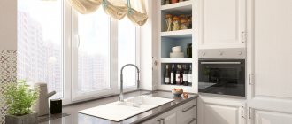
1. There is no need to hang a curtain (such as tulle) on the entire wall and cover the window openings. Firstly, it is not very beautiful, and secondly, there will be less light. It’s better to play around with these windows, for example, by placing some kind of buffet or shelves between them. And hang a decorative curtain at the very top, just for beauty.
2. Also, we pay attention to such an important point - heating. If you have expanded the kitchen yourself in some way, then do not forget about the need to install an additional radiator. With one battery in a kitchen of 15 sq.m it will be quite cool.
3. A few words about kitchens with access to the balcony. Now it has become fashionable to remove the concrete slab from the balcony and install a floor-to-ceiling window instead. Yes, it's very beautiful, but don't forget about safety.
Especially if you have children who tend to stumble, fall, fight... And maybe one “unwonderful” day, your child will crash into this very window, which is by no means always armored and strong. Therefore, our advice to you: it’s better not to take risks.
4. Another important detail is light. If there is only one window, then take care of additional lighting in the far corners. And in the evening, one chandelier will clearly not be enough for you (although if it is 5-armed, then there will be enough light).
If you have a corner kitchen and this corner is not lit, then we do not recommend placing a dining area there (although it just asks to be there, purely visually). It is better to place the table by the window, and the refrigerator and other equipment in a dark corner.
Types of kitchen finishes
The option for finishing the kitchen depends, first of all, on the budget that you are willing to spend on finishing it and your preferences.
We divide the room into zones - for cooking, eating and relaxation, we isolate them from each other with air partitions or highlight the sectors with the same color.
It is important that all materials for finishing the kitchen meet the following basic requirements:
- moisture resistance, a lot of water is always used for cooking, so the general climate of the kitchen is always more important than in ordinary living rooms;
- resistance to thermal influences must be present in materials that are located in the food preparation area;
- resistance to mechanical damage must be present in the materials of the food preparation work area, as well as the floor;
- it is important that all materials used to decorate the kitchen are fairly easy to maintain on a daily basis, because cleaning in this room is carried out very often;
- the materials must be sufficiently wear-resistant, so your room will have a very beautiful and neat appearance for a long time.
We select and clear the seating area and determine a place for the sofa.
Floor finishing
Now there are quite a lot of high-quality flooring materials on the market that meet all of the above requirements, so you can simply be guided only by your financial capabilities and needs.
Floor tiles are the best choice for kitchen flooring. It comes in different types and sizes, different textures. This is the most wear-resistant and unpretentious material for the kitchen.
Stylish design of a modern kitchen using non-standard furniture.
The entire floor can be tiled, or only the work area where food is prepared can be tiled. If you are tiling only a certain part of the kitchen, then it is better to select the material for the rest of the premises to immediately match the tone of the tiles. Floor tiles are made from different materials, the choice is quite wide, you can easily choose an option depending on your needs. Laminate or specially treated floor boards go well with tiles.
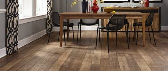
You can lay out the entire kitchen with laminate or wooden panels (boards, parquet). When choosing a laminate, it is important that it is sufficiently moisture resistant.
You need to choose a model based on the planned arrangement of the headset and the location of your soft friend.
Advice. The most budget option for floor finishing is still linoleum. Modern technologies have made this material quite high quality and beautiful. Linoleum can be chosen with a classic pattern like tiles, marble or wood. There is also the opportunity to choose some beautiful modern designs. When choosing linoleum, pay attention to the manufacturer and the wear resistance of the material’s texture, and not just the pattern and color, this is important for the kitchen.
Wall decoration
Often the walls in the kitchen are decorated with several materials; more moisture-resistant and wear-resistant materials are used for the work area, while painting or wallpaper is still used for the rest of the room.
Before buying a sofa, measure the dimensions of the place where you will subsequently place it. It must fit freely in the seating area.
Today, thanks to modern technologies, there are many more options for finishing walls in the kitchen; we list the most types of finishing:
- wall decoration with traditional ceramic tiles;
- mosaic;
- wall decoration with slabs of natural or artificial stone;
- plastic panels with and without patterns;
- wall decoration with cork panels;
- glass panels for finishing the work area where food is prepared;
- decorative and textured plaster;
- painting walls with regular or texture paint;
- regular wallpaper, photo wallpaper, liquid wallpaper, bamboo wallpaper;
- wall decoration with MDF panels;
- clapboard finishing;
- other options from modern and classic materials.
It is better to decorate elongated shapes with a narrow but long sofa along the wall.
When choosing materials, it is important to consider where exactly your kitchen is located: is it an apartment building, a private house or a summer cottage. The temperature in the room throughout the year greatly depends on this, and, therefore, the selection of materials for walls and other surfaces. Some materials are chosen for typical urban conditions, while other materials are better suited for country houses. Wood and other natural materials are still traditionally chosen to decorate a dacha or country house.
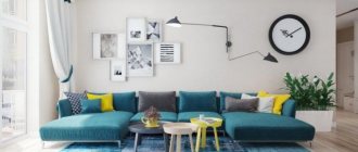
The main thing is to successfully complement the area with other objects, emphasizing the primacy of the sofa in the design.
Ceiling decoration in the kitchen
When choosing materials for the ceiling, you need to be guided by the fact that the kitchen is a room with high temperature and humidity, where soot, grease, and surfaces quickly become dirty and dust sticks to them. As a rule, even a good hood does not cope well with large volumes of soot. In order for your room to have an attractive, neat appearance for a long time, you must carefully select materials for finishing the ceiling.
The upholstery of the sofa should be as practical as possible and should be washed away from potential stains as quickly and efficiently as possible and not absorb foreign odors.
The main most popular options for finishing materials for finishing the ceiling in the kitchen:
- Whitewashing still remains one of the most acceptable methods for the kitchen and the most budget-friendly methods of ceiling finishing. It absorbs moisture well and does not become very dirty, especially if the exhaust hood and general house ventilation work well. Whitewashing is usually done with lime and chalk or higher quality modern ready-made mixtures. These mixtures have good environmental properties, are moisture-resistant and bactericidal. Depending on the operating conditions, such finishing may not last long or, on the contrary, quite a lot of years, but then the repair must be done again.
- Water-based paints are often used for kitchen ceilings. They “breathe” well and can be applied independently without any problems. Such paints are inexpensive and with the help of additional coolers you can change the shade. They come on an acrylic or latex base, so they can be washed several times during use. This coating will last longer than regular whitewash. Its cost is also low. This type of finish is more modern and more preferable in the low price category. But before painting, just like before whitewashing, you need to carefully level and prepare the surface of the ceiling (clean and putty any uneven areas).
- Quite often the ceiling in the kitchen is decorated with wallpaper. It is best to use washable vinyl wallpaper and select moisture-resistant glue. Wallpapers come in a wide variety; you can choose textured plain wallpapers in a beautiful color or with a pattern. Now there are a lot of beautiful photo wallpapers specifically for ceilings. This is also a fairly budget-friendly finishing option that is easy to do yourself.
- One of the modern popular finishing methods has become decorative plaster. This material looks very beautiful and modern; it will easily hide various small irregularities on the ceiling. Materials of this type are very diverse; with their help you can create various effects and imitate ceiling finishing with natural materials. Using such materials, you can get a very beautiful and effective renovation for little money. When choosing such materials, pay attention to their quality and composition. There are acrylic, silicone, mineral and silicate mixtures. Acrylic mixtures are very durable, they are not afraid of humidity and temperature changes, but they have low fire safety (not the best option for a country house). Silicone mixtures also have very high moisture resistance, good adhesion and elasticity, and are quite versatile. Mineral mixtures are made on the basis of lime, cement, natural clay, and stone chips. This is a good option for country houses, as it has good frost resistance, moisture resistance, and is suitable for poorly heated rooms. The silicate mixture is made on the basis of liquid potassium glass; this material is not very environmentally friendly and is usually used for outdoor work.
You can decorate the space around the sofa with paintings and photographs.
- Plastic panels, usually white, are still used to decorate the kitchen, but this option is already a little outdated. This finish is inexpensive, perfectly hides uneven ceilings and is resistant to temperature and moisture changes. This option is well suited for country houses.
- Foam tiles are another inexpensive and versatile renovation option. It perfectly hides uneven ceilings and is easy to lay out yourself. The tile can be white or colored, its texture and pattern are very diverse.
- Wooden lining is now used less frequently, but nevertheless, it is one of the popular types of natural finishing materials (good for country housing).
- MDF panels are also used for finishing ceilings. When choosing this type of finish, it should be taken into account that the height of the ceilings will decrease slightly during the renovation process.
- Sometimes a suspended aluminum slatted ceiling is used for the kitchen, but this type of finish is more intended for bathrooms.
- Recently, cassette suspended ceilings have become very popular. Square tiles made of plastic or made from gypsum (of various textures or with patterns), together with well-chosen lighting, look very beautiful.
- One of the most popular quick types of ceiling finishing are stretched fabrics. The canvas can be made of different materials - PVC film, polyester or other more environmentally friendly materials. They can be matte or glossy, plain or patterned, smooth or textured. The choice of materials is quite wide. They are made with one or more levels. Installation is usually carried out by specialists using special equipment. This is a fairly universal and inexpensive repair that can be done very quickly.
- Plasterboard ceilings are not very suitable for kitchens, but they are still a fairly popular type of finish.
- Recently, ceilings made of glass panels have been gaining popularity. For their manufacture, silicate or organic glass is used. The panels can be plain or patterned, and they are often combined together. This type of renovation looks very nice, but you will have to spend money on it.
- If you are a supporter of eco-style, then you will probably like a ceiling made from natural environmental materials. Panels made of wood, bamboo or cork are now popular. Such materials can be used not only for the ceiling, but also for the walls; together they will look quite harmonious.
You can decorate the living room sector with decorative stone, and install flower pots as decoration.
Each option has its own advantages and disadvantages. As we noted earlier, the microclimate conditions in the kitchen are quite unfavorable, so there is no ideal material and this room needs to be renovated periodically. When choosing a material, be guided by your own preferences.
Attention! Whatever type of finish you choose, first of all look at the quality of the materials, because this is what determines how long the entire ceiling finish will last.
Options for arranging kitchen units on 15 square meters
In this block we will talk about the layout and placement of the most important thing - the kitchen unit. And from there you can “dance”, shaping the further interior of the kitchen. It’s much easier to figure out how to furnish the remaining area.
So, what options are available to you at this quadrature?
1. Straight kitchen 2. U-shaped 3. L-shaped 4. Set on two sides of the walls 5. Set + island 6. Set with bar counter
We will devote a separate section and a selection of photos to each of these types of placement (except linear) so that you can see how it all looks in the interior.
Now let's discuss all the options in more detail.
U-shaped placement of the headset
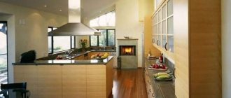
A U-shaped kitchen is not available to those whose space does not allow covering three walls, and at the same time “stealing” the space inside. But this problem does not concern the owners of a kitchen of 15 sq.m. Here, just the opposite, the U-shaped arrangement will come in very handy, otherwise the room may look empty and not fully furnished.
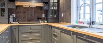
But, if we take into account the practical side of the issue, then a U-shaped set is not an essential thing at all. After all, in fact, where can you get so many utensils to place in numerous drawers? The best option is if you equip the bottom drawers with the letter P, but place open shelves on top around the entire perimeter. You can put decorative elements, jars, etc. on them.
Check out these photos. This is what a kitchen design for 15 sq.m. might look like. with a U-shaped set.
Making the most of the space
Fifteen square meters is enough to create a multifunctional kitchen-living room. However, when designing the interior yourself, you can make mistakes. They will lead to a lack of space to accommodate the necessary things.
Creating a combined kitchen and living room will add mystery to the interior and characterize the owners as stylish and modern people.
The first mistake is leaving the corners empty. The corner of the room can be occupied by a sink, shelves, cabinets for household appliances. The second mistake is not using walls near the work surface. You can hang hooks and open shelves for seasonings on the walls.
Some of the utensils will easily fit on the walls and will always be in sight.
L-shaped
If you place furniture this way, you will have enough space for other elements: a sofa, a sideboard, a coffee table. If you do not intend to put such furniture in the kitchen, then you can make a large dining area with a huge table. You can also place indoor flowers in tubs on the floor, for example, hibiscus or ficus.
See what a kitchen like this could look like with the furniture arranged in the letter L.
Kitchen 12 sq. with access to the balcony. Unconventional approach to corners and bright details
Sometimes the layout can be extraordinary - for example, the kitchen may have as many as 5 corners! The corner design of the headset fits perfectly. Small cabinets and shelves helped to rationally use the space and free up the central part of the room for free movement.
There is never too much usable space. Transforming the window opening while combining the areas allowed more natural light to flow into the kitchen with soft blue walls. This is an example of bright monochrome solutions. Dynamic shades of gray in the splashback tiles, glossy white and black facades.
An example of a contrasting color scheme that transforms a balcony into a cozy nook in the kitchen. The abundance of white makes the room light, and red and newspaper princes place accents on the zones.
On both sides
Let’s say right away that if your kitchen is square, then we do not recommend choosing this arrangement, since the room will look more elongated and narrow.
But if the room is long and narrow, then placing the set on two sides will be very reasonable. Just place it across, on short walls.
Adviсe
Some useful tricks and recommendations for arranging a kitchen with a balcony:
- ➤ Design of combining rooms
. If you are planning to remodel, for example adding a loggia to the dining room, then do not forget to arrange everything properly. Otherwise, you may be fined. Illegal plans also hinder the sale of real estate. - ➤ Organization of space
. If space allows, then on the loggia you can create a corner for work or relaxation. It’s easy to visually divide a room using a niche or using different materials in the design. - ➤ Communications
. When combining rooms, make sure that the loggia is warm - insulate the walls and hang an additional radiator.
Redevelopment needs clearance
Use a window sill as a tabletop
Without a battery on the balcony, you risk freezing in winter
With an "island" in the middle
“Island” is fashionable, but... Is it convenient? By and large, such a piece of furniture is good for 20 square meters, but for 15 square meters it will simply take up extra space and deprive you of the opportunity to equip a large dining area.
Well, think for yourself, how miniature this “island” should be so as not to interfere with anything else? And if it’s small, then it doesn’t have much of a view or convenience.
You can’t place a sink in it, you can’t cook on it, you can’t sit down to eat, because your feet will rest against the drawers... Please look at the photo to see what kitchens with an “island” look like in exactly this quadrature.
Look and think, is this beauty worth the comfort? After all, instead of a “sub-island” you could put a comfortable sofa, for example. It's convenient, yes! You are cooking, and your husband is lying on the sofa and morally “supports” you =)
Interior design of a small kitchen combined with a balcony
Implementing such a design requires solving two issues.
- Firstly, it is necessary to properly insulate the balcony, which will require considerable costs.
- Secondly, heating the room will require moving radiators, which requires permission from the BTI, which you may not receive. Therefore, it is necessary to immediately address this issue and, if necessary, resort to alternative heating methods (for example, a “warm floor” system).
- By combining a small kitchen and a balcony you can create a comfortable mini-dining room.
- Removing the wall separating the balcony and the kitchen will add some free space.
- A neat shelf above the wall is a wonderful element of interior decor, allowing you to practically place spices and a mini-bar.
When organizing a combined design, the following options are usually used:
- the dining area is organized by replacing the window sill with a tabletop, which will combine the balcony with the kitchen space, and can be decorated as a bar counter;
- setting up a relaxation area with an oversized sofa, a lamp, a TV and a table for magazines is a wise decision in a tiny apartment, especially when receiving several guests;
- moving the cooking area to the balcony will increase the usable space of the room and add coziness to the interior, however, moving kitchen equipment is a rather labor-intensive process. In addition, the implementation of such redevelopment requires documentary permissions from a number of authorized authorities, which will require a lot of time and financial resources.
With bar counter
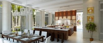
In such an area you can fit a bar counter. But, this will be more appropriate if the kitchen is not separate, but combined with the living room, for example. Then the bar counter serves as a separator, looks stylish and does not “steal” the usable space.
In this case, it even turns out to be a kitchen-dining room, where a set, a dining area and a sofa with a TV can easily fit. Or maybe it will just be a kitchen-living room of 15 sq.m., in which instead of a dining table there is a counter and bar stools.
Although, we do not recommend this option for large families. Having lunch sitting in a row at the counter is uncomfortable. Instead of placing a dish in the middle of the table where everyone can help themselves, you will pass the plates to each other in a chain.
But, if your family is of two people, for example, then you can do it this way.
Take a look at the photo below and maybe you will like some design ideas.
Well, now that we have considered all the possible options for placing basic furniture in the kitchen, let's move on to specific examples and styles. After all, zoning is not everything. The main thing is style.
Features of upholstered furniture in the kitchen
Upholstered furniture increases the comfort of the room and helps to zone the space. The available area is enough to place a small sofa.
The kitchen has the following advantages:
- Unusual appearance.
- Convenience. After long hours of work, you can sit down and rest your back.
- The ability to accommodate a large number of guests in the kitchen without losing comfort.
- Correctly selected colors create a calming and relaxing effect.
- Folding sofas with closed compartments are used to store kitchen items. Rarely used dishes and equipment are hidden in free cavities and free up useful space on the tables.
The disadvantages include the following:
- The smells of cooking food are absorbed by the upholstery. The problem is partially solved by installing a powerful hood.
- Difficulty in cleaning. Microparticles of fat and food fall on the surface, are absorbed by the material and accumulate dirt. Cleaning upholstery is difficult and takes a lot of effort and time.
- Even a small sofa takes up a significant part of the kitchen and is not compatible with certain types of layout.
Minimalism
In the modern style, which is “minimalism,” equipping a large kitchen is not very interesting. It will look overly empty and boring. This style does not imply any beautiful, interesting details and it is difficult to choose something interesting to diversify the atmosphere.
But, if you really like minimalism and the whole apartment is made in it, then we invite you to look at the photos that we selected.
As you can see, there is nothing special to advise here and there is nothing to focus on any details. The only thing that cannot be ignored is technology. In a kitchen of this style, you can install a maximum of appliances, and it will not look inorganic (for example, like in Provence or country styles).
Color scheme for the kitchen-living room
The color palette of a small room is rarely in doubt, because light shades are needed for visual expansion. The optimal color is white, which perfectly reflects the rays of light, so the finish seems to glow on its own.
There is no need to be afraid that a bright kitchen-living room of 15 square meters will be boring and monotonous: in any style you can find interesting accents, textured coatings, original pieces of furniture that will decorate and diversify even the most ordinary interior.
In a kitchen combined with a living room, a bright accent will be an apron or a pattern on the furniture fronts. The decor can be utensils, fruit in vases, glasses suspended above the bar counter.
An interesting solution would be a horizontal wide strip in the decoration - a work area in an apron or a narrow wall with a room measuring 2 by 7.5 m. This technique literally expands the room, but for this the strip must be noticeable - contrasting or darker than the main shades at least a couple tones
In the guest area, you can use a couple of rich accents or dark wood surfaces. Although a catchy carpet and curtains in the same color will be enough, because another rich surface will be the TV, which will somehow be noticeable against a light background.
You should not choose colored paints for the background - they will visually make the room smaller, which should not be allowed if there is limited space.
Vanguard
Now this is an interesting option. Here, in the free space, you can put a lot of interesting decor. For example, sofas that are made in the form of half a car. Or, instead of a china cabinet, there is a decorative telephone booth, like in England, on every corner.
Here are a few photos of large kitchens in this style:
Fusion
Fusion is a large number of different-sized parts, colors and other “philistinism”. Here, the more of everything, the better and more stylish the final look. In such a kitchen you can put a buffet, bench chests, shelves, shelves, floor lamps...
Textiles should be bright, lamps should be as unusual as possible. Mixing styles is not welcome here. Everything should be in the old version.
Classic
A real, cast-iron stove-stove begs to be added to a classic kitchen. But it should be tall, with carved details. For the price, this thing is very expensive, but it's worth it. If you don’t want to buy a ready-made one in an antique store, you can lay out a fake stove from ceramic tiles or make something like a fireplace, for example.
You can put a chair next to it, it will look very natural.
Do not forget that the furniture set must also match. Kitchens in the style of modern classics, which are sold in stores (in the form of dark furniture with friezes and mesh) are not at all the classics that were before. It’s better not to buy this travesty, but to order furniture that will really look appropriate if you are creating a classic interior. Also, install brass faucets, do not forget about cornices, chandeliers and other little things.
In the photo below, interesting design options for a 15 sq.m kitchen in a classic style.
Style selection
According to the rules of interior design, the rooms of an apartment or house are decorated in the same style. Mixing different directions creates chaos in style and shows a positive result in very rare cases.
Before starting renovation work, you should study the best ideas for arranging a 15 sq. m kitchen. meters and outline successful options.
Minimalism
The name of the style implies the use of a small amount of furniture and kitchen appliances. Because of this, a large kitchen can look boring and empty.
In the visual part, the style is distinguished by restraint and severity of shapes and colors. As a rule, the design is done in one color. They use single-set sets and tableware.
Using simple design elements saves money. With the right approach, you can renovate your kitchen on a budget.
A soft corner or a set of mini-sofas will fit perfectly into the overall design and create a comfortable place to relax, eat and communicate with family members and friends.
To fully appreciate the new 2022 kitchen interior design 15 sq. m. with a sofa, you need to carefully study the photos of finished projects and layouts.
Fusion
The complete opposite of minimalism. The essence of the design is to combine obviously incompatible elements and colors. Despite all the diversity, all components of the interior must be harmoniously combined with each other. The designer is required to have impeccable taste and a developed sense of proportion.
For the kitchen, choose a sofa with bright colors and an unusual shape, which clearly stands out from the general background.
Attention! When decorating, it is important to see the edge so as not to oversaturate the room with objects. Visually they will be stylish, but too much will not do any good. If you are not confident in your abilities, you should order projects from professional designers.
Country
The rustic kitchen style is an attempt to combine rural simplicity and modern technology. When decorating the premises, natural materials are used. The color scheme is dominated by natural shades, without bright or sharp transitions.
Decorative elements reflect the national preferences of the designer. For example, a samovar or a Soviet set immediately gives off a Russian country design. Since country is an old-fashioned style, modern kitchen appliances are not usually left in sight. The refrigerator, dishwasher and microwave are hidden or disguised to match the overall style.
Furniture is selected taking into account visual compatibility. Upholstery with traditional patterns, plant and floral patterns or checkered patterns. Old upholstered furniture is suitable - it is inexpensive and easy to repair.
Advice! Country style is well suited for country houses and blends well with the environment. In modern apartments, achieving a complete combination is difficult and expensive.
Classic
A style that is popular at all times. The basis of the design is the feeling of free space. Therefore, they prefer furniture in light shades. It visually expands any room and creates the illusion of a large space.
All design details must be symmetrical, clear and correct. Experiments and playing with abstractionism are not appropriate. It is preferable to use furniture from one set.
In the classic style, all zones are clearly limited. Therefore, a sofa or soft corner will fit perfectly in the kitchen, outlining a place for relaxation and pleasant communication.
High tech
Design direction based on modern technologies. It is the complete opposite of country music. All appliances are on display, demonstrating the direction of the kitchen. The kitchen set is filled with convenient fittings.
Finishing materials – plastic, metal, glass. Color – white, black, silver, metal. You should carefully study the selection of stylish kitchen interiors for 2022 to choose the best layout for yourself.
Strictness and simplicity of design are used for long rooms with access to a loggia. Instead of a window frame and a passage, a bar counter is installed, and a seating area is organized on the balcony itself.
High-tech furniture is visually simple, but functional. The sofa outlines the area for eating or relaxing. There are no frills provided.
Provence
A must-have element in such a kitchen is a buffet with dishes, and it must be an old one. Without it, Provence is not Provence, so be sure to buy it.
As a budget alternative, any antique sideboard is suitable, scratched and unpresentable, which you can paint yourself white and make scuffs on it. It's not difficult and you can find master classes on the Internet.
Be sure to hang curtains and lay a tablecloth on the table. If the kitchen has two windows, then it will be beautiful if you place the sink right under the window.
How to zone a room?
There are several options for visual and actual separation of zones in the kitchen-living room:
- Separation by color. The interior of the kitchen and living room should be harmonious, but at the same time made in different colors. Warm colors are often used: yellow, beige, light brown, sand. Or they play in strong contrast: yellow and green, white and black, and so on.
- Light separation: Another effective and popular technique is to accentuate light above a living room table. Wall and floor lamps are a good tool in this case.
- Visual zoning by finishing the floor, walls and ceiling.
If the budget and imagination of the customers allows, then the floor in the kitchen area and living room can be made at different levels. Usually the kitchen is made a little raised - it looks extremely stylish.
The ceiling is also used to divide space. For example, in the living room the ceiling can be decorated with stucco or mirrors. In the kitchen you can use ceiling panels or hanging structures.
The use of walls for zoning is recommended by many experts, but harmony is always above all! You can combine wallpaper in the living room with tiles in the kitchen and decorative plaster with wall panels.
Recommendation from the architects: in case of redevelopment of the apartment and creation of a kitchen-living room, you can leave part of the wall as a semi-partition. This part can even be left unfinished, if the interior of the apartment allows it, and can also be used as a shelf for house plants.
Country
In country-style kitchens, a mini-oven similar to a Russian one would be appropriate. Also, various chests, benches, clay and cast iron dishes look good there.
Look at the large country-style kitchens in these photos.
Wall project
The walls, as the largest surface in the apartment, need to be given appropriate attention. Here everything is limited only by your imagination and your capabilities. The basis of the interior can be wallpaper, paint or tiles. Their color is also selected depending on your desires.
Horizontal stripes and wood tiles in kitchen design
Beige and green walls in the kitchen
White and green walls in the kitchen
White walls in the living room-kitchen
Kitchen in soothing colors
Beige and white stylish kitchen
Beams in the kitchen interior
Brown and black living room-kitchen
Retro
The main thing here is to choose the appropriate technology. Nowadays you can find both ovens and refrigerators in the style of the 50s. Old radios, rocking chairs, and bookshelves with old cookbooks on display look great in such kitchens.
Also about technology: with a refrigerator, things are simple: you don’t have to buy a stylized one, but repaint the old, semicircular one. But with the stove it’s more difficult.
If you couldn’t find a retro stove, then at least buy a hob. Take a built-in oven. The same goes for choosing a washing machine and dishwasher. Nothing modern should be visible, otherwise the retro charm will no longer come out.
In this article we looked at kitchen design projects with an area of 15 square meters. In 2022, all of these options will be relevant in both studio kitchens and conventional layouts. We are sure that you will definitely like something and the renovation of your apartment will be a success!
Layout
At the stage of creating a design project, you need to decide on the layout - for example, you can fully or partially combine the kitchen with the balcony. If such a goal is not worth it or you do not want to get involved with the bureaucratic aspects of legitimizing the redevelopment, it is easier to leave everything as is and not combine the premises. Let's look at these situations in more detail below.
Without merging
Here it is important to think about the placement of appliances and kitchen units in such a way that the balcony door opens freely. Nowadays, the design trend is when the window sills are dismantled - this makes the room visually more spacious and brighter. Plus, you can provide not just a standard balcony door in your kitchen, but a French window.
Dining room layout: the loggia is located behind the glass door
Partial
Do you want an original kitchen interior with a balcony? Consider the possibility of partially combining premises. For example, some designers remove the balcony door and somehow play up the resulting opening.
The balcony here is a kind of “island” for relaxation
If the space is really bad, then you should use it as functionally as possible. For example, try placing a refrigerator or cupboards on the balcony.
Place the refrigerator on the loggia - it’s convenient and original
Complete
With complete unification, you will be able to win several square meters of space. This is especially true for small one-room apartments in panel houses. However, do not forget that redevelopment will require not only quite a lot of financial investments, but also registration.
Full integration helps to significantly increase the area
