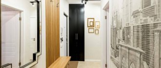
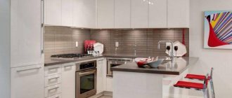
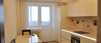
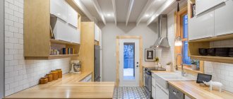
head of design studio
Introduction about the kitchen 16 squares, come up with 2-4 sentences
If you consider the kitchen to be the main room in the apartment, then this article is definitely for you! Today I will talk about how to make a comfortable, functional and beautiful kitchen. Make yourself comfortable, there will be a lot of useful information!
Read more
Kitchen layout
Kitchen set shape
The shape of the kitchen set is most often dictated by the area and shape of the kitchen space. There are these types of shapes: straight, L-shaped, U-shaped and with an island. Let's look at all the options and determine what the pros and cons of each of them are.
Direct kitchen
For kitchens larger than 10 m2, a straight kitchen is not very convenient, because it has the longest perimeter of the working triangle. What is a "work triangle"? This is an invisible triangle, the vertices of which are on the refrigerator, sink and hob. The longer the sides of this triangle, the more mileage the housewife puts in while preparing food.
What if the kitchen is small?
If the kitchen area is less than 8-10 m2, then the shape of the set does not matter - in all shape options the working triangle is minimal. In small kitchens, another problem is to fit everything you need for cooking and storage.
L-shaped (corner) and U-shaped kitchen
They are the most convenient, since everything a housewife needs to prepare food is always at arm's length. Also, in such kitchen sets there are always secluded corners where you can hide “visual noise” from the eyes: rags, detergents, cutting boards and small household appliances.
Kitchen with island
The most inconvenient form of kitchen set, although it looks impressive. The fact is that due to the rupture of the working surface, the cooking processes will have to be divided. Leave some of them on the main work surface, and move some to the island. And since a lot happens unconsciously in the kitchen, it often turns out that the housewife cooks only on the main work surface, forgetting about the island. And all because transferring processes to the island is inconvenient and requires additional actions.
The greater the distance between the hob and the sink, the more convenient it is to cook. This is the main working surface. And it must be at least 90 cm, and free from small household appliances!
Sink placement
Don't think that the area near the window is the ideal place for your sink. Are you ready to constantly wipe it from residual water?
You should also not install the sink close to the wall or next to the stove, because splashes of water will also fall on these surfaces and leave marks.
You will have to carefully consider communications if you decide to install a sink on a kitchen island. As for the corner sink, not everyone is comfortable using it, but it perfectly saves space in the kitchen and will not interfere with you while cooking.
Arrangement of equipment in the kitchen
Fridge
The most used item in the kitchen! It is best to place the refrigerator at one end of the kitchen unit, which is closer to the dining area and to the entrance to the kitchen. A built-in refrigerator will fit better in terms of design into a modern and classic kitchen. If you are planning a loft or Scandinavian style, then from the point of view of good design it is acceptable to use a free-standing refrigerator.
Sink
I usually place the sink 40-60 cm from the refrigerator, meaning that while preparing food, I take vegetables out of the refrigerator that need to be washed. If the product does not require washing, then I place it on the countertop between the sink and the refrigerator.
Dishwasher
For a family of 2-3 people, I recommend a dishwasher with a width of 45 cm. It is spacious enough to wash large utensils: pots, ladles, pans. If the family is larger, then I recommend taking a 60-centimeter dishwasher. Although it won't fit in every kitchen.
Coffee machine
It is best to place a freestanding coffee machine on a piece of countertop between the sink and the refrigerator. Because when using it you will need water and coffee, which is best stored in the refrigerator.
Oven
60% of our customers prefer to place the oven at a comfortable height - at chest level. I think this is important if the oven is combined with a microwave function. That is, with frequent use. And if it's just an oven, then I would place it under the hob, and at chest level I would place something more used. For example, a cupboard with sweets 
Washing machine
If the washing machine does not fit in the bathroom or in the hallway, then choose a built-in version of the washing machine. And even if you have a freestanding washing machine, cover it with a facade, so the kitchen set will look much more aesthetically pleasing.
Hood
A freestanding hood, which is clearly visible from anywhere in the kitchen, is appropriate in a loft, and sometimes in classic and country styles. But for a modern style, definitely choose a built-in hood. In addition, when a hood is built in, additional small shelves appear that can be used for seasonings and small household appliances, such as a coffee grinder.
Hob
When placing the hob, step back at least 90 cm from the sink. This space is the main work surface. This is where you'll cut, mold, stir, and season! If the design of a white hob suits you well, then I highly recommend taking it. Because a black glass surface is the most easily soiled and impractical thing you can think of!
Chopper
A thing that you will appreciate if you haven’t used it yet. All leftover food from plates, tails and peels from vegetables, tea leaves from a cup, spoiled soup - everything is crushed in 5-10 seconds. And the benefits are obvious: the trash can is odorless (there are only packages there) and you won’t know what sewage clogs are in the kitchen.
Water filter
Remember to leave space under the sink for a water filtration system. For example, reverse osmosis systems are quite large. By the way, now many places sell faucets with 2 holes. One for tap water, the second for purified water. And you don't need to drill into the countertop to install an additional filtered water faucet.
Opening upper cabinets
Swing
The most inexpensive and popular option for opening doors on the upper cabinets of a kitchen set. Personally, I like this option more than others.
Folding
For folding facades it is better to use good fittings. Bad gas lifts fail over time and they are unable to keep the doors open.
Folding
The most expensive and beautiful option for opening facades. With a slight movement of the hand, an entire cabinet opens. But be careful if you are short.
Convenient kitchen design
Heights, dimensions, ergonomics
Lower cabinets
The standard height of the lower cabinets of a kitchen set is considered to be 90 cm. But each cabinet has adjustable legs. Therefore, the height of the tabletop can be adjusted from 86 to 91 cm with a standard 4-cm thickness of the tabletop. If you are tall and you need an even higher tabletop level, you can “add up” the height with a thicker tabletop. We recommend using as many sliding mechanisms as possible in the lower cabinets - they are convenient to use for storing kitchen utensils and small household appliances.
Working surface
This is the main space on the kitchen unit where you prepare food. The most convenient place for this is between the sink and the hob and should be at least 90 cm long. Ideally 120-150 cm.
Upper cabinets
The standard depth of the upper cabinets of a kitchen set is 35 cm. But their height varies. Of the standard ones - 60, 72, 90 and 120 cm. In modular kitchens there are 2 standard heights - 72 and 90 cm. Nowadays you can find kitchens “in the ceiling”. This is when the upper cabinets are made up to the ceiling. It looks nice, although not very practical - mezzanine cabinets are not convenient to use. And often little useful things are stored there.
At what height is the hood?
I am often faced with a lack of understanding, even by the kitchen workers themselves, at what height to place the hood. Some say 80 cm from the tabletop, others 60. And the answer is actually simple. Place the hood at a height so as not to hit your head. Ideally, the hood should be mounted a couple of centimeters higher than the tallest member of the family.
Modern style
in the kitchen interior there are 16 squares
I like it best when the kitchen is built into a niche.
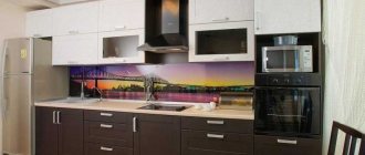
It looks both beautiful and solid, as if it was designed together with the house. Well, the functionality and ergonomics of the kitchen have been worked out, now we can move on to the appearance. In a modern kitchen, the first thing that catches your eye is the smooth fronts. Today, the most popular option for facades is painted MDF. The paint can be glossy or matte. The most affordable option is plastic facades. From a distance they look the same as painted MDF, but are cheaper.
Modern kitchens can often be found without handles. In this case, the doors open when pressed using special push-up fittings. But facades with integrated handles, which represent a recess in the facade, have become even more widespread.
Lots of modern kitchens!
Neoclassical style
and design of a 16-meter kitchen
In terms of functionality (location of appliances and content), kitchens in the neoclassical style are exactly the same as modern ones. The only difference is in the facades. In neoclassicism, facades with panels are most often found. With this design of facades, ordinary handles are mainly used.
If you replace the facades with smooth ones, without panels, you will get a modern kitchen.
Neoclassical kitchen is here!
Photos of the best interiors
A thoughtful design solution for this kitchen made it possible to place a comfortable work area, a soft sofa and a large dining table.
Ideas for a kitchen apron
Tile splashback
The most popular and practical option for finishing an apron. Centuries will pass, and the tiles will have the same presentation and in the same place. In addition, there is now a very large assortment of tiles that will allow you to create a nice kitchen design: boar-type tiles, mosaics, chevrons, hexagons, and triangles, in general, there is something to choose from!
Tempered glass apron
This type of finishing opens up wide possibilities in kitchen design. You can create minimalism when you can see the monochromatic painting of the walls behind the transparent glass. Or, as an option, you can paste classic wallpaper under the tempered glass - an excellent option for a neoclassical kitchen. Skinali (glass with photo printing) is a technique that can be found quite rarely.
Wood effect apron
Those who want to slightly dilute the asceticism of a modern kitchen decorate the apron with a wood look.
Previously, the apron was finished with laminate. This material is quite practical and washes well. The only weak point of laminate is the seams. If water gets into them, the seams will swell a little. Nowadays, wood-effect tiles are increasingly used for backsplashes instead of laminate. Lots of ideas for an apron!
Choice of colors
After combining the rooms, the kitchen and living room areas should be decorated in the same color scheme. Although fans of non-trivial solutions can choose two completely opposite shades, partially adding them to both parts of the room. In this case, they are recommended to use the Art Nouveau style, where smooth lines and bright shades dominate the design.
Zoning in a combined room Source www.pinterest.ie/
By choosing the right color scheme, you can make the kitchen and living room lighter, more spacious and attractive. When decorating a small room, it is recommended to pay attention to light finishes:
- yellow, peach - will make the design soft and warm;
- cream, milky, powdery, beige - emphasize the elegance of the interior;
- mint, lime, light green, raspberry are chosen by fans of bright design;
- black and white – ideal for minimalism and hi-tech;
- nut, coffee, chocolate and other shades of brown are suitable for a classic style.
Partitions in the interior Source design-homes.ru/
Lighting
in a 16-square kitchen interior
Lighting in the kitchen is distributed according to the same logic as in other rooms. There should be 3 types of lighting: general light, local and decorative. General light is usually used when cleaning and receiving guests. Local is used in the evening to create a cozy atmosphere. And with the help of decorative light they emphasize the texture of surfaces, for example, a brick wall. It is very important not to forget to provide power for illuminating the work surface. This wire can also be used for lighting inside the upper cabinets.
Dinner Zone
The design of the dining area deserves special attention, because eating and drinking coffee in the morning is doubly pleasant in a beautiful atmosphere. Be guided by the following principles:
- Choose a convenient location, according to the chosen method, to ensure convenient access to the furniture.
- The size of the table, sofa and number of chairs are calculated depending on the number of family members and how often everyone gets together.
- A set of furniture should be combined in tone and material, creating a single compositional solution.
- You can highlight the dining module with a bright accent on the wall, over the entire surface, or partially, as well as with lighting fixtures.
- If there is a lack of square footage, the dining room is made in another room, taken out to the balcony, and instead of a window sill, a table top and a bar counter are made.
Small kitchen design
in a standard apartment
Most standard apartments were designed even before dishwashers, microwaves and other small household appliances began to be widely used. That's why they are so small. For example, Khrushchev apartments were designed when refrigerators were slightly larger than a cabinet. This is why we can often find Khrushchev apartments with a refrigerator in the hallway. In modern houses of the P44-T series, kitchens are at least 10 m2. Such spacious kitchens are much more comfortable than mass-produced kitchens from the times of Khrushchev and Brezhnev.
A typical kitchen implies a typical arrangement of furniture. That is, in a typical kitchen it is very difficult to arrange the furniture any differently than what the architect intended when designing the house. To be precise, you can arrange the furniture differently, but you will have to sacrifice comfort.
Small typical kitchens!
White kitchen
Design ideas
If you are interested in white kitchens, then most likely cleaning does not scare you. I want to please you: white kitchens need to be cleaned no more often than kitchens of a different color. Wipe the countertops after each cooking, wipe the facades once every one to two weeks. That's all! But for greater practicality, I recommend combining materials in the kitchen set. For example, more easily soiled lower facades should be made in the most practical colors: light wood. And the upper facades can be made white. And at this point we’ll make a reservation: if you consider yourself a “cleanliness maniac,” then I recommend considering only facades with a wooden texture or stone look for kitchen furniture. Discard all monochromatic options and don’t waste time thinking 
Lots of white kitchens!
Advice
An original way to separate zones would be to paint the walls. In this case, the wall covering will be the same in structure everywhere, but the colors and motifs will be different.
In the recreation area, you can create a whole landscape on the walls. It could be the seashore or Venice. In the cooking area, such motifs should be duplicated only with individual elements, and the overall background should be made even.
Grey colour
in the design of a 16-meter kitchen
This is what happened with the gray color. Just a few years ago, gray was undeservedly called dull and depressing. Now this color, as they say, is “on horseback,” which I am very happy about. This color adds rigor and seriousness to the interior. And if you mix gray with bright colors, they become more noble. For example, kindergarten yellow turns into a noble olive color.
There are gray kitchens here!
Beige kitchen
Interior Design
I have already repeated many times that beige is the best color for the interior. It is moderately calm, it is warm, it is natural (there are many natural beige materials). This is why beige can be found in 99% of our studio interiors. But of all the beige shades, I prefer grey-beige. I would call this color universal, as it can be combined with a wide range of colors. In general, we have a large selection of beige kitchens, come in and get some ideas!
Beige kitchen ideas!
What finishing materials are best to use in kitchen design? Is it possible to use laminate or parquet boards in the kitchen? What is the best way to decorate an apron in the kitchen? I have prepared a wonderful article about finishing materials. Go to the “Tips” section, there is a lot of useful information there!
Textile
You can create decorative elements for the interior design of your kitchen with your own hands. A type of needlework whose purpose is to create a pattern from scraps of fabric is called patchwork. Using this technique you can create real works of art. Take a look at the photo and see for yourself!
Curtains
Curtains are a great alternative to blinds, which also add a splash of color to the kitchen. If you decide to make curtains from scraps of different fabrics, choose larger scraps to save time.
Curtain fabric can be translucent, but a denser material will hide everything that happens in the kitchen from unwanted views. Such curtains will look very beautiful in the kitchen-living room or in the kitchen combined with a loggia.
Carpets
The carpet can be used as an auxiliary decorative element in the design of a kitchen-bedroom or living room. The principle of its creation is not very different from sewing curtains.
Once you've finished stitching together the scraps of fabric for the top layer, complete the bottom layer using a single piece of fabric. This way you will extend the life of the mat and spend less time working.
Seats
To make patchwork seats very soft and comfortable, first prepare soft squares of fabric with padding polyester inside. Sew two square patches on three sides, turn them inside out, fill them with padding polyester, and then sew up the remaining edge by hand. Combine all the resulting small pillows into one fabric, decorating with lace if desired.
I also recommend ideas
Kitchen design 14 sq m
White kitchens
Design options
By generally accepted standards, this is a large kitchen. It can be arranged so that there is enough space for all the elements. There are quite a lot of location options. Here are some of them.
Kitchen design 16 sq. m. can be:
Linear. Everything lines up in one line. Looks beautiful when combined with other options. Occupies one wall. The only inconvenience is the movement during cooking mainly in two directions.
Parallel. The stove and sink and work areas are located on two walls, respectively. This option is good for a rectangular kitchen, but not for a square one.
In the shape of the letter T. For those who like a large dining area. Two walls are involved. The rest of the space is free.
The letter P. Extra movements are completely eliminated. All the necessary items are located on three walls.
"Island". All furniture is in the center. Easy access to any item plus an interesting visual effect.
"Peninsula". Contact of one end with the wall. You can integrate equipment in different ways and model a bar counter. Despite the feeling of less space, this option allows you to furnish the kitchen more efficiently than an island.

