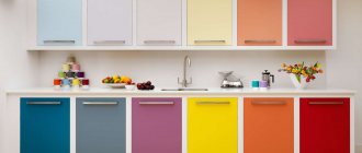
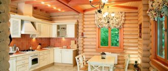
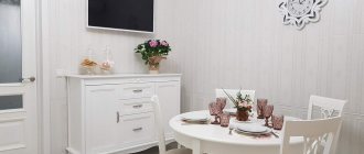
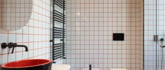
When starting to decorate a kitchen, you first need to understand exactly what it should be like: homely, comfortable, stylish and new-fangled, or defiantly original. To ensure that the result exceeds all expectations, and you want to live, create and relax in your new kitchen, you should familiarize yourself with the rules and recommendations of the designers. And also, look at photos with the most successful color schemes for kitchens.
When planning a kitchen, the choice of colors in the interior is of great importance.
A combination of colors or a monochrome color scheme can do a lot:
- create the illusion of a spacious, bright kitchen or a small, cozy corner;
- set the mood, increase or, conversely, reduce appetite;
- act invigorating, or calm, pacify;
- colors support, enhance or smooth out, shade the interior style;
- are decisive in creating the desired atmosphere - festively bright, tenderly romantic, restrained and strict;
- The choice of color for the kitchen indicates that the owners have a delicate taste.
A color scheme
Nowhere will you find recommendations on which colors to use and which not to use in the kitchen. Consider first of all their harmonious combination. In this regard, the following principles are often used when designing:
- Contrasting. About 60% of the entire interior should be painted in the main color, allocate 30% to the complementary color, and the remaining 10% is enough to place accents. Based on the principle of contrast, a bright design is created in eye-catching shades. Saturated colors (red, orange) will successfully dilute a boring background if you make them complementary. They rarely act as the main ones.
- Connected. Involves using colors together that are close to each other on the color wheel.
- Monochrome. One color is taken as a basis, and its shades become additional. The most difficult principle to implement, since it is necessary to take into account all the characteristics of color - intensity, saturation, psychological impact. It is important not to end up with a range that merges into one spot. It is especially dangerous to use orange, red and purple shades in monochrome.
Color and human psychological perception
All existing shades of colors can be divided into:
- Warm, creating a friendly, positive atmosphere. They are suitable for dimly lit areas and literally radiate energy. These are red, pink, yellow, brick shades.
- Cold, having a calming, relaxing and peaceful effect on the psyche. Among them are fresh green, blue and gray colors.
Tip: Within each color you can achieve warmer or cooler shades. Dark options narrow the space and make it smaller. Light colors help visually expand the area. They can be combined with each other for different purposes.
Depending on your temperament, psychologists recommend which tones to choose for the kitchen:
- Sanguine people will feel comfortable in light green, yellow and orange colors. These are active people, prone to action and mobility.
- Cholerics will love red and orange cuisine.
- Melancholic people are better off choosing calm colors with white and blue colors, as well as classic brown.
- Phlegmatic people can be advised to abandon scarlet shades, which will depress them.
The nature of work and lifestyle also influence the choice of color. Violet colors are preferred by creative people, while nervous people will feel more comfortable in a beige space.
According to Feng Shui, warm and light colors are good for the kitchen. But you shouldn’t go overboard with red and orange, because the room already has a source of the element of fire - a stove. Bright, cold shades are not suitable for the same reason - due to the presence of a water tap. You need to choose colors that do not conflict with the elements.
Glossy or matte
The matte set absorbs sunlight, creating an atmosphere of comfort in the room. Also, splashes, scratches, and dust are less noticeable on such a surface. However, the rough texture is more difficult to maintain.
Glossy furniture also has its advantages: it visually increases the space, is easy to maintain (sometimes it is enough to wipe the surface with a dry cloth), and has an impressive appearance. But there is a drawback - any dirt is visible on the glossy surface, so it will need to be constantly wiped.
Style and colors
Features of interior styles suggest which color scheme to choose for the kitchen:
- Sanguine people will feel comfortable in light green, yellow and orange colors. These are active people, prone to action and mobility.
- Classic does not allow combining contrasting shades. Here it is customary to use different shades of brown. A classic wooden kitchen in natural wood tones looks expensive and luxurious.
- Loft includes shades of natural wood, brick or raw concrete.
- Provence loves muted beige shades, combined with delicate versions of bright colors.
- Neoclassicism is pastel colors and soft halftones.
- Romantic styles such as country and Provence love natural tones. It is allowed to complement the design with rich accents in small details.
- Modernism combines not only light colors, but also rich ones.
- Minimalism implies restraint in colors. The most common combination is black and white and their shades.
- Scandinavian style is made in light and calm background colors with accent details.
- High-tech is white, silver, black and gray shades. But the main feature is the presence of metal components. Bright details are present in a single copy.
How not to make a mistake?
When purchasing finishing materials, accessories and furniture, you will choose a shade if you listen to some tips:
- Form a project. This can be done using specialized programs that can be found on the Internet.
- Check the color compatibility according to the table. They must be in harmony with each other.
- Take as a basis a picture of the interior from the Internet that you liked. Match the colors to the real photo. Analyze whether the design will suit your layout.
The perception of the interior is influenced by the size of the kitchen, natural and artificial lighting, ceiling height and the entire design concept.
Before choosing material and furniture, think about what mood will reign in the kitchen:
- calm and easy;
- balanced;
- cheerful and bright.
When it comes to choosing which kitchen color to choose, the most popular shades are white and gray. But there are also bright design options. It is important to design everything so that a large number of shades does not tire you. Modern design allows you to combine different colors in the upper and lower tiers of the headset.
Tip: Remember that repainting walls is easier than buying new furniture. Therefore, it is better to leave rich colors for walls. A thoughtful choice of color guarantees you a good mood and appetite.
Where to start the project?
The choice of color combinations in the kitchen interior should be based on the following important factors:
- room size;
- ceiling height;
- shape of the room;
- is the kitchen combined with other rooms;
- availability of natural light;
- age and temperament of family members;
- number and location of windows;
- Which side of the world are the windows facing;
- how much time family members will spend here;
- how family members want the kitchen to look;
- style of the kitchen, as well as the entire apartment.
Cheerful cheerful interior
Additionally, the necessary financial investments in remodeling an existing kitchen or decorating an existing one must be taken into account and calculated.
Choosing a color
White
Pairs perfectly with all other shades. It gives lightness, peace and freedom to the space. There is no need to be afraid of him. Modern materials allow you to quickly return it to its original whiteness. It is considered the most popular of all colors. It can be found in many styles. In Scandinavian style, it serves as the main shade, combined with natural materials. In high-tech it harmonizes with chromed metal. And in minimalist retro you can see white and red designs.
Yellow
It makes up for the lack of sunlight and creates a friendly mood. Associated with energy and youth. But in large quantities it can be irritating. It is perfect with black, white, green, blue and red.
Beige
It looks stylish, especially if you dilute it with green, pink or purple. This is a proven color for kitchen furniture, resistant to changes in fashion and creating a cozy atmosphere.
Black
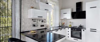
Dark kitchens are a “luxury” option. Black helps add elegance to a room and makes the space feel smaller. It is actively used in styles such as hi-tech, gothic, minimalism and retro. Black is an excellent option for a headset with chrome surfaces, glass and gloss. Such a kitchen will create a feeling of luxury and celebration.
Grey
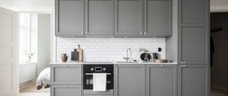
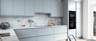
Gray is the most practical of all shades. It is neutral in feel and looks beautiful with many bright colors. This color fits well into minimalism and modern design, which is based on simple transparent details.
Green
This color comes in many shades. Each of them will fit perfectly into the kitchen space. Light tones of green are suitable for rooms facing south, and bright tones will color gray northern rooms. It can be beautifully combined with white, red and brown. By playing with different options, you can increase or decrease the space where you need it. Green is considered ideal for the kitchen, as it improves appetite and lifts your mood. But it is better to avoid olive oil, as it provokes depression and anxiety. Designers recommend green options such as fresh lime, relaxing, pistachio and energetic light green. The color will fit perfectly into classic style, country, minimalism and Provence.
Red
A bold choice for the kitchen. It increases appetite and energizes, and if you dim the lighting, it becomes romantic and intimate. This is the color of warmth and love, which in excess will irritate. It is rarely used as the main color, more often for accessories and additional elements. It will visually make a small room smaller and will look perfect in large kitchens. It fits into retro, classic, Provence and other interior styles.
Blue
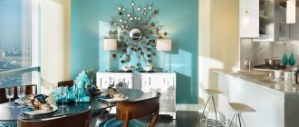
Marine shades have only recently begun to be used for kitchen interiors. They help curb appetite. If you are prone to being overweight and want to lose weight, then give preference to the color blue. Blue and cyan shades refresh the space; they “love” good lighting. They expand the space, but do not combine well with other colors.
Brown
The traditional version will mark constancy and stability. It dominates classic design styles. It goes well with a variety of textures and gives a feeling of closeness to nature. Forms elegant combinations with green, yellow, grey, red and its own shades. It is considered one of the oldest flowers used in kitchens. Light shades of brown harmonize with absolutely any color. Warm colors will make the interior majestic and original. Chocolate, caramel and coffee colors help digestion. Dark shades will add coziness.
Violet
A controversial color that is difficult to work with. It is best used to form accents in design. Color has a calming effect and creates an atmosphere of mystery and glamor.
Pink
Light pink is considered feminine and fresh. It evokes pleasant associations and looks beautiful both in a headset and on the walls. Pink relaxes and increases appetite.
Orange
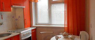
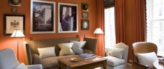
This is an “appetizing” color that is suitable for people with small children. All its shades will fit well into the kitchen space and will evoke positive emotions. Orange is suitable for large and small kitchens. Accessories of this shade will look attractive in places where there is a lot of light.
Get a car wash for 0 rub.
Installation of equipment as a gift
Installment plan 0%
Table top free
Sale up to 70%
Test “Kitchen of your dreams”
Features of choosing by kitchen area
The color scheme of a room largely depends on its size. But does this mean that in a large area we can give free rein to our imagination, and a compact kitchen must be white?
Color solutions for small kitchens
A small room is not a death sentence. Despite the fact that it is necessary to think through every detail, you can fit absolutely any color into the interior. Don't be afraid of dark shades. The only limitation is that they should not be dominant, especially on the ceiling, otherwise we will get the “closed box” effect. Gray, chocolate and black tones are recommended for use on the floor and in the lower part of the set.
Recently, designers like to combine light wood with blue, pink and mint shades. They do not overload the space and benefit from the combination of natural materials with delicate tones.
The photo shows a small kitchen with a gray bottom, yellow countertop and splashback. A rich color for a small kitchen is a great way to distract attention from its size.
Snow-white interiors with colored inserts remain traditional. If you use beige in combination with white, the kitchen will look softer; besides, pastel colors are practical, versatile and never go out of style. And colored accessories can always be replaced if desired.
The photo shows a compact kitchen with loft elements: white brick and pipes painted gold.
Color options for large kitchens
The main difference in the color design of a spacious kitchen is the ability to use dark colors as the main ones. Designers still love “delicious” brown shades - coffee, chocolate, caramel, trying to avoid the boring red shade. A deep-colored kitchen (indigo, anthracite) in combination with rich yellow elements looks interesting. By the way, black gloss is no longer relevant in modern interiors: it is more correct to choose matte facades in muted graphite shades.
In the photo, the emerald color of the walls creates the impression of a stylish, expensive and respectable kitchen.
No less popular are light interiors with bright or dark contrasting accents. Gray color in kitchen design is suitable for those who find it difficult to work with the palette: it will serve as an excellent background for your favorite additional shade.
In many countries, white is still the leading color. In spacious kitchens, both glossy and matte facades are used. To add warmth to the interior, designers advise adding wooden elements: countertops, dishes, furniture. However, this advice applies to connoisseurs of the Scandinavian style, but for lovers of the classics it is more appropriate to add gold, stucco and details in muted pastel colors to the decor.
The photo shows dark turquoise facades with glass inserts that make the cabinets visually lighter.
