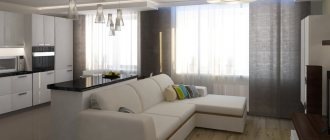
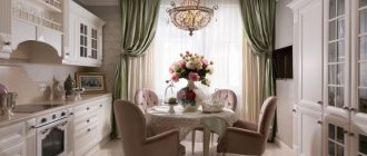
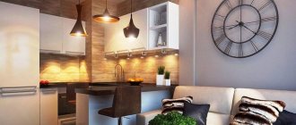
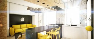
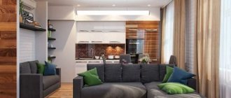
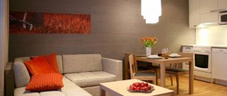
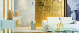
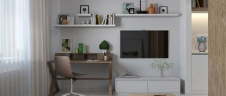
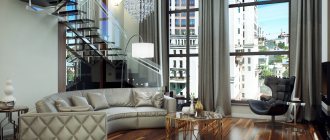
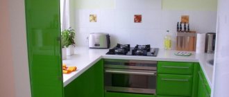
When starting renovations in a house or apartment, it’s not uncommon to combine the kitchen and living room. It’s not difficult to choose a beautiful kitchen design for a living room of 18 sq m; we will show many stylish photo examples and talk about the features of planning and zoning.
Advantages and disadvantages of combining a kitchen and living room for a room of 18 sq.m.
A combined living room of 18 sq. m. with a kitchen has many advantages, listed in the table below.
| 1. Possibility of changing the area of functional areas | You can divide the kitchen and the living room with various partitions that can move and change the situation |
| 2. Changing the environment with lighting | By using different lighting, a strong contrast is obtained that is impossible to obtain in ordinary rooms. |
| 3. Modern design | The current trend is studio apartments. They incorporate new stylistic solutions, so the apartment can be furnished according to the latest trends |
In addition, there will be a feeling of spaciousness and more lighting will appear. It will also be convenient to keep an eye on children playing in the living room while preparing food.
However, there is also a negative:
- Noises during cooking will interfere with watching TV for you and other residents of the house.
- If ventilation is poor, odors will spread throughout the room and stain textiles.
There are many more positives than negatives, which is why the living room kitchen layout is often found in modern interiors.
Window sill-countertop in the kitchen: photos of design options, ideas for arranging a kitchen with a countertop under the windowCozy interior
How to fit a dishwasher in a small kitchen
Popular colors for kitchen-living room 18 sq.m.
The color palette of the living room and kitchen is very extensive. But snow-white is considered traditional. It increases the space and lightens the atmosphere. The second most popular color is beige. It is suitable for any style, if you choose a cool shade. Warm beige is also suitable for many design projects, such as shades of sand, peach or caramel.
Interesting! If the apartment is located on the north side, then you can add yellow to visually make the room warmer. For apartments facing the south, blue-blue shades are chosen for coolness.
Recently, they have begun to combine gray with white. Modern styles complement the cool palette with metallic elements. Pastel colors alone will not create an interesting room, so you need bright accents. For example, you can divide a room into zones by adding a little black and red trim. If it is throughout the room, it will weigh it down. And local use will invigorate the situation.
Color palette
An area of 18 m does not need visual enlargement. You can use both light and dark shades in the interior. The choice is limited by design and personal preference.
Pastel colors are used for furniture facades. Tiles with a bright pattern in the apron area help to break up the monotony. You can play with the surface texture by choosing a glossy finish for furniture with metal fittings.
A set of dark shades will not look like a gloomy spot, but will add coziness to the room. It is recommended to dilute the snow-white palette with bright accessories to avoid turning the kitchen into a sterile room. The best choice would be a harmonious combination of light and dark tones, as well as matte and glossy surfaces.
Brave individuals use all sorts of shades of the same color with smooth transitions. Lovers of refined aristocracy prefer to use gold tones for decoration, diluting the interior with the colors of noble wood. With this option for arranging the kitchen, you will have to purchase appropriate furniture and decoration. Cheap materials will look ridiculous.
Bright colors should be treated with caution, and it is better to dilute the interior with a monochrome shade. For example, green glossy furniture will sparkle with new colors against the background of plain walls.
Basic rules when choosing a color:
- It is necessary to focus on the level of natural light. If the windows of the room face north, then it is better to use decoration in light colors. Kitchens located on the south side of the house are recommended to be decorated in dark and bright colors.
- The play of colors is created using metal surfaces. The minimalist style with built-in appliances and a stainless steel apron allows you to use the reception as harmoniously as possible.
- The location of the kitchen also affects the temperature of the shades. For northern rooms, warm colors are preferable - sand, beige or orange, while for southern rooms, cool colors are preferred - white, blue or green.
- The choice is also influenced by the psychological characteristics of the individual. Young creative people prefer bright or saturated colors. Those who want to relax after work will appreciate discreet shades.
- If the set is monochromatic, then the decoration and textiles should be bright, but not merge with the facade. Against the background of the rich color of the walls, plain furniture made from natural materials looks advantageous.
Selecting the interior style
Fresh and original rooms are obtained in various styles. By choosing a loft style, the unusual taste of the owners will be visible. Brickwork, concrete, metal, wooden elements and gloss are used for finishing.
Scandinavian design of a small kitchen-living room is filled with light and air. It is built on white colors and natural textures (wood, metal, stone). Everything is diluted with catchy colors - blue, red, green, yellow. But they should be in moderation so as not to drown out the white tone.
Modern styles are very functional and practical. Surfaces can be painted, covered with wallpaper, ceramic tiles, laminate. They do not require large expenses, so they are often used for houses and apartments.
Rustic Provence and country are gentle and elegant. They will allow you to plunge into a carefree, relaxed atmosphere. Curtains, wallpaper, furniture upholstery can be plain, checkered or with a floral print. Natural textures, such as wood, should also be used for furniture.
Classical trends will require clarity and canonicity of all details. Colors should be soft or bright, but noble and rich tones. The furniture should have carved elements and gilding.
Parallel
All used parts of the headset are installed along two opposite walls with this layout. With its help, they create a practical and functional design.
The two-row option makes it possible to rationally use the available space, creating a comfortable environment for all family members. This set does not have end elements or corner storage systems.
The modules allow you to accommodate a large number of items that the housewife needs. You should not order a heavy table for the dining area; it is difficult to move it to the side if necessary.
Light colors are chosen for finishing surfaces to make the room seem more spacious. Glossy and glass elements will fill the interior with air and light.
Interior decoration
Interior decoration includes the design of walls, floors and ceilings. Let's start with the floors.
Floor
To select a floor covering, you need to determine whether you want to highlight zones with different materials or leave a single canvas. Different materials are suitable for the floor: linoleum, tiles, parquet, carpet, laminate, self-leveling varieties.
For durability of the kitchen combined with the living room, you can lay ceramic tiles. Ceramics feel cold, so you can install a heated floor system underneath it. Another bad property of the material for the kitchen is that glass plates, mugs, and trays will immediately break upon contact with strong ceramic tiles.
For example, laminate and linoleum are more delicate materials that do not instantly break glassware. This zoning of the kitchen and living room can be done by using different shades of the same material. The border between them can be made diagonally or rounded by decorating the joint with special connecting profiles.
It will be interesting to look at coverage with different levels. To do this, a podium made of a frame or monolith is installed. You can decorate it with various materials. A carpet is laid out near the sofa for comfort.
Walls
Wall decoration can be done using various materials: painting, whitewashing, gluing wallpaper or panels. The main thing is to choose the right colors for a sharp or smooth transition. The kitchenette uses materials that are easy to wash and do not absorb dirt. Any decoration with various prints or photo wallpapers is suitable for the hall.
Kitchens must have an apron. Modern models made of tempered glass and plastic with photo printing will reliably cover the walls. Mirror models will visually expand the space and reflect light rays.
Ceiling
Many people are interested in how to divide a kitchen in a simple way. This can be done with ceilings: suspended, hemmed, cassette, slabs, painting, wallpapering. If you use bright colors and different levels, you will get a contrasting transition.
You can decorate the ceiling on a budget by whitewashing and painting. Stretch fabric is also popular. They are very strong, durable, do not burn and do not allow water to pass through. For example, in the event of flooding by neighbors, the canvas will retain masses of water and protect property. In order to remove the water, you will need to call installers who will pump out the flood. After the operation, there is no need to replace the blade - it will return to its original position.
Tiling can be done with your own hands. There are many textures and colors that can contrast in different functional areas. Cassette-type suspended ceilings have long been used not only in offices. Cassettes are also used for interior decoration of houses due to their lightness and easy cleaning.
Window decoration
The presence of curtains on the windows in the kitchen and living room creates warmth and comfort. Night curtains, blinds, allow you to close in the evening from outside attention.
Placing the curtains on a single curtain rod will hide the empty space between the windows. If there is a beam on the ceiling or a bar counter, different cornices are used.
Curtains and tulles play an important role in creating unity.
Try incorporating beautiful blinds into your kitchen design. They are made to order, choosing colors and decorations.
The modern world opens up a lot of opportunities to make the interior of an apartment unique, everything is done to order: built-in kitchen, counters, sewing curtains, making upholstered furniture. Use your imagination. Free yourself from the problem of finding furniture of the required dimensions. This opportunity simplifies the task of creating a “studio” of 18 square meters that is beautiful, comfortable, and practical.
Nuances in lighting
The small kitchen and living room are zoned in contrast with different lighting. You need not only lamps in the center, but also spot lighting. Often, spotlights are built into a ceiling with many levels or a suspended ceiling, edging a functional area. In addition to the ceiling, you can illuminate the podium with a multi-level floor covering.
Interesting! In minimalism, hi-tech and loft, I install lamps on long cords.
Necessary furniture
All furniture should be comfortable to use and match the style. It is better to choose simple shapes rather than curved and concave ones. Recently, tables and chairs made of transparent plastic have become popular. They are invisible, so they make the situation easier.
Transformable furniture models are suitable for a small combined room. For example, a folding table can increase in size during a feast, and a pull-out sofa can accommodate all guests. It is better to minimize furniture. For example, a coffee table may not be installed in order to leave a free passage to the sofa and armchairs.
Expert advice
Designers often suggest decorating rooms of 18 square meters in the same style. If you choose light shades, the living room layout will visually expand. Dark colors will narrow the room, so they are not recommended. For brightness, you can use an accent of any tone that will dilute the light palette.
For interior decoration, it is better to select materials that are easy to clean and not expensive to replace. For example, paint, MDF panels, wallpaper, plaster. You can decorate your walls in an unusual way with photo wallpaper. They can depict natural landscapes, black and white photographs of city streets, animals, plants, famous reproductions of paintings or geometric shapes. For a pop art style, you can add modular paintings. The main thing is that they are not large in size, because they will visually make the room smaller.
The window space can be decorated with blinds to take up less space with fabric and reduce washing. It is better to install a ceiling in a room using tension models. It will be able to protect property in case of flooding.
Zoning
The division of space is carried out taking into account the style of the interior. Each part of the room must perform its specific functions. The work surface is usually located next to the stove and sink. Lighting devices are carefully selected for the dining area.
The simplest and most popular way of zoning is the use of furniture. A regular dining table will help to divide the space. To enhance the effect, the piece of furniture is surrounded by chairs of different colors, designed in the same style.
Some of the elements should correspond to the working part, and the rest to the dining area. Dividing a room is possible using upholstered furniture and storage systems.
Photo design ideas
For inspiration, look at the photos with zoning of real interiors:
How do you like the article?
