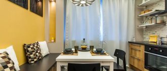
If you are interested in this topic, then you understand that design plays not the first role here. Functionality and convenient layout are of concern to the owners of such kitchens. The good news is that you are not the first to encounter this problem, so there are already ready-made solutions. All you have to do is choose.
How to arrange a small kitchen: designer tips
A number of recommendations:
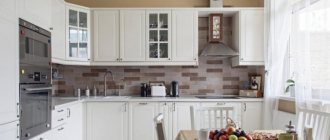
- For decoration, it is undesirable to use too dark, bright and saturated colors, which will visually narrow the space. It is best to give preference to a light milky, white, cream or beige palette that gives the room lightness.
- It is better if the interior contains mirror and other reflective surfaces. They, combined with good lighting, will expand the tiny kitchen and add additional optical volume to it.
- For a family of one or two people, instead of a dining table, you can install a bar counter, a folding tabletop, a small folding or pull-out table.
Layout 6 sq m
Considering the layout of a 6-meter kitchen, you can achieve a functional and ergonomic design. Such premises are typical for Brezhnevka, Stalinist or small-sized Khrushchev apartments.
Such a kitchen space most often has a square shape, where the length of the walls is about 2.5 meters. In such a room it is necessary to equip three functional zones. The best choice is a corner set, which, thanks to its configuration, can even accommodate a dishwasher.
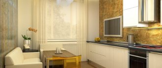
In a narrow rectangular kitchen with walls of 2 and 3 meters, it is most convenient to place a linear set with cabinets and appliances along one wall.
The photo shows the layout of a 6 square meter kitchen.
The layout and renovation of a 6-square-meter kitchen space in a Leningrad series ship house raises a number of difficulties. If appropriate technical conditions are available, complete demolition of walls can be replaced by partial dismantling. In this case, the partition between the kitchen and living space is replaced with a wide arch, and the main entrance is closed with plasterboard. The resulting niche is suitable for installing a refrigerator or several hanging shelves.
The photo shows the design of a small kitchen of 6 square meters in a ship-type house.
Single row
Represents the placement of kitchen utensils along the length of one wall. This method is most suitable for narrow kitchens, and if there are few people living in the house.
- Window sill-countertop in the kitchen: photos of design options, ideas for arranging a kitchen with a countertop under the window
Cozy interior
How to fit a dishwasher in a small kitchen
If the room is wider, you can use a two-row layout, the downside is that there is no room left for a meal.
Color spectrum
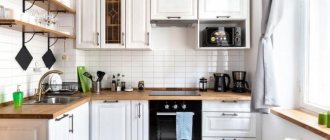
The design of a 6 square meter kitchen welcomes a muted light and soft color palette. White is a common color and goes well with cheerful splashes of color. For example, an interesting option is to complement a bright room with light green furniture facades. The use of white in tandem with pearl or gray will help to endow the atmosphere with nobility and sophistication, as well as add asceticism and rigor.
Proper use of dark tones will add visual depth to the room, rich horizontal and vertical stripes will help expand the space.
The photo shows a red accent apron area in the interior of a bright kitchen of 6 square meters.
White color expands space
Use a base color of white, which blends perfectly with the entire range of shades and creates harmony with the wood. The rest of the interior elements look more expressive in numerous shades of white.
A white kitchen looks noble, stylish and elegant.
Finishing options and repairs
Optimal finishing solutions:
- Floor. The classic way of tiling is to lay the floor with tiles. It is advisable to give preference to light materials. A walnut-colored wood imitation tile or a stone-like coating with a marble effect will look unusual. If you decide to lay linoleum in a 6m kitchen, it is better to choose a commercial type.
- Walls. It is appropriate to use tiles or washable wallpaper in the design. A small kitchen of 6 square meters is covered with canvases with a medium-sized blurry pattern, which will smooth out the clear boundaries of the room.
- Ceiling. To make a room of 6 square meters visually look higher, you should choose a white ceiling covering in the form of painting, whitewash, wallpaper or stretch fabric.
- Apron. In finishing the apron area, plexiglass with images of still lifes, landscapes or city panoramas, as well as small tiles or mosaics, can be used.
Thanks to the right choice of facing materials, you can not only transform a 6-square-meter kitchen space, but also visually expand it and correct planning deficiencies.
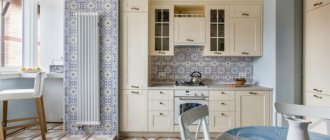
The photo shows a 6 sq. m kitchen with an apron lined with small tiles with patterns.
Kitchen furniture and household appliances
Real examples of arrangement in a limited kitchen space of 6 sq. m.
Photo of a 6 meter kitchen with a refrigerator
For a small kitchen of 6 square meters, it is recommended to choose a special narrower and taller model or a unit with the possibility of corner placement. The most suitable place to install a refrigerator is the left, right edge of the unit or a separate corner.
Modern design includes a built-in refrigeration device. This design occupies a minimum of square meters and creates a single composition with the kitchen set.
The photo shows a mini-fridge in a kitchen design with an area of 6 square meters.
Ergonomic option for location near the window. The free-standing model provides convenient use while cooking. It is better if the unit doors open in the opposite direction from the working area.
Kitchen 6 m with washing machine
In apartments with a small bathroom, it is not possible to install a washing machine, so this household appliance is located in the kitchen. In this case, it is recommended to place the washing machine next to the sink so that there are no problems when connecting communications.
The machine built into the set will look great. In this way, the tabletop above it can be usefully used.
The photo shows a small-sized kitchen of 6 sq m with a washing machine built under the countertop.
Kitchen design 6 meters with sofa
For a small kitchen, a mini-sofa, slightly larger than a bench, is suitable. A rectangular model will fit perfectly into a narrow room of 6 square meters. If you don't have enough storage systems, you can use sofa drawers. It is better to place upholstered furniture with an L-shaped configuration diagonally to the sink or stove, and place a table next to it.
Examples of a kitchen with a gas water heater
According to safety rules, it is not always possible to disguise a gas water heater behind the façade of a set. It is appropriate to play up the open structure with a specific color scheme that matches the furniture or wall decoration.
If the column is put away in a cabinet, it is required that it have holes for pipes, corrugations and ventilation. It is preferable to make such a cabinet to order.
The photo shows an open gas water heater in harmonious combination with the white finish of a 6 sq. m kitchen.
Kitchen ideas with dishwasher
A compact dishwasher is put away in hanging cabinets or simply mounted on the wall. This way the dishwasher will take up minimal usable space. The narrow model can be placed under the sink. The design will not cause any difficulties when connecting, will function perfectly and will not disturb anyone.
Basic Rules
A small room, whether it is a kitchen or a bedroom, puts forward special requirements for decoration. What is permissible on 10 or more square meters is impossible on 6 square meters. m. More precisely, you can allow it, but the result will be far from optimal.
Experts identify 7 main rules for arranging a small kitchen.
- Light color. This is banal, and has already set teeth on edge, but a more confident and competent solution cannot be found: a light color visually expands the space, a dark color makes it visually even smaller.
Choose from a rich palette of light colors: beige, cream, milky and many other tones.
- Moderation of print on wallpaper. A 6-square kitchen design that involves wallpapering excludes options with large patterns, just as it excludes options with small prints. Choose either a blurry middle pattern, or samples without it - monochromatic, with not the most expressive texture.
The purpose of wallpaper is to make the space lighter, airier, and “expand” the walls.
Light and mirror surfaces
- Any surfaces that have reflective properties will help in the design of a small space. The only question is practicality - whether the stretch glossy ceiling will be inconvenient, and whether constant fingerprints on the glass dining table will be annoying.
But if you are not afraid of the need to care for such surfaces, then a set with expressive glass display cases, a glass table, and glossy worktops will help make the interior more interesting and visually more spacious.
Unload the window
If you can avoid curtains altogether, do so. It will be a little Scandinavian and will definitely add light to your kitchen. There are many examples that an open window does not make the room uncomfortable or rude. If you can’t do without curtains, let them be light and airy curtains (maybe a very laconic tulle).
Do not clutter the window sill - if its tabletop is filled with all sorts of little things, the chaos will make the room visually even smaller.
Practicality and minimalism
An empty kitchen and a kitchen where there is nothing superfluous are two different things. Think about how to set up a storage system for bags, vegetables, and various household appliances. Often all this is constantly in sight, making the kitchen seem disorganized and even cluttered. It should not contain anything that is rarely used. And especially don’t overload it with decor, souvenirs and other things.
Leave what is cute, valuable to you, and in which the aesthetics of brevity will be clearly visible.
Don't overdo it with textiles
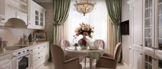
Many people really love cozy kitchen spaces, where the tablecloth is beautiful, the cushions on the dining chairs, and the curtains are somehow unusual. But at 6 meters it will be a definite overkill. Have changeable decor - buy a few modest runners for the dining table, make chair covers for the seasons or holidays. Leave plenty of open space against which the same napkin or table runner will be visible. Please note - noticeable, not intrusive.
Consider options with a refrigerator
For example, metallic-colored appliances will also be an item with a reflective surface that is valuable for a small kitchen. And if the set includes a cabinet for the refrigerator, and all this does not look bulky, this is a sound decision. And also, do not place it so that it blocks the light flow.
A little about taboo. A small kitchen should not have massive, heavy furniture. There is no place for heavy long curtains and curtains with complex decor. A colored ceiling is simply a knockout for the interior of a small kitchen, only one color, preferably milky white.
Space layout
The key to a well-structured kitchen is planning the space and conveniently placing the most important appliances so that frequently performed tasks can be completed easily and efficiently. For example, to make coffee, you need to fill the kettle with water, remove coffee and milk from the refrigerator, and find coffee cups.
They must be positioned at arm's length for the task to be completed efficiently.
Professional designers call planning their workspace the “work triangle.” Its total distance should be from 5 to 7 meters. If it is less, then the person may feel cramped. And if it’s more, then a lot of time will be spent searching for the necessary cooking utensils.
Linear kitchens are becoming increasingly fashionable these days as they allow for an open floor plan. If this option is used, it is better to consider placing the work area inside.
A must in the kitchen, even one that has only 6 square meters. m, there should be space for cooking, serving and washing dishes. Compactness will allow the relevant equipment to be stored close to the occupied area, with enough space to operate and complete the task at hand.
Which kitchen set is suitable?
In a small kitchen with an area of 6 square meters, it is not recommended to install bulky and voluminous furniture with complex shapes. It is advisable to replace a set with a wide tabletop with a narrow design. An excellent option is to furnish the room with a model without upper cabinets, so the space will become more spacious and filled with light. A tall product with a facade merging with the color of the wall decoration will look airy and blend into the interior.
Direct cooking has particular advantages. This way it turns out to free up most of the room to accommodate the dining area. In addition, this design allows for trouble-free installation of equipment with hinged doors, so that they do not interfere with each other.
The corner kitchen set is less compact, which leaves not much space for the dining segment. At the same time, this model uses a corner and two walls, thanks to which it has spacious storage systems and a spacious work surface. If you arrange the sink, refrigerator and stove using a triangular pattern, there will be a minimum amount of movement during cooking.
The photo shows the interior of a kitchen of 6 square meters with a direct set, equipped with a bar counter.
In a small room, household appliances with eye-catching colors and designs are not appropriate. Devices with this design will visually conceal the space. An ergonomic solution is to choose built-in elements, hide them behind the façade of the headset, or give preference to reduced-sized appliances. For example, for a family of 1-2 people, a hob with two burners is suitable, and for 2-4 people, a stove with three burners is suitable.
Where to put the refrigerator?
A refrigerator is the largest and most necessary attribute for any kitchen. But placing it in a small room is not so easy. However, you can cope with such a task!
For example, you can put a pantry under the refrigerator or place it in a niche. If there is no such place, then you will have to place the refrigerator next to the rest of the appliances and furniture. In this case, you need to select an oversized model, and, if possible, disguise it to match the rest of the furnishings.
Kitchen design 3 by 3 meters: beautiful ideas (70 photos)
Which curtains are best to choose?
It is advisable not to use heavy curtains, curtains with large bright patterns, pretentious lambrequins and other luxurious details when decorating windows.
Lightweight short curtains look most organic in a 6 square meter kitchen. Shortened options will not interfere with access to the functional area if the window sill is an extension of the working surface or plays the role of a table.
For a small space of 6 square meters, it is appropriate to purchase sliding curtains with eyelets or stationary models. The most convenient option is Roman, elegant Austrian canvas or roller blinds.
The photo shows light Roman blinds with green edging used to decorate a window in a 6 sq. m kitchen.
Lighting Features
The more lighting in a small kitchen of 6 square meters, the better. This applies to both artificial and natural light.
The mini-kitchen is equipped with diode spotlights, which are located above the work area. They also use a regular chandelier or lamp to illuminate the area with the dining table.
Functional window sill
The window sill is another chance to benefit from every free centimeter of the kitchen. So why use it for potted plants or leave it empty altogether? It is better to replace it with a countertop and thus extend the cooking area. In addition, such a surface will allow you to sit here with a book (natural light will allow) and a cup of aromatic coffee.
Photos of kitchens in popular styles
The leader for decorating a small room is the high-tech style. Thanks to metal, glossy and glass surfaces, a 6 square meter kitchen is filled with visual depth and volume. The design involves the use of 2-3 shades and is distinguished by smooth lines that allow you to see real beauty in a simple way.
In order to create an ascetic and laconic environment, they prefer a minimalist style. This kitchen space has a minimal number of decorative elements and muted colors. The furniture has clear shapes and is made from plastic or light wood. A good level of lighting fills the room with lightness and airiness.
The photo shows a loft style in the interior design of a kitchen area of 6 square meters.
A 6 square meter kitchen space designed in Scandinavian style becomes bright and spacious. The design concept is characterized by snow-white finishes, whitewashed wooden furniture and welcomes bright decorative accents that enliven the environment, adding coziness and homeliness.
Photo gallery
Read: How to choose an electric built-in oven
Let's discuss this article together:
Click to cancel reply.
Design ideas
The presence of a balcony contributes to the illusory expansion of the space, bringing lightness and natural light into it.
A 6 square meter kitchen combined with a loggia or balcony opens up additional design possibilities. You can move the work area onto a glazed and insulated balcony, leaving only the dining segment in the room.
The photo shows a kitchen design of 6 square meters with a window with a window sill integrated into the bar table.
In panel houses there is often a kitchen with a niche. This recess does not spoil the layout of a 6 square meter room and can be conveniently used for various purposes.
Useful tips
The most obvious option for the most practical kitchen arrangement is to manufacture a set to personal order. This will make it easier to adapt to existing furniture, make a niche or cabinet for the refrigerator.
Little tips for owners of a small kitchen:
- you can make a false mirror on the wall near the dining table, which gives an interesting effect and works great to expand the space;
- do not make the refrigerator a board for magnets - this is no longer fashionable, and the main thing is that it also works to visually make the kitchen smaller;
- use railing systems, they are practical and can eliminate the need to order a very large set;
- colorful floor mats are only suitable for a plain, preferably white, space;
- use side tables that are round when unfolded, and half-circle when folded; if the family is small, then the unfolded version is not needed for everyday use;
- If you decide to use photo wallpapers, they should not be very colorful and depict a perspective.
Moving the dining room into the living room is an option that many people like, but excessive conservatism does not allow people to decide on this.
If you and your whole family never dine in the kitchen (because there is not enough space), feel free to move the table into the living room and do not deny yourself the pleasure of family meals.

