Tips for arrangement
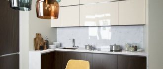
The kitchen is 11 sq m, or rather the interior design has its own nuances:
- Determine the priority zone: for cooking or eating, based on this, calculate the size of each.
- Place a spacious table if 4+ people live at home or you regularly invite guests.
- Choose any colors for an 11-meter kitchen. It doesn't need enlargement.
- Separate the stove from the sink with a countertop, and place the refrigerator on the edge.
- Line your cabinets up to the ceiling to relieve pressure underneath.
Layout 11 square meters
The kitchen area of 11 square meters can even accommodate an island if you move the dining table into the living room. But the most common layouts are:
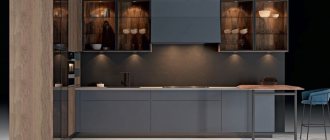
- Linear. The furniture is inexpensive and does not take up much space. Suitable for apartments where people like to eat more than cook.
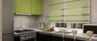
- L-shaped. Corner arrangement breaks records of popularity in any kitchen. When building a working triangle on 11 square meters, make sure that the distance between the points does not exceed 3 meters.
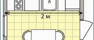
- Double row. Parallel placement of modules assumes a passage width of 100-120 cm. Place the sink, hob and work surface on one side, and the rest of the equipment on the other.
- U-shaped. The 11 square meter U-shaped kitchen allows you to use corners and provides plenty of storage and cooking space. You can build a bench or bar counter into it, creating a single work and dining area.
The photo shows a refrigerator near the window in a bright interior.
The type of layout depends on your preferences and kitchen parameters:
- A long and narrow room of 11 square meters can be arranged in two ways: a double-row or U-shaped one will emphasize the parameters, and an L-shaped or straight one along a short wall will make the kitchen wider.
- You can do the same with a square one. They will stretch out the layout of the room into 1 or 2 rows, and cleverly decorate it with kitchens in the shape of the letters p or r.
- When drawing up your plan, also take into account the presence of a window or balcony. Under the window there is a table with chairs or a kitchen work surface.
The photo shows an unusual kitchen interior with a yellow wall.
Zoning rules
To plan your kitchen space, you need to consider:
- location of the working triangle;
- minimum width of aisles;
- dimensions of furniture and number of seats;
- distance from the door;
- possibilities of natural and artificial lighting.
There are several important factors to consider when planning your kitchen.
The shape of the room is also important: in rectangular elongated kitchens it is better to place furniture along opposite walls; for square ones, an island layout or the location of the dining and work area along adjacent walls is suitable.
What color is better to decorate?
11m2 does not need visual expansion techniques, so the colors can be any.
Light white, gray, beige shades offset a lot of furniture.
A bright tone will make the interior unique - the set, apron or wall decoration can be colored.
Even in such an area, dark colors should be used wisely so that the room does not look half as big.
Matte or semi-matte facades look more expensive than gloss.
The photo shows a black kitchen set in a private house.
Minimalism
Another laconic design option in which there is no place for unnecessary decor and intrusive details, so it is often used to decorate small spaces. The interior in this style is made of natural materials, but is completely subject to modern requirements of comfort and functionality.
The ideas of minimalism come down to a few simple solutions, which, however, are not always cheap:
- The kitchen interior is formed by a spacious set that allows you to hide as many details as possible behind simple, laconic facades . You can choose furniture up to the ceiling for storing utensils, dishes and food. A work area can consist of a pair of pencil cases, a cabinet under the sink and a stove. It is only important to arrange at least one table for cutting food. This can be a bar counter or a small table that will also serve as a dining group.
The photo shows the design of a working area in the style of minimalism in the part of the combined space.
- Transformable structures are a convenient solution for saving space . And this is one of the primary tasks on an area of 10 square meters. The easiest way to organize a folding table instead of a dining group, a retractable tabletop for cutting. The living room can also be equipped with transformable interior items.
The photo shows the design of the hall and kitchen for 10 square meters. m with transformable furniture.
- An unobtrusive palette of wood, natural ceramics and stone that is pleasing to the eye - this is exactly what minimalism looks like in its ideal execution . Natural minerals require a lot of space - this is a monumental decoration, which makes the design quite “heavy”, so in 10 sq. m stone cannot be called the optimal solution. But light wood, tiles in pastel and natural colors will be optimal for decorating a small room. In a combined room, you can use both materials as zoning - wood in the living area, ceramics in the work area.
The photo shows the interior of the living room and kitchen with zoning.
In minimalism, the living room should not be colorful - here 3 colors are allowed, in which one will be an accent color. As a rule, the first one is the background. Most often it is white or cream. Furniture in the kitchen and a straight sofa in the living room can be made in the same shade. The second color is wood. Usually brown is present in this design both in the pattern on the tiles and in the details of furniture made from natural solid wood.
Finishing options and repairs
The renovation of an 11-meter kitchen combines aesthetics and practicality. For finishing walls, floors and ceilings, non-staining and easily washable materials are needed.
- Ceiling. Can be whitewashed or painted, stretched, panel. In terms of price-quality ratio, a suspended ceiling wins: it hides any unevenness and is easy to maintain. Painted or whitewashed ceilings require careful preparation of the surface, and ceilings made of PVC panels may turn yellow in areas of heating.
- Walls. Buy materials that are resistant to cleaning, high temperature, and humidity. Washable wallpaper or paint simplifies the renovation process and suits any style. Imitation brickwork will fit perfectly into a loft. Tiled walls are suitable where there is a lot of cooking and frequent cooking.
- Apron. A simple and functional option is ceramic tiles. It is easy to clean, can withstand high temperatures and high humidity.
The photo shows a stylish dining table made of wood and glass.
- Floor. TOP 3 floor coverings for a kitchen of 11 square meters: tiles, laminate and linoleum. The warmest and safest, as well as easiest to install, is the last option. The laminate must be waterproof, non-slip, with a protective layer, otherwise it will swell from moisture. The most durable floor is tiled; the coating should also not slip, and lay a warm floor system underneath it.
Materials and design
Finishing materials for the kitchen must be practical, non-staining and easy to maintain. The kitchen is always about humidity, temperature, fat and food, so don’t forget about this when choosing.
Floor finishing
Durable ceramic tiles are the simplest and most versatile solution for kitchen flooring. Even wine and juices do not penetrate the smooth, non-porous structure, so you can always wash the tiles.
Modern laminate is also good, but still slightly inferior in wear resistance. But it is less sensitive to mechanical damage and falling solid objects, knives and kitchen utensils.
Ceiling design
In the decoration of kitchen ceilings, stretch fabrics with a matte, glossy or satin texture are the leaders. Whitewash gets dirty more easily and may turn yellow - and then the surface will have to be completely repainted. And plasterboard structures take up extra space, so they are used only in kitchens with high ceilings.
Wall decoration
To prevent the walls from getting dirty, turning yellow, or absorbing odors and grease, be sure to choose a washable coating. This can be facing tiles, moisture-resistant non-woven wallpaper or regular water-based paint.
Lighting
Instead of a classic chandelier in the middle of the room, pay attention to a series of spotlights and zone pendant lamps. An LED strip around the perimeter is suitable for illuminating the work area, and sconces or floor lamps are suitable for cozy evening tea parties.
How to furnish the kitchen?
You have already decided on the arrangement of kitchen furniture, it’s time to think about the final design of the 11 sq. m kitchen.
Kitchen ideas with refrigerator
The location of the refrigerator directly depends on the layout of the unit and the initial parameters of the room.
In a linear or angular layout, it is placed near the window. In any version of an 11 square meter kitchen, it can be built into a pencil case or placed next to it - this way the room will not seem cluttered.
Kitchen design 11 sq m with sofa
If the furniture in a kitchen of 11 square meters is made in 2 rows or in the shape of the letter P, choose a built-in sofa. In a linear and L-shaped layout, it is transferred to the opposite side.
The photo shows a kitchen with a voluminous sofa against the wall.
When there is a lot of space left in the room, install a corner sofa. To save space - straight. If additional storage is needed, replace it with a bench with drawers underneath.
In the photo there is a kitchen of 11 square meters in white and gray tones.
Examples with a bar counter
The bar counter is used in two cases: the apartment is inhabited by 1-2 people or, in addition to the dining room, a separate area for snacking is needed.
The stand, located at the tabletop level, is used as an additional work area. A kitchen peninsula with a height difference provides both additional storage and cooking space, as well as convenience for snacking.
Arrangement of the dining area
An area of 11 square meters requires zoning: different parts for cooking and eating food.
All family members should be seated at the dining table. Square or rectangular is suitable for a sofa, round for chairs.
Organization of storage systems
If every thing has its own place, the apartment will be clean and tidy. Some tips for optimizing storage:
- Replace lower cabinets with drawers - they are more spacious and more convenient.
- Think about the position of the equipment in advance; built-in is preferable.
- Order sliding or lifting mechanisms instead of hinged ones for the upper facades, it will be safer.
- Buy fittings for corner modules to make the most of them.
- Organize additional systems - mezzanine, shelves.
Style Variations
Some prefer that there is “nothing superfluous” in the kitchen, while others value comfort and elegant decor more than strict lines. For each group there is a suitable interior style that will combine functionality and design in the concept of a particular design.
The style of the kitchen can be chosen according to your taste and discretion.
Loft
Modern decoration with a minimal amount of decor, with an emphasis on original things and free spaces. For such a kitchen, wooden or metal furniture and minimal wall decoration are suitable. Equipment with a laconic design will not stand out from the style concept, so it can be placed in plain sight without covering it with decorative overlays. Suitable solutions include pendant lamps on long mounts, bar counters, sofas and benches assembled from pallets.
The loft style goes well with wooden furniture and a laconic design.
High tech
Minimalism and an emphasis on the technological component - this is how this style can be briefly described. To implement the idea, furniture with leather upholstery or plastic cladding, an interior item with a laconic design, and an abundance of chrome parts are suitable. It is curious that communications can not be hidden in niches at all, but covered with colored or metallic paint. A self-leveling floor will fit perfectly into the style: plain or with a 3D pattern.
Minimalism with an emphasis on technology - these are the foundations of the high-tech style.
Classical
Strict, massive furniture suits the style: a “high-quality” kitchen set with a countertop made of artificial/natural stone or wood, spacious cabinets, a large table with a comfortable sofa. It is advisable to select technical devices to match the furniture or hide them in niches with wooden doors.
A spacious set and a large table are suitable for a classic style.
Plastic and bright laminated surfaces are not allowed. All finishing materials - natural and artificial - should imitate natural patterns. Wood, tiles or mosaics, parquet, plain or wallpaper decorated with a large pattern are suitable for finishing the room.
Modern
What distinguishes modern from a number of classical styles is its curved, but not pretentious, lines. If classic silhouettes are strict, straightforward, and baroque decor is rich in decorations, then modernism is something in between. Rounded outlines of furniture, closeness to natural shapes and colors, small original furniture. Wooden and forged elements can be used in the interior; plastic and chrome are not allowed.
Art Nouveau is distinguished by curved but at the same time strict lines.
Preference should be given to built-in technology.
Rococo
One of the most luxurious, deliberately pretentious styles. It cannot have too much decor. Carved openwork ornaments, forged elements, gilded fittings, elegant upholstery - it is impossible to imagine Rococo without these elements.
The Rococo style has an abundance of decor and additional elements.
Wood, tiles, mosaics, parquet, and Damascus wallpaper with a heraldic pattern are suitable for finishing the room. It is better to hide the equipment in niches or cover it with decorative film so that laconic modern objects do not stand out against the backdrop of ancient luxury.
Provence
The gentle and sophisticated French country style will make the kitchen cozy. A wooden table, a soft sofa upholstered in fabric with a floral print, curtains and napkins to match, shelves with decorative and functional household items. Carved decorations or furniture finished with cross beams are a must.
The French Provence style is characterized by tenderness and sophistication.
Vintage items, for example, a beautiful buffet, will fit into the interior. Among the finishing materials, wood and stone textures predominate. The walls can be decorated with wallpaper, stripes or tiles.
Lighting Features
Spot lighting not only delineates, but also creates the right mood.
Bright cooking lights can be in the form of LED strips, pendants or sconces.
Subdued lighting of the dining area is achieved using one or more chandeliers; a sconce can be placed in the corner.
The photo shows an original chandelier in the interior of a kitchen of 11 sq. m.
Ceiling
If the kitchen is on the ground floor, then you should give preference to suspended ceilings. In this case, when you open the windows, dust and dirt particles will settle in the room, which over time will create a coating on the coating. Stretch ceilings are easy to clean; they do not deform under the influence of liquids, high humidity, or chemical cleaning agents.
If you use wallpaper, for example, it can become damaged and deteriorate if washed frequently.
If you are not living on the 1st floor, you can use plaster, paint, or washable wallpaper to cover the ceiling. Also, the ceilings in the kitchen are covered with panels and slats.
What does the kitchen interior look like in popular styles?
Kitchens with an area of 11 sq. m will look great both in neoclassical and modern, as well as in Provence or country.
The photo shows a dark loft-style kitchen interior with a brick wall.
Modern minimalism with neutral decor will ensure order in the room. Its differences are the absence of unnecessary details, natural materials, and laconic technology.
An interior in which you want to look at a lot of details - country, Provence or Scandi. Designers recommend creating coziness with the help of little things like hanging frying pans and colorful textiles, as well as the classic combination of wooden and white surfaces.
Ideas for a kitchen apron
Tile splashback
The most popular and practical option for finishing an apron. Centuries will pass, and the tiles will have the same presentation and in the same place. In addition, there is now a very large assortment of tiles that will allow you to create a nice kitchen design: boar-type tiles, mosaics, chevrons, hexagons, and triangles, in general, there is something to choose from!
Tempered glass apron
This type of finishing opens up wide possibilities in kitchen design. You can create minimalism when you can see the monochromatic painting of the walls behind the transparent glass. Or, as an option, you can paste classic wallpaper under the tempered glass - an excellent option for a neoclassical kitchen. Skinali (glass with photo printing) is a technique that can be found quite rarely.
Wood effect apron
Those who want to slightly dilute the asceticism of a modern kitchen decorate the apron with a wood look.
Previously, the apron was finished with laminate. This material is quite practical and washes well. The only weak point of laminate is the seams. If water gets into them, the seams will swell a little. Nowadays, wood-effect tiles are increasingly used for backsplashes instead of laminate. Lots of ideas for an apron!
Kitchen-living room design 11 squares
The kitchen, unlike the living room or sleeping area, is not usually decorated: but it is the decor that will add zest to any renovation.
The photo shows a version of the kitchen-living room 11 sq.
- Buy a decorative hood that matches the style so you don’t have to hide it.
- Hang light curtains, they will expand the space.
- Add slipcovers to the chairs or throw cozy pillows on the sofa for contrast.
- Place beautiful dishes, green herbs and cookbooks in the cooking area.
- Hang matching pictures or photos at eye level on an empty wall.
Tip: Follow the rule of moderation: bright kitchen decorations, colorful ones - moderate decor.
Bar counter in a studio apartment
For owners of a studio apartment, the bar counter is one of the most appropriate interior items. Regardless of the shape of the room - square or rectangle - it can be easily divided into functional areas - kitchen and living room - due to a sufficient number of square meters.
The owner of the apartment will only need to decide on how to place the bar stools. If you plan to watch TV while eating, which will be in the living room, then it makes sense to install seating in the kitchen area. In the case when you spend a lot of time cooking and you need more free space to move, it is logical to place the chairs on the side of the living area.
Modern Design Ideas
Remodeling a kitchen with access to a balcony involves combining these rooms. The simplest and most inexpensive option is to insulate and dismantle the internal double-glazed window with the door.
The photo shows an option for connecting a room with a balcony.
If the area of the balcony allows, you can place a dining table on it. Or make a bar counter on the former window sill. Another idea is a relaxation space with comfortable seating and a TV.
How to choose the right furniture
The main guideline when creating a project is the shape of the room and its load. For those who prefer free spaces, wall and console shelves, a miniature table with a corner or compact sofa for two or three seats are suitable.
Compact furniture and wall shelves will create a feeling of free space.
Fans of filled interiors will like massive sets and spacious dining groups. In some cases, it is permissible to install two sofas, one of which will be smaller.
Those who like fullness can choose massive furniture.
