fAll culinary masterpieces are created by hand. People say that to make a delicious dish, you need to put your soul and spirit into it. That’s why it’s important to create your next delicacy in harmony and comfort. It’s so convenient when literally everything is at hand. How to plan the cooking process so as not to feel tired later? Properly thought out ergonomics of the kitchen and furniture will help solve this issue.
Correct kitchen ergonomics
Proper kitchen ergonomics: the rule of the working triangle
The basic principle of science is the planning and design of multifunctional work environments in confined spaces. The creation of an ergonomic area is based on a “working triangle” that is impeccable in terms of comfort.
The concept of a “work triangle” in ergonomics was first used by the famous architect Ernest Neufert in the 1940s.
The essence of the know-how is the implementation in practice of the optimal distance in order to facilitate movement around the kitchen between three main zones connected in the shape of a triangle:
- food storage place - refrigerator;
- food preparation place - stove;
- The place for washing dishes is the sink.
When the points are combined imaginarily, an equilateral triangle is obtained - the main place of work of the housewife. A distance between them of 1.2 to 2.7 meters is considered optimal for comfortable work in the kitchen.
If the kitchen triangle has smaller gaps, the housewife is constrained in her movements. In the case where the main zones do not meet the distance standards, she is forced to make a lot of useless movements and gets tired quickly.
The correct location of the kitchen triangle is the key to maximum work comfort with minimal energy consumption for movement.
Neufert triangle
Choosing the layout of the main zones
Before delving into the numbers, let's decide how to arrange equipment and furniture so that it is convenient to move.
First of all, we will select three main zones. They are different for each person. Some people follow the refrigerator-microwave-sink chain, while others need a work area for preparing food, a stove, an oven and a sink.
When developing the layout of the kitchen, we take into account how it will be used and which areas are important and which fade into the background.
Look at this picture, the triangle in it is called the “working triangle”.
It was invented in 1920 by German scientists. They decided to place the refrigerator, stove and sink at the vertices of an equilateral triangle. It turned out that this layout saves the housewife’s time and effort better than any other.
There are several ways to create a work triangle in the kitchen:
- single-row kitchen;
- two-row kitchen;
- kitchen in the shape of the letter L;
- kitchen in the shape of the letter U;
- island kitchen;
- peninsular cuisine.
We talked more about the layout of the kitchen in the article “Kitchen layout: how to arrange furniture and appliances?”
Height ergonomics: what housewives don’t know about
Installing kitchen units on adjacent walls is the most efficient use of space. Here efficiency is successfully combined with practicality and aesthetics.
The ergonomics of the kitchen set implies strict adherence to the rule of the Neufert triangle - the height of the kitchen working area along the vertices should be located on two equal perpendicular lines.
Rules for optimal height in kitchen ergonomics:
- To calculate the optimal size of the countertop, you need to bend your arm at a right angle and measure down 15 cm. The resulting figure is the ideal height of the working surface in relation to the height of the kitchen owner.
- The standard desktop depth is 60 cm. Adding an extra 15 cm will provide space for kitchen appliances, which are always convenient to keep at hand.
- When installing cabinets, it is necessary to take into account that the door should be at a distance of a slightly bent outstretched arm. The optimal distance for comfortable work from eye level to the shelf above the tabletop should be no more than 20-30 cm.
- Ideal ergonomics - in the corner there is a sink, next to it is from 80 to 120 cm a stove, on the other side of the sink there are drawers for storing food or a refrigerator no further than 40-60 cm.
The angular dislocation of the main zones is convenient for a kitchen of any size. There is a nuance in this plan - it is better to use sections with a beveled facade. The depth of kitchen cabinets must be planned in advance, taking into account the height of a person at arm's length.
As E. Neufert said, the kitchen will be ideal if the triangle has equal sides about 1.5 meters long.
Kitchen ergonomics in action
Storage Distribution
- All instruments, utensils and devices that are used every day must be located in the work area.
- In one place you need to collect only items of the same type in order to easily search.
- For convenient storage, it is recommended to use trays, boxes and other dividers. Closed containers are equipped with labels. Fixing rods are used for lids and boards.
- Drawers and systems will simplify access to even the most remote corners of the kitchen. In addition, every square centimeter is used.
- All things should be stored in rows, not in piles, so that you don’t have to constantly move or lift everything. Trays, hooks, rods or special elements are used for separation. The only exceptions are deep dishes and large pans.
- It is recommended to use non-standard storage places, such as rod hooks on cabinet doors, mounts for jars of spices, clothespins for gloves and kitchen towels, nets for small items, etc. Larger items will support the outer side ends (cans, rolling pins, kitchen towel holders, etc.).
- The interior corners of the set, as well as on the work surfaces, are equipped with carousels or shelves with drawers that match the interior.
- One of the corners of the room can be allocated for a tall cabinet, which will act as a storage room. Its height should be for the ceiling itself. Inside there are shelves, drawers, and fastening systems for different types of products or devices.
- The lowest tier of furniture is equipped with wide drawers in which you can put pans, unclaimed dishes, and bottles.
- There is a lot of wasted space under the sink. The use of trays will allow you to organize the storage of detergents and various household chemicals, sponges, gloves, and buckets.
- The sink organizer will simplify the storage and use of dishwashing detergent and sponges.
Even hard-to-reach places can be used correctly. For example, between the wall and the refrigerator you can place a narrow rack on wheels for spices, and equip the apron with a magnetic knife holder.
Kitchen with a U-shaped layout: proper ergonomics
An ergonomic kitchen with a U-shaped layout is practically no different from other design methods, but has its own peculiarity.
This layout is ideal for a spacious room with a lot of free space.
For example, you can equip a workplace in the dining area near the window, where the distance between perpendicular floor tables should be no more than 1.2-1.5 meters. A narrow or, conversely, wide passage creates discomfort for the owner when moving between working modules. The location of the kitchen is appropriate here, where the refrigerator, sink and stove are parallel to the table.
To plan the ergonomics of the kitchen table, you can use the services of a designer. Or do it yourself, taking into account tips on kitchen zoning and following recommendations for the optimal distance between work surfaces.
U-shaped kitchen layout
Planning a place for a dining area
The space for the dining area is planned based on the maximum number of people who will sit at the table and move in the space around the table. The size of the dining table includes the location of the dining utensils, the comfortable position of the person sitting at the table and his active actions while eating, and the area where the dishes are placed for general serving.
A distance of 61 cm is planned for each person at the dining table. But a person will feel more comfortable when a distance of 76 cm is planned for each person. In this case, you can take a more comfortable position, your elbows can be set aside, despite etiquette.
The minimum dimensions of the cutlery placement area are 61 by 41 cm, the maximum are 76 by 46 cm.
The area for general serving dishes ranges from 13 to 23 cm. Thus, the width of the dining table should be from 95 cm.
Modern furniture manufacturers offer tables with a width of 80 cm or even less. Yes, such a table width does exist; it is determined by the dimensions of a typical home. In individual construction, you can plan the space you need for the dining table, ensuring maximum comfort for yourself and the implementation of your plans for table setting. The length of the table can be calculated based on the number of people you plan to accommodate at the table as much as possible. Let me remind you that for each person the table length is planned to be from 61 to 76 cm.
The size of the dining table is influenced by the nature of the reception that is supposed to be held at it. Either the table is planned for family dinners or meals only, or for formal dinners and receptions.
For official receptions, the table size should be larger, so the optimal table area for one person is 76 by 69 cm, the minimum is 61 by 53 cm.
An example of planning a seat at a table for four people
For the movement area of the chair from the table, you need to plan from 46 to 61 cm. For example, if a table measuring 1 m by 1 m is planned, we plan a space for the dining table area of 192 by 192 cm. If a movement area is planned around the table or any of its sides, add another 76 cm.
A round table is usually produced in certain sizes. A table with a diameter of 90 cm is suitable for breakfast for 4 people, 120 cm for 4 to 6, 180 cm for 6 to 8 people. The diameter determines the optimal or minimum size for each user and is selected based on the formality of your dinner plans. To calculate the size of the area required to place a table, taking into account the freedom to extend the chair, it is necessary to add from 46 to 61 cm to the radius of the table, and another 76 cm for the free movement area, for example for waiters.
Planned distance for a round table for four people
Planned distance for a round table for six people
Planned distance for a round table for eight people
Planned distance for a round table for six people, taking into account the active movement area around the table
Ergonomic kitchen with linear layout
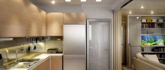
Proper planning of linear ergonomics is used in cases of limited space. For example, if you need to combine a small kitchen with a living room.
Here the Neufert triangle rule is observed provided:
- The central location of the sink is a refrigerator in the far corner, a stove near the window, separated from the wall by a pull-out cabinet. If you take into account the individual characteristics of the walls, the location of the kitchen furniture can be changed, observing the correct arrangement of the triangle.
- It is economically feasible to connect work surfaces with a countertop for arranging dishes and chopping food. This minimizes useless movements of the housewife in the kitchen.
- The location of the dining areas is either in the corner or on the opposite side. This layout will save space in a small area for the movement of two or more people.
Linear kitchen ergonomics
Don't forget about safety
Kitchen ergonomics implies not only convenience, but also safety. In this regard, here are some tips :
- It is better if the top row of cabinets is narrower than the bottom row, so that there is no risk of hitting your head while cooking. This principle is implemented, for example, in the WINSDOR kitchen produced by the Eggersmann factory.
- If the kitchen has high modules up to the ceiling or mezzanine, you should buy a stable stepladder in advance. Otherwise, you will have to stand on ordinary chairs, and this is unsafe. Sockets should be located so that you always have access to the plug, and you can quickly disconnect any device from the network.
- Place sockets no closer than 30 cm from the sink and hob so that splashes of grease and water do not lead to an emergency.
Kitchen with island
An island in this case is an additional multifunctional table, the placement of which is economically feasible if the area of the room is no more than 15 m2 and the width of the room is at least 4.5 meters. These are the most optimal space sizes for an ergonomic kitchen layout in cramped conditions.
Nuances of planning a kitchen with an “island”:
- There should be a distance of no more than a meter between the central working surface of the kitchen and the table.
- The height of the “island” must be calculated in accordance with the height of the person. With average height, this is from 85 cm to 1 meter above floor level. The optimal depth of the cabinets is no more than 90 cm, and the width is from 1.2 m.
- Taking into account the fact that during the cooking process the “island” has to be walked around, the optimal distance for placing it to the rest of the furniture is considered to be a perimeter of 80 cm to 1.2 meters.
- A hob and sink can be built into the countertop. This solution does not violate the conditions of the ergonomic triangle and saves a lot of space.
- For a kitchen with an island, a corner arrangement of furniture is ideal. But you should correctly take into account the distance from the kitchen to the table - it should not exceed 1.2 meters.
- If the stove is placed on the island part of the kitchen, when installing the hood, you need to maintain the optimal distance so as not to touch it with your head when cooking.
- The width of the working surface of a multifunctional table should be proportional to the width of the hood. With this layout, you can use a multi-level air filtration mode to ensure sufficient flow circulation across the entire work surface.
You can hide a large exhaust hood without disturbing the design using a false panel or a multi-level ceiling.
For maximum illumination of the central area, it is best to use ceiling lights.
Visual kitchen design with an island
The nuances of lighting and the location of sockets in the kitchen
To make the kitchen comfortable for cooking and for family dinners or relaxation, thoughtful multi-level lighting is important. One chandelier will not be enough.
Ideally, several lighting fixtures of different types are required:
- Large ceiling lamps . There can be only one chandelier in the kitchen, but it is better to hang separate lamps above the dining table and above the food preparation area. This will help visually zone the space.
- Spot lighting in the work area . It is absolutely necessary, because cooking in the twilight is inconvenient and dangerous. You can attach an LED strip along the entire length of the apron or install small lamps above the sink, stove, or countertop.
- Decorative lamps that fit into the concept of your kitchen. They don't illuminate as much as they create atmosphere.
And one more important point - sockets . There are a lot of appliances in the kitchen, and separate power points are needed for each appliance: from the dishwasher to the kettle. Count how many appliances you use in your home, and add a couple of extra outlets to this number.
NB! Sockets can be located in the work area (for example, on the apron), along the bottom row of cabinets, and also next to the largest appliances - refrigerator, oven, dishwasher, hood.
Read on the topic: Rules for the location of sockets in the kitchen
Kitchen ergonomics with corner furniture arrangement
The corner arrangement is convenient when properly planning the ergonomics of the kitchen in a very small room. An L-shaped arrangement of furniture with a folding dining table is suitable here. To increase the capacity of all cabinets and to save workplace space, the drawers can be equipped with a retractable mechanism.
For such a kitchen, it is better to choose household appliances with combined functions. It is better to mount large devices at a height; small kitchen aids should be placed on shelves above the work surface within raised arms.
Corner kitchen layout option
Additional furniture
In the large bedroom you can organize a relaxation area. It is better to equip it in a free corner. To equip it, you will need a comfortable chair - perhaps with an ottoman or footstool, as well as a small table and a floor lamp. This is a convenient solution for those who like to read or, for example, knit in the bedroom.
If you're dressing in the bedroom, you might find a design like a psyche mirror useful. Its advantage is ease of use (you can see yourself at full height) and portability (this item can be carried both within the bedroom and throughout the house).
Ergonomics of a linear straight kitchen
One of the types of planning a small area for a kitchen, for example, in a Khrushchev building. The ergonomics of the linear method requires the use of sliding cabinets and cabinets, since open doors take up a lot of space.
If it is inconvenient to place a kitchen set with a refrigerator in a small area, you can take it out into the corridor and place it in the corner so that the door opens towards the wall. Here, of course, the requirements of the rules of the kitchen triangle are violated, but sometimes such measures are necessary to save space.
Linear kitchen layout
Bedroom layout: necessary furniture
The main piece of furniture in the bedroom is, of course, the bed. She is given a central place. And it is selected most carefully, taking into account that it is comfortable to pass through, and does not blow, and does not overheat, and does not hit the door.
All other pieces of furniture “rotate” around the bed. Therefore, when planning your bedroom, first of all choose a place for the bed.
Buy the largest bed your room can accommodate—including, of course, room for other furniture. It is better to take a smaller wardrobe and a more compact chest of drawers than to huddle on a narrow bed.
A typical set of furniture for a comfortable bedroom, complementing the bed, is as follows:
- bedside tables (or bedside tables)
- pouf, mini-sofa or soft bench at the foot of the bed
- dressing table with seat
- dresser
- wardrobe
Much (if not all) of this can be avoided. But if the space allows, it is better to include all of the above in the bedroom set if you think that you will be more comfortable with this furniture.
Bedside tables or tables are very convenient. There is somewhere to put a book, cream, alarm clock, glass of water, mobile phone, etc. Without a bedside table, you have to put things on the floor (and occasionally accidentally step on them) or on the chest of drawers (you have to constantly get out of bed to, for example, drink water). In a word, bedside tables should be abandoned only in the “strictest space-saving mode.”
A pouf or bench at the foot is no longer a necessity, but the level of comfort will be higher. After straightening the bed, place a blanket on this object. After undressing before going to bed, things are left on it.
Bed linen is stored in chests of drawers
You don’t have to put the wardrobe
A dressing table is needed by ladies who are accustomed to using this piece of furniture in the bedroom.
Option with a peninsula
When planning a peninsula, it is important to keep the arrangement of kitchen furniture compact. The optimal model of the option with a peninsula provides for the division of work zones:
- storage of supplies (refrigerator and freezer, cereal cabinet);
- area for washing dishes (dishwasher with a small area convenient for placing dishes);
- preparation area (countertop with sliding cabinets and drawers for storing cutlery);
- food area (oven combined with a stove, above which there is a hood, where the ventilation duct is hidden by the upper shelves).
In the version with a peninsula, the working surface of the multifunctional table can be equipped as a dining room.
When planning your kitchen, you should take into account the location features:
- Microwave. The optimal distance for placing the device is no lower than 10 cm from the shoulder.
- The oven should be at chest level so you can see the cooking process without bending over.
- Dishwasher. The ideal place is to place it under the sink countertop.
- Fridge. At a distance of no more than 1.5 meters from the main working surfaces, with the condition that the doors open towards the wall. For example, in the corner near the window.
- An “island” as a separate table is more suitable for storing food, cutlery and as a work surface for cooking. It is inconvenient to install a sink and stove here; splashes will fall on the floor.
- Tabletop. The height of the working area should be no more than 15 cm from the bent elbow. Table length size up to 1 meter. To save space, you can build chairs into the peninsula and use it as a dining room.
- The width of the passage between the cabinets and the “island” should be from 80 to 120 cm to accommodate two people.
- The countertop space can be expanded using the built-in dishwasher.
- The hob can be either at table level or no more than 10 cm lower - this is considered the optimal comfortable distance for hands.
- It is best to place the gas stove at a distance of 50 cm from the window or more. This will help prevent the fire from being accidentally blown out by the wind or the curtains catching fire.
- The distance between the stove and the sink must be at least 60 cm so that splashes of water do not extinguish the fire.
- A good place for washing is close to the corner near the window. You can also place frequently used household appliances there.
- It is better to hang the hood at a distance of 60-70 cm from the stove.
- The cabinets fit perfectly under the ceiling. This is convenient for rarely used dishes.
- Sockets. An indispensable thing for proper planning of desktop ergonomics. It is better to distribute them into groups and connect them to “their” devices. To provide easy access, the ideal option is to mount the outlets on the side or bottom behind the drawers.
When planning the ergonomics of the kitchen space, we must not forget about efficiency, rationality and comfort. The chaotic dislocation of work areas and ill-considered arrangement of furniture creates a negative impression of the owner of the kitchen. Such organization of the workplace increases fatigue during the cooking process, which affects the mood and quality of the dishes.
Ergonomics of the kitchen set
The ergonomics of the kitchen is influenced by proper kitchen planning; the main task is to make the user bend, squat or reach for the upper shelves less. In many ways, the individual parameters of a person matter. Also, the ergonomics of the kitchen affects the convenience of opening the doors of the kitchen unit. It must be possible to open them completely, and blocking one door while the other is open is also not allowed. This mistake is often made when installing a corner kitchen unit.
The design of a kitchen set for a large and small kitchen differs in the number of cabinets. A small space requires a minimum of furniture, but with maximum functionality. It is not recommended to turn a large space into a warehouse; only the necessary cabinets are installed.
Helpful tips for maintaining kitchen ergonomics:
- The optimal depth of the kitchen countertop is 60 cm. If cutlery or small household appliances will be placed in the work area, add another 15 cm.
- The height of the countertop, and therefore the floor cabinets of the kitchen set, depends on the height of the user. If several people will constantly work in the kitchen, they calculate according to the average parameter. You need to bend your arms in front of you at the elbows. There should be 15 cm left to the tabletop so that it is comfortable to use and you do not have to constantly bend down or reach up.
- The highest shelf of hanging cabinets in a kitchen set is placed at a distance of an outstretched arm minus 25 cm. To reach the top shelves of modern mezzanines or cabinets that rest against the ceiling, you will need an indoor stepladder, for which you need to provide space for storage.
- The top row of kitchen cabinets is 15-20 cm narrower than the bottom row. The average width, depending on the requirements and the manufacturer, is 25-80 cm. The depth of the lower ones is 50-58 cm, the upper ones are about 30 cm. The height of the lower cabinets is 85-90 cm, the upper ones are 45-100 cm.
- The bottom of the kitchen cabinet hanging should be at a height of 5-10 cm from the shoulder. There should be at least 25 cm between the forehead and the facade to avoid injury.
To ensure that kitchen cabinet doors do not creak and close smoothly, closers are installed.
| Distances between furniture in the kitchen | cm | |
| Height | bar counter | 120 — 130 |
| islands | 90 | |
| dining table | 75 | |
| Distance | from the sink to the dining area | not less than 100 |
| from the work area to the dining area | not less than 90 | |
| from the table top to the floor | 80 — 110 | |
| from sink to stove | at least 50 | |
| from refrigerator to stove | at least 30 | |
| from stove to window | at least 45 | |
| from the surface of the tabletop to the upper modules | 45 — 60 | |
| from stove to hood | 65 -75 | |
| Width | table tops | From 60 to 90 |
| upper modules | From 30 |
Our photo gallery:
Space configuration
How to arrange zones so that it is not only convenient, but also aesthetically pleasing? Space configuration is an important point that should be given serious attention.
Location of zones and types of layouts
Most often, the dining area is located closer to the window, and the cooking area is located near the entrance. However, there are no strict recommendations on this matter: proceed from your personal needs and preferences:
- if you prefer to cook with a beautiful view, feel free to place the set near the window;
- if there is a balcony adjacent to the kitchenette, and you have organized a pantry there, it would be logical to place a work area by the window, but if there is a mini-bar, a place for tea drinking or a small seating area, a dining group by the window block may be more convenient;
- a set located further from the entrance will allow fewer odors to leak into the rest of the apartment (however, a truly powerful hood will eliminate this problem);
- if part of the storage will be moved outside the room (for example, a pantry in the hallway or a sideboard in the next room), this should also be taken into account when planning the configuration of the dining room-kitchen.
ADVICE. When choosing how best to arrange a kitchen-dining room, you should familiarize yourself not only with design projects and layout options, but also refer to photos of real interiors of spaces of a similar area.
Stylish kitchen-dining room - unusual design
Headset configuration
The most trendy option is a linear headset layout. This arrangement allows you to arrange the work area as compactly as possible, as well as visually escape the feeling of being in a kitchen space. However, linear sets do not allow you to create a comfortable working triangle, and may also not be the best option for small kitchens and very tiny spaces.
Other ergonomic options are an L-shaped (corner) kitchen, a U-shaped kitchen, and a kitchenette with an island.
But complex, intricate options for arranging a work area (say, in a semicircle or with a curved bar counter) are extremely rarely used in the design of modern spaces. However, if your design concept requires it, why not.
ADVICE. Modern interior design of a large or small kitchen-dining room in an apartment or private house is not only a beautiful picture, photo, but above all, your personal comfort.
Stylish kitchen-dining room - modern design
Space zoning options
The design of the kitchen-dining room involves zoning the space. And if there are other functional areas in the room (for example, a living room or a minibar), this issue should be approached even more thoroughly.
ADVICE. Modern layout and interior design of even the smallest kitchen combined with a dining area requires zoning. This is not the prerogative of exclusively large spaces in a private home.
The division of the kitchen into parts can be:
- Visual (zoning with color, light, decoration).
- Physical (zoning with furniture, partitions).
In this case, physical zoning can be mobile (sliding partitions, zoning with curtains).
In addition, there is a method that combines visual and physical zoning - dividing the room into parts using different floor or ceiling levels, as well as using structures protruding from the wall.
Zoning depends, among other things, on the chosen style. So, for a kitchen-dining room with an interior design in a modern style, as in the photo below, a variety of types of partitions are suitable. And, say, the classic style will be more selective and demanding.
ADVICE. A textile partition is a cozy idea for zoning the interior of the kitchen and dining room; the design move will be appropriate in any style.
Stylish kitchen-dining room - designer renovation
