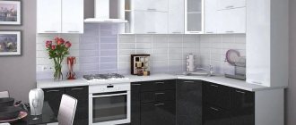
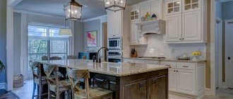
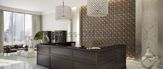
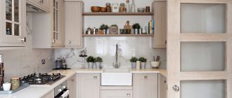
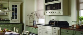
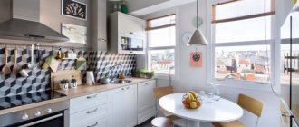
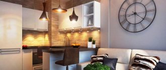
White and brown kitchen is considered traditional and can create a cozy, homely atmosphere. You can use a warm combination of colors for modern and traditional interiors. To get an interesting, unique design, experts use an original approach to the balance of shades and decorative design of the kitchen space.
Advantages and disadvantages
Advantages of white and brown kitchen:
- White is an achromatic color; it goes well with all shades and does not interfere with adding bright details and decorative elements to the interior. Suitable for organizing small kitchens, visually increasing the space.
Small kitchen
- The most common are warm shades of brown; it creates a cozy, homely atmosphere. There are different tones, from light, sandy, to dark brown wenge.
Wenge is one of the darkest shades
- The combination does not strain visually, it helps you relax and collect your thoughts.
- Green plants look great in this kitchen.
Plants in the interior
Flaws:
- Dark brown color needs to be dosed, especially in small kitchens. It can visually reduce space. In large rooms this effect is not noticeable.
Dark is suitable for large kitchens
- White color on work surfaces can be easily soiled. It is necessary to carefully select materials for organizing the work area.
- It is required to maintain a balance of colors. The predominance of snow-white will feel like turning the kitchen into a hospital ward.
Color balance maintained
Brown effect
Brown is considered a strong and energetic color, so it is chosen by people who convey an impression of self-confidence. When creating an interior, it is important to consider the impact of each design element. An example is a brown leather chair, which helps you relax and forget about current problems.
At the same time, this color is perceived as natural and does not distract the attention of the apartment residents. It is worth remembering that brown is the personification of restraint, so young people rarely choose it. It can be used to create an atmosphere of calm that helps in making important decisions.
If this color is quite appropriate in the office, then why use it in the kitchen - many will say. If the hostess is in this room for several hours in a row, then a feeling of calm and balance will contribute to the exact observance of recipes, which will affect the quality of the created dishes. Also, thanks to the brown color in the kitchen, you can relax and enjoy peace after the day's activities.
Other features:
- brown color promotes deep immersion in the task at hand, so the housewife will not be distracted from cooking;
- the described range is suitable for people who are not used to being in the public eye;
- people living in an apartment where brown color predominates try to avoid showing weaknesses;
- color also contributes to a feeling of stability.
How to combine white and brown correctly
There are several secrets that designers use to create a harmonious interior in the kitchen:
- The use of brown to white in a ratio of 80:20 is suitable for spacious kitchens combined with a living room in a private home. To prevent the kitchen space from looking gloomy, you will need plenty of lighting and a warm light temperature.
Spacious kitchen-living room in dark colors
- For Khrushchev-era apartments and small-sized kitchens, white or its shades are chosen as an accent color. It is complemented with light brown, sand, a hint of milk chocolate or coffee with milk.
Compact interior for Khrushchev
- The classic combination is most often used - dark bottom, light top. Not so much for aesthetic reasons, but for practical ones - lower cabinets are more susceptible to contamination.
- The design can be diluted with elements in a third color. Warm colors will look good here: orange, yellow, red. Green plants are suitable for decoration.
Yellow decor and plant
- To prevent a two-color kitchen from looking boring, it is recommended to add fabrics with patterns, furniture with rounded lines, and glass details. The choice depends on the style of the interior; for Provence, curtains with a floral pattern are suitable, for Art Nouveau, a crystal chandelier, forged furniture legs.
Additional elements: chandelier, grilles, glass
Lighting
The following chandeliers are suitable for lighting in a white Scandinavian-style kitchen:
- from glass;
Photo from source: wayfair.com
- varnished or painted wood;
Photo from source: decorilla.com
- made of wire or chrome, spider chandeliers;
Photo from source: home-designing.com
- in the form of an incandescent lamp on an ordinary black cord - without a lampshade or in a metal lampshade;
Photo from source: pinterest.ru
- in the form of snow globes;
Photo from source: pinterest.cl
- in the form of bells.
Photo from source: interyerdizayn.ru
Options for combinations of white and brown
The combination of white and brown can be done in different proportions. There are nuances that need to be taken into account in advance.
White top brown bottom
The classic color distribution is the top drawers are snow-white or milky, the bottom drawers are brown. The shade of the floor half of the drawers is chosen based on the area. For a spacious kitchen with a white top, a brown bottom in the darkest, richest colors is suitable: wenge, chocolate, mahogany, walnut. For small-sized ones, it is recommended to take light colors: chestnut, clay, ocher. Pastel-colored walls look harmonious with light hanging drawers. The apron is selected to match the tabletop or with a pattern to match the color of the cabinets, which will add dynamics to the interior.
White bottom brown top
This option is used less frequently and is more suitable for spacious kitchens with high ceilings. Interiors are trendy in which some of the drawers on top are made in light shades (milky, pearl), and the other part in brown. Wood shades are more popular today than ever; designers choose materials close to nature. The apron can combine the shades that were used for the facades. Snow-white walls may seem boring; it is recommended to use shades one or two shades darker, for example, antique, ivory.
Dark top, light bottom
White kitchen set with brown countertop
This idea looks neat and practical in everyday life. On a brown countertop installed in a white kitchen, traces of cooking and mechanical damage are less visible. Popular combinations of a snow-white kitchen set and a dedicated line of small hanging drawers with wooden fronts. The tabletop is matched to match them. Choose a contrasting apron, similar in color to the walls, or decorate the entire work area in one shade. For variety, you can add a pattern or a third color and support it with decor.
Brown kitchen set and white countertop
An interesting option for urban interiors, where wood and metal predominate in the decor. A white countertop adds aesthetics to the interior and goes well with an apron of the same color. Wooden kitchen fronts will stand out against the background of the wall in light, pastel shades. The only caveat is that the wall should be slightly darker than the countertop. It is not recommended to use brown walls; the atmosphere can turn out gloomy.
Combination with a third color
To liven up the design of a two-tone white and brown kitchen, use a third color. Warm shades go well with green, orange, yellow or red. Decor made in these colors will add energy to the atmosphere. A third color is often used in finishing materials or for an apron.
Benefits of Brown Kitchen
If you have doubts about choosing a brown color when creating an interior, it is worth considering the features of using this color in the kitchen:
- Versatility. Noble brown shades can appeal to people of different ages and outlook on life. Moreover, such a kitchen can be decorated in almost any style. This is due to the fact that the apartment owner can use many shades of the same color.
- Practicality. When contaminants get on the surfaces in the kitchen, many of them remain unnoticeable, so even during cooking the room will maintain an attractive appearance.
- Neutrality of shades. Brown color can be combined with many objects that decorate the space.
Important! The most common option is a brown kitchen with a white countertop.
Finish options
The surroundings should match the style and materials that were used for the white and brown set. There are several ideas that designers use.
Ceiling
For the ceiling, it is recommended to use white or beige in combination with light brown furniture and light walls. It is not recommended to use dark colors, especially for small kitchens. They create a depressing effect.
If the ceiling is high enough, brown or black inserts can complement the design in combination with light fabric, which help separate functional areas.
Ceiling inserts for zoning
Walls
A universal option for a two-color kitchen set is a light background in pastel shades of milky, beige, and cream. It is advisable to choose the same tone as the white facades or a little lighter so that the set does not blend in with the wall covering.
Light wall
If the kitchen is spacious, with high ceilings, a dark background to match the color of the facades would be appropriate, as would be the case for a white set with a brown countertop, helping to visually highlight it.
dark wall
Coatings that imitate wooden boards or brickwork look good in combination with white. This combination will add dynamics to the interior.
Brick wall
Floor
A dark floor for a white and brown kitchen is a beautiful and functional design solution. Since this area of the house is one of the dirtiest, covering will help hide stains and scratches. Light flooring should be a shade or two darker than the white kitchen cabinets.
Light floor
You can also use combined options, for example, brown and white tiles with a pattern or geometric pattern.
Combined floor
Design and textures
The design may include furniture with matte, glossy facades, glass inserts, stained glass windows, as well as fittings in the form of gold-plated, bronze or copper handles.
Gloss surfaces in dark brown tones look very catchy and impressive. Plain facades are sometimes diluted with bright accents, such as drawings.
The photo shows a kitchen interior with a suite with light brown wood-look facades, decorated with patina.
The use of patina can add originality, charm and charm to the kitchen, adding an unusual and chic antique look to the surface.
The photo shows a gray-brown glossy set in a kitchen interior with brick walls.
Which apron to choose
If the area is small, a white kitchen with a dark brown countertop and an apron matching its color will look light, without visual load. Nut, chocolate and coffee shades are suitable. Natural colors of wood, a wall made of stone or brick, covered with transparent plastic, are relevant.
Brick apron
Dark apron and countertop
A white apron will draw attention to the kitchen set against the background of dark walls, it looks neat and aesthetically pleasing. Also, the light finish of the work area is suitable for wall coverings in pastel colors.
Color scheme for the kitchen
The color scheme of this room can determine the mood for the residents of this house. Therefore, creating a harmonious atmosphere in the kitchen is a very important point when designing, especially when choosing colors.
When choosing a color, it is recommended to take into account the size of the kitchen. The fact is that different shades can visually expand or reduce space. So, for a small kitchen, the best option would be light and pastel colors. For a large kitchen, dark shades are better, which will make the kitchen elegant and beautiful.
Basically, the design of a kitchen set is determined by the color combinations of the facade and elements. Many other elements can enhance or reduce the colorful effect. In addition to the size of the kitchen, it is also important to take into account the lighting of the room, family composition, etc.
Lunch group
The table and chairs in the dining room should repeat the shades of the kitchen in order to look harmonious and the interior is combined into one composition. Solid dark chairs are practical, especially if they are complemented by soft upholstery. Most often, brown furniture is made of the same type of wood as the kitchen itself, and the table repeats their texture and materials.
Table made of the same material as the work area
Furniture in the dining area in the color of the white facades will also be appropriate, but not so practical in everyday life. According to the designers' recommendations, the countertops of the working and dining areas should match in shade and texture. Glass is used for the table if this material is present in the decoration or decor.
Floor decoration in brown tones
Many people refuse to use wood when arranging the floor in the kitchen, choosing more budget-friendly and practical materials. However, if you wish, you can choose wood for a brown kitchen interior that is resistant to moisture and mechanical damage.
Country style even implies boards with minimal processing. In addition, luxury can be emphasized with the help of exquisite ceramic tiles, artificial and natural stone.
In any case, the floor should be made darker, in contrast to other components of the interior.
Decor ideas
In the kitchen, the interior in white and brown tones will be complete if you add decorative elements to it. Interesting options:
- chrome-plated golden and gray parts: sanitary ware, handles on kitchen units, chair legs, lamp shades;
Vintage chrome plumbing fixtures
- brown and white, matching the facades, textile elements: napkins, curtains, tablecloth;
- contrasting warm details: red or orange lamps, yellow figurines and similar decor;
- dishes made of clay materials, handmade wicker baskets;
Dishes as decor
- green plants in pots, hanging compositions from them, walls made of moss.
Why is it worth using this color in the interior?
According to psychologists, shades of brown help clear thoughts, calm the soul, and create a feeling of security. Experts believe that this is due to its nature of origin - much that surrounds a person is actually dark brown - black soil, tree trunks, the banks of muddy rivers.
A kitchen in brown tones helps to direct thoughts in the right direction, relax and is truly suitable for strict, somewhat conservative people who work or are engaged in the field of intellectual work.
When preparing food, the accomplished atmosphere will not hurt the eye with inappropriate brightness. In addition, brown can slightly stimulate the appetite, refreshing the memory of the taste of sticky peanut butter, strong coffee or tea.
In what style should I make it?
The combination of white and brown is one of the most popular. In the modern manner of execution it takes on a new interpretation. In traditional interiors, brown is presented in wood and leather, looking solid and expensive. Modern minimalist interiors make the white and brown kitchen set visually easier to perceive; innovative durable materials are used for implementation.
Classic
The classic style is characterized by the use of natural materials: wood, marble, stone. Wall decoration and facades with a matte finish, pastel shades for walls. Stucco molding, patterned milling on furniture, and moldings are used.
Suitable for classics:
- Facades made of natural wood: mahogany, walnut, wenge. Dark, deep shades are combined with a white countertop made of natural stone.
- White kitchen with a stylish brown splashback and gold vintage fixtures. Carved fronts complemented by chrome handles.
- The walls are in light pastel colors or two-tone. You can use combined wallpaper with patterns and mosaic tiles.
- The floor is calm, brown, close to beige or with a pattern.
Country
Original and simple rustic style. Simple wooden furniture is used, facades with glass and bars are complemented with forged handles. Decorative items include a copper chandelier, dishes made of clay and wood, and baskets.
Suitable for a country style interior:
- Heavy kitchen set made of brown or light wood with an aesthetic light countertop.
- The floor is made of combined tiles or stone in beige and brown shades to match the color of the set.
- Open wooden shelves with dishes and jars made from natural materials.
- Vintage chandeliers and plumbing fixtures in copper color, artificially aged.
Minimalism
Characteristic are straight facades and furniture with smooth shapes. For surfaces, plain materials are used, both glossy and matte. Nothing unnecessary should remain on horizontal surfaces, the appliances are built-in, the decor is minimal or absent.
How to match the style:
- The colors of the floor, walls and furniture should have something in common. They can be white to match the kitchen facades, or the wall decoration is brown and the floor is light. Do not use variegated colors in decoration, only plain ones.
- Combine straight facades with imitation wood with white trim and countertops.
- Use several levels of lighting so that the snow-white color does not look too cold. Preference for warm light lamps.
- Choose leather furniture to match the color of brown facades. Use a glass or white table surface.
Choosing a shade of brown
In order for the interior to look elegant and harmonious, you need to decide which shade to use. The choice is quite large, because this color can be either cozy and warming or cold and formal.
Thanks to such a multifaceted palette, it can be used to design any room:
- In large kitchens with proper lighting, it is good to use rich shades such as chestnut, dark chocolate, mahogany, golden brown or black coffee.
- If the task is to make the space wider and airier, then you need to add several delicate tones, such as baked milk, ivory, light brown cocoa with a hint of pink, nutty or caramel.
- To create a calm and friendly environment, soft autumn tones are perfect: peach, tan, sand, neutral medium cinnamon or milk chocolate.
Brown is considered a universal option. It will decorate any kitchen interior and will be appropriate in various styles: it will bring grace and chic to classic, and comfort and homeliness to Provence. By choosing it for ultra-modern design images, you will be able to give the room clarity of shape, depth and dynamism.

