Studio apartments are a new type of housing, which is most often chosen by young people. Their area can vary from 15 to 40 square meters. This layout does not involve internal zoning; as a rule, the studio has a separate bathroom and a room that can be used as a sleeping area, personal workspace and living room.
A common characteristic of such apartments is functionality - every meter of space must be functional and used for its intended purpose. It is important to take this feature into account at the design project stage and create an interior with maximum comfort. This is especially true for studio apartments with an area of 25 square meters.
Layout of a studio apartment 25 square meters
In designing the design of this studio, it is especially important to think through the project in as much detail as possible, draw up a technical plan and complete the drawing.
It is also necessary to take into account the layout of the batteries, ventilation shafts, central riser, etc. Since such a single room is supposed to accommodate several functional areas at once, each of them must be organized correctly and not interfere with one another. The simplest layout for arrangement is a square studio apartment. It is especially possible to experiment with decoration and furnishings.
A rectangular and elongated space requires a completely different approach. When decorating, you need to think through everything down to the smallest detail, for example, use decor in the form of mirrors, photo wallpapers or 3D paintings to visually increase the area so that the room does not look too narrow.
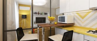
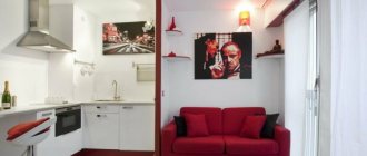
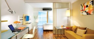
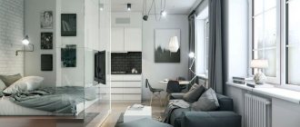
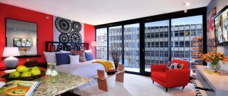
The photo shows a layout option for a studio apartment of 25 square meters. m., made in light colors.
Color solutions
The color scheme should not contradict the chosen style and your wishes, and also not harm the geometry and area of the space. The recommendations here are as follows:
- For an elongated room with a window on the smaller side, colored curtains are suitable - this way you can expand the space a little.
- Floors and walls in the same color are not recommended due to the resulting effect of enclosed space. Usually the floor is darker or is made in a different shade from the walls.
- A colored ceiling will make the height of the apartment lower.
- If you use vertical stripes in wall decoration, the height of the studio will visually increase. As a vertical, you can choose the appropriate wallpaper on part of the wall or a narrow shelving to the ceiling.
- A monochrome palette with a base of white, gray, and beige is the right option for small spaces.
How to zone 25 sq. m.?
As zoning elements, various partitions made of plasterboard or wood are used, which can differ in any height and at the same time serve as bookshelves or a place where stylish accessories are placed, equipment is placed, etc.
Also, certain areas are separated using curtains, canopies, furniture items, or using different configurations and textures of the ceiling, for example, in the form of glossy and matte stretch fabric. No less popular is the delimitation of space by lighting, different types of wall decoration or differences in floor level.
Rules for setting up a small studio
A few recommendations:
- In a small room, special attention should be paid to furniture. It should have maximum efficiency and functionality, which will help improve the ergonomics of the entire space. The best option would be custom-made furniture elements; they will fit especially perfectly into the interior of the studio, taking into account all its features and configurations.
- If you have a balcony or loggia, an excellent solution would be to combine them with the apartment and thereby achieve a real increase in usable space.
- In a small apartment, it is important to properly consider natural and artificial lighting to make the room comfortable to be in.
- The color palette should predominate in lighter and pastel colors.
- In the design of this studio, it is not advisable to use too much small decor that clutters the room.
Counting the advantages and disadvantages
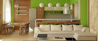
The kitchen-living room is a rather non-trivial and extravagant solution. There is both individual style and modernity, and with the help of a removed wall, the space is significantly increased.
However, one cannot fail to mention the disadvantages:
- The room will get dirty much faster and more heavily.
- Kitchen aromas will spread into the living room.
- The noise of technical devices can disturb guests in the hall.
The obvious advantage is that the hostess will be closer to her husband and children. The time that a woman spends in the kitchen (and this is quite an impressive period), she will be close to her household.
Go to living rooms
Sleeping area
To ensure comfortable rest and sleep, this area is often separated using a screen, curtain, shelving or a more mobile and lightweight partition, for example in the form of sliding doors, which do not restrict the space and do not prevent the penetration of light.
The photo shows a sleeping area in the design of a studio apartment of 25 sq. m., decorated with a partition in the form of curtains.
A bed may not always be a permanent structure. The use of a regular folding sofa or transformable bed is quite appropriate here. If there is a high ceiling, it is possible to build a second tier on which the sleeping place will be located. The two-level studio apartment has a particularly interesting design and provides significant space savings.
The photo shows the design of a studio apartment of 25 sq. m. with a bed located on the second tier.
Lighting
The studio requires local lighting items to highlight each of the functional areas.
- Kitchen. Main overhead light plus LED cabinet lighting.
- Bedroom. The main light is wall lamps, which are convenient to turn on and off without having to get out of bed.
- Living room. The main light is a chandelier. Wall lighting is also an option if the bedroom is on the second level directly above the living room.
Important
. In the studio, decorative light elements can be used for zoning and in general for additional light zones. In this case, it is recommended to limit yourself to minimalist LED strips, light bulbs in niches and not to purchase oversized lampshades/plafonds.
Kitchen design in a studio apartment
When arranging the kitchen area, all the necessary equipment is carefully thought out, since it requires additional space. It is also important to properly distribute the work surface so that various appliances can be placed freely on it and there is room for cooking. In some cases, to save space, a hob with two burners is used, and the oven is replaced with a mini-oven or convection oven.
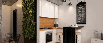
The photo shows the design of the kitchen area in the interior of a modern studio of 25 sq. m.
It is better if the kitchen set has wall cabinets up to the ceiling, this way you can significantly increase the storage system. When decorating a bar counter, it is more rational to use a structure that has a solid base, which is complemented by various shelves or drawers.
Zoning methods
Designers today recommend using partitions, furniture, multi-level ceilings and floor podiums for zoning. Visually, different zones can be designated using accent colors, new textures and finishing materials.
When choosing partitions, as when working with furniture, it is important not to overload the space of the room. Moreover, in the case of separating a sleeping area, the only problem to be solved is the separation of space. Sound insulation is impossible without creating full walls. Options include stationary partitions made of durable materials and podiums. Another non-standard solution is lattice partitions made of wood, metal and plasterboard. They will not only solve the zoning problem, but will also serve a decorative function.
The easiest way to solve the issue of zoning the kitchen. Most often, a bar counter is used for these purposes. It separates the cooking space from the rest of the space, while being used as a table and additional storage space. A more conservative zoning option is a dining table. Designers advise paying attention to the design of furniture in a color contrasting with the main interior. This will additionally allow you to visually zone the space and create a feeling of separation.
Hanging shelves, mezzanines and shelving with simple geometry can be used as additional storage space. The main task is to provide additional possibilities for placing things and at the same time save square meters.
Photo of a children's area for a family with a child
In a studio apartment for a family with a child, zoning is extremely necessary. The children's corner should be located in an area with a window to provide the maximum amount of natural light. The space can be isolated using a canopy, open or closed shelving, which simultaneously serves as a partition and storage system. The use of bright, colorful elements and fantasy decor is appropriate in the design.
The photo shows the design of a studio apartment of 25 square meters with a children's corner equipped in a niche.
Planning and creation of the project
This is the most important and initial stage on which the comfort of future living depends.
Old panel houses did not provide for the construction of studio apartments, which means that redevelopment of such housing will require permits from various authorities.
Important detail
: if gas is installed in the apartment of a panel house, then it is impossible to demolish the door between the kitchen and the room.
New developments increasingly include studio options: housing is rented just like that - without partitions. This means that the construction of all the walls will be the owner’s responsibility and will allow a variety of ideas to be realized.
- First you need to distribute the space between the kitchen, bathroom, living area and storage space.
- A second tier is possible as an area for a kitchen, storage or bathroom. This option is good for apartments with high ceilings.
- You need to pay attention to the geometry of the room. In studios with niches and projections, it is important to use them to the maximum: a small corner, with proper planning, can in the future turn into a full-fledged dressing room or office.
- You should not ignore thinking through the storage area - this will allow you to avoid ordering and installing bulky and sometimes completely unnecessary cabinets in a studio apartment. Instead, you can use designs with various modules, which can be selected exclusively for specific needs.
Workplace in the studio
Most often, the work area is located in the corner, a desk or computer desk, a chair and several small shelves or cabinets are installed. Another practical option is a wardrobe combined with a table. This mini-office is separated by a small partition to create a secluded atmosphere, or a color scheme that differs from other functional areas is used.
Photo of the bathroom and toilet
In a 25-meter studio apartment, very compact and small-sized plumbing fixtures are selected for the combined bathroom. For example, they use a shower stall, which may not have a tray or have folding partitions.
When installing a bathtub, pay attention to corner, seated or asymmetrical models, and the toilet is equipped with an installation, since such a design visually looks less cumbersome. The decoration is mainly dominated by lighter shades, mirror and glossy surfaces.
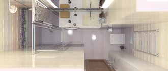
The photo shows the interior of a small combined bathroom in the design of a studio apartment of 25 sq. m.
Here it is also important to think through storage systems for necessary things, such as towels, cosmetics and various hygiene products. The bathroom is equipped with corner or wall-mounted shelves, narrow cabinets or small cabinets placed under the washbasin. Even in the design of such a small room, creativity is encouraged; the room can be supplemented with various accents and accessories, in the form of colored soap dishes, dispensers or cups for brushes. A soft rug will add a special coziness to the atmosphere, and a large mirror will visually increase the area.
The photo shows a bathroom made in light colors in the interior of a 25-meter studio apartment.
We count the pros and cons
A kitchen combined with a living room is a rather bold and unusual solution. It looks very modern and stylish, and the removed wall allows you to significantly increase the space.
However, there are also disadvantages here:
- Smells from the kitchen will penetrate into the living room;
- The noise of kitchen appliances will disturb those relaxing in the hall;
- The room will become much more dirty.
On the other hand, the hostess will become much closer to the family. Now all the time she spent in the kitchen, she will be able to be close to her husband and children.
A white sofa in the middle of the room will perfectly complement the interior of the living room
Wood in the interior looks very beautiful and modern
The design of the living room is made in the same style and color
See alsoInterior design of a living room with a fireplace
Decoration of the corridor and hallway
Using high-quality and beautiful finishing materials, it is possible to give the hallway comfort and hospitality. For example, the interior looks more harmonious in light shades; it is also complemented with tall cabinets, shelving or furniture with a glass, glossy or mirrored facade. Thus, the corridor is filled with light, air and visually looks much more spacious. It is especially appropriate here to install glass sconces or lamps, through stained glass windows or various lighting.
The photo shows an option for decorating the hallway in the design of a studio apartment of 25 sq. m.
Features of zoning a studio with one window
For this apartment, the “sick” spot is lighting. The sofa is the central element of the living room. You can focus attention on it with the help of light. A straight sofa will look cozy by the window, and a corner sofa can be placed in the center of the living room. In the second case, the light source can be a chandelier hanging from the ceiling above or near the sofa, a floor lamp nearby or lamps on the sides. The choice of lighting fixtures depends not only on the interior style, but also on the size of the space allocated for the sleeping area.
Studio apartment: photo of the interior and layout of 25 sq. m in Moroccan style. Don't forget about the TV, which should at the same time be clearly visible from the sofa and fenced off from the sleeping area. The light falling on him from the window will make it impossible to watch programs during the day.
Photo of a 25 m2 studio with a balcony
If the studio apartment is 25 sq. m. has a balcony or loggia; when combined, it turns out to achieve additional space, which can be equipped with a single or double bed, a study, a dressing room or a relaxation area. A panoramic door and identical finishing will help to visually increase the space.
The photo shows the design of a studio apartment of 25 sq. m. with a glazed balcony decorated with a panoramic sliding door
It is also quite possible to place a kitchen unit, refrigerator or bar counter on the loggia, adding a special style to the design.
Basic styles
For design projects of small apartments, such as a 25 sq. m studio, inspiration is drawn from styles that are as laconic as possible and aesthetically not overloaded with additional elements: minimalism, hi-tech, loft.
The most common design style for small spaces is Scandinavian. Advantages:
- modularity;
- brevity of furniture groups, where almost every item has transforming abilities;
- predominantly light shades - delicate blue, beige, natural and of course - white;
- simplicity of details, accessories.
For fans of high technology, minimalism with high-tech elements is more suitable:
- main materials: glass, durable plastic, metal;
- laconic contrasting colors – characteristic black and white monochrome;
- glossy, mirror surfaces;
- ergonomics of furniture structures.
The Japanese style is not suitable for everyone, but you can take certain features that are perfect for the interior of a 25-meter studio:
- vertical stripes, highlighted by finishing, play of textures, colors - together with screens make up an ideal zoning duet;
- the standard bed is replaced with an exotic podium - alternative storage spaces appear;
- laconicism of furniture and decorative elements – relevant for small spaces;
- order is ensured if you adhere to a special style philosophy - it’s not for nothing that Japanese authors of books about special cleaning secrets and storage systems that become a way of life are popular all over the world.
How to arrange furniture in the studio?
A small studio in Khrushchev can be furnished with low and less voluminous furniture, which should not contrast too much with the decoration of the walls. When using bright furniture items, a feeling of busy space is created.
The photo shows the arrangement of furniture in the design of a studio apartment of 25 sq. m. in the attic.
In the design of a square-shaped apartment, the furniture is located exactly along the perimeter, and in a rectangular room it is moved to one wall. In this case, the free wall is equipped with hanging shelves or other storage systems.
The photo shows furniture placed along one wall in the design of a studio apartment of 25 sq. m.
Important nuances
The first step in arranging a studio apartment is to create an interior design.
The design project will allow you to see the future interior before the renovation begins.
Important. A pre-created plan will significantly improve the quality of the repair and reduce the time required to complete it.
It will be easier to place furniture on the size diagram
When creating a project, you must have certain technical papers. The technical plan will show where the main communications are located. You can get it from the housing office. Based on such a plan, you can build a detailed project on a piece of plain paper. It needs to indicate the exact location of sockets, communications, mark the position of furniture, and interior areas.
See alsoDesign of a small studio apartment
Studio ideas with two windows
Studio apartment 25 sq. m. with two windows is a very good option, having a lot of natural light. Windows placed on one wall provide a natural and harmonious division of the room into two functional zones.
For example, if a kitchen set is installed near one window opening, and a sleeping or living area is located next to another, you can refuse to use additional partitions. An excellent solution would be to place the head of the bed by the window, make the window sill a bedside table, or arrange cabinets and shelves around the opening.
The photo shows the design of a studio apartment of 25 square meters with a window and a half-bay window.
Divide the indivisible
Interior designers successfully use space-zoning partitions when creating apartment interiors, including 25 sq. m studios:
- Monolithic from plasterboard. A low one can serve as a headboard and at the same time serve as a bookcase between the bedroom and living room;
- Plasterboard and wooden false partitions. They do not completely hide the detachable part - rather a conditional function, but they will additionally serve as bookshelves, places to place stylish accessories and necessary gizmos;
- Curtains, canopies. Ideally suited for girls who own studio apartments and dream of creating an unusual design in the spirit of shabby chic;
- Sliding glass. Partitions made of frosted glass may not reach the ceiling, leaving free space above, giving even more lightness and airiness. The advantage may lie in the location of the berth near the window. During the daytime, light will easily penetrate the second half;
- Furniture items – wardrobe. The simplest, most functional way.
For visual zoning, techniques are used, sometimes simultaneously:
- Variety of ceiling configurations. They use a simple technique with different textures: in the kitchen - gloss, the main part - matte stretch ceiling;
- Wall solutions. You can visually highlight any zone simply by using different wallpaper options;
- Floor. A well-chosen carpet in accordance with the style will easily separate the living room area;
- Lighting.
Interior design in various styles
The minimalist style is considered the most suitable for decorating small studios. This direction is distinguished by the use of no more than three shades of white, gray and brown. The furniture here has the simplest form possible; the upholstery uses plain textiles.
Scandinavian interiors require fairly light colors, especially in wall and floor decoration. Furniture elements are made of natural wood, the lining has various patterns and ornaments. The design is complemented by posters, paintings depicting northern landscapes or animals, and the decor is also decorated with living plants.
The photo shows zoning with a metal partition in a studio design of 25 sq. m., made in loft style.
The industrial loft is characterized by brickwork, wood trim and a fairly wide range of colors from white to dark brown and graphite shades.
Provence style involves a floral print, white, beige or other light wall cladding, furniture in pastel lavender, mint, purple or blue colors. French style often involves partitions and other structures with crossed slats that transmit light well, do not clutter up the space and therefore fit particularly harmoniously into a small room.
The photo shows the interior of a studio apartment of 25 sq. m. in Scandinavian style.
Provence
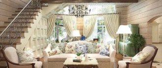
The French style, combining simplicity, lightness and luxury, is widely used in the design of modern living rooms. Natural textiles, artificially aged furniture, hand-painted dishes, and plant prints are successfully combined in pastel colors.
Photo: living room in Provence style
The walls are decorated with decorative plaster or wallpaper in white, beige, blue, plain or with a non-dimensional pattern. Upholstered furniture should be as comfortable as possible. Open shelves are filled with books, souvenirs, and photographs. Restraint in colors, quality of design and freedom of living space should fully reveal the advantages of the romantic French Provence.
