Interior design
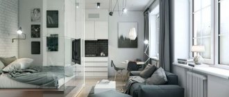
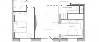
Stylish and modern design of a two-room apartment of 50 sq. m. m will allow you to comfortably arrange one of the most common types of housing and arrange all the necessary areas. Correctly filling the space will allow you to implement a specific concept and ideas, while maintaining the functionality and practicality of every detail.
Features of redevelopment
Before you start developing a design, you need to decide how many people will live on these square meters. It is also important to clarify whether there will be elderly people and children in the house. The location of the rooms and the type of functional load they will have to bear will depend on these two points.
For a bachelor, the most preferable option is a studio. However, not every home can be converted into one, since in some situations it is prohibited to remove internal load-bearing structures. In such an apartment, in addition to areas for sleeping and receiving guests, you can allocate space for an office, sports, and a dressing room.
A two-room apartment of 50 sq. m. is suitable for a family with a child. m, where the larger room is intended for adults, and the smaller one is for the baby. A minimum amount of furniture is installed in the children's room, because there should be enough space for active children's games. In the parents' room, the sleeping area is separated using a partition or shelving.
When 3-5 people are planned to live, a rational solution would be to divide the rooms with pieces of furniture, screens, and partitions. This way, all residents will have a separate small zone. When it comes to sleeping areas, it is recommended to purchase beds with two tiers.
If the housing is intended for newlyweds, one of the living spaces is made into a common bedroom, the other into a living room. The bedroom is equipped with separate storage systems for spouses and a double bed. In the hall there is a soft corner with a television panel. In some cases, the living room is combined with a kitchen.
Kitchen
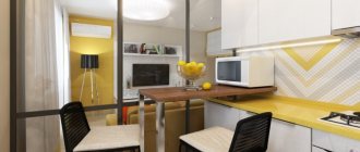
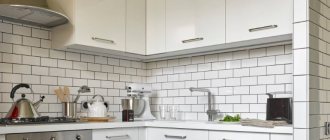
The kitchen, as a rule, is designed in accordance with the canons of minimalism. The kitchen set should be compact and functional. Work areas are located between the sink and the stove. The upper shelves should not “press” too much from above. The dining area is either left next to the cooking area, or moved to the living room if we are talking about a 2-room apartment. They zone the space with a narrow bar counter, which will add sophistication to the room and become another work surface. In houses of the 137th series, kitchens are usually large. For such options, large suites and luxurious dining rooms with large dining tables, designed for a large family or a group of frequent visitors, are suitable. The washing machine is also placed in the kitchen and hidden behind one of the cabinet doors.
Helpful advice. The window should not be covered with heavy curtains. Firstly, even with high-quality hood, they will absorb food odors and constantly require washing. Secondly, compact kitchens require maximum light and space, which the window will provide.
Recommendations from experts on choosing furniture and lighting items
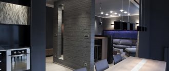
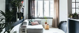
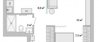
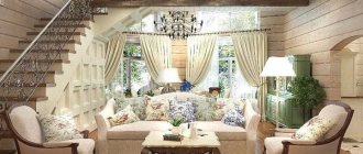
Photo of the design of an apartment of 50 sq. m clearly illustrate all the key recommendations of the designers:
- Furniture should be present in a minimum quantity. This way there will be more space for free movement, and this is important if the apartment is intended for a family with children.
- Each functional area should have its own lighting source.
- It is advisable to adapt niches and corners for built-in storage systems.
- The workspace of the kitchen, office area, children's room - in all these places it is recommended to organize good lighting. In the hallway, bedroom, and bathroom, it is better to install lamps that provide a more subdued light.
Balcony
In a one-room apartment with an area of only fifty square meters, a balcony or loggia will become not only an observation point with a beautiful view of the park or street, but also a separate office. If the family is large, and the dimensions of the housing leave much to be desired, then a battle will begin for every square. For example, there is no place in the room to receive guests, the hostess dreams of her own workshop or a riot of flora at home, but there is simply nowhere to place all this. Decorating a balcony as a separate functional area will be a real option for saving space. Then you should start insulating your balcony or loggia. After this, you can demolish the balcony door and window to combine the room with an additional room. In cases where a separate office or workshop is placed on the balcony, it is better to leave this functional area as a separate room. For a relaxation area on the loggia, place a narrow sofa or a pair of soft armchairs paired with a small coffee table. Particular attention should be paid to the finishing of walls and floors. A plan for reorganizing the balcony needs to be prepared and finishing work must begin thoroughly so that the balcony no longer resembles a “junk pile” and a place for drying clothes, but becomes a full-fledged room. Window frames are installed with thermal insulation; plastic double-glazed windows are ideal for these purposes. The floor can be installed with heating, the walls are finished with natural wood, but not with lining, which has long become a “beaten” and boring material.
What to combine with what
Today there are not only standard variations in the layout of a 50 sq. m apartment. m. Designers have developed quite a lot of non-standard approaches, for example, such types of housing as:
- round apartment;
- corner apartment;
- Czekh;
- butterfly;
- vest
A key aspect in the design arrangement of any residential property is a well-designed project. If the location of the premises is not satisfactory, it is changed.
It is much easier to zone space in houses with an open plan. At the same time, it is easiest to carry out such work in Stalin buildings, more difficult in Khrushchev and Brezhnev buildings. It would be enough to divide the home into “islands” of different functionality. The successful combination of several such zones will allow the interior of an apartment of 50 square meters to be maintained. m in the general style direction.
Redevelopment on a more global scale is also appropriate for two-room apartments. Thus, their owners often gravitate toward combining the kitchen with the living room. For this purpose, it is customary to partially or completely demolish the interior partitions between these rooms.
If it is impossible to demolish anything, then you can allocate space in the bedroom for an office. If there is a lack of square meters, it is recommended to purchase a transforming bed - during the daytime it can be put away in a niche or folded into a wardrobe.
The options that combine the hall with a dressing room look quite original. The functions of the latter can be performed by a spacious wardrobe of a compartment model. The traditional way of arranging a storage area, with harmonious isolation from the rest of the space using an aesthetic partition, is also acceptable.
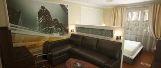
The design, where a sleeping place is allocated in the hall, is suitable for large families with children and the elderly. It is appropriate to separate the sleeping space with a beautiful partition, folding screen, curtain or furniture.
Zoning
Space zoning is the most pressing problem for studio apartments. Zones can be divided:
- Actually;
- Conditionally.
The easiest way to solve this problem is with the help of decorative partitions. They will not only divide the space, but can also be beneficial if we are talking about through shelving or walls with niches. An arch that will stretch across the entire room will completely protect the sleeping area from the prying eyes of guests, but it will add “heaviness” to the space and ground it. For conditional zoning, curtains or portable screens are suitable. A stand with a TV can also be placed on the “border” zone, thereby fencing off two different “worlds”. One of the most original design ideas is the placement of a universal stand that can be used both for work and for tea drinking. She partitions off the bed and adds another seating area instead of a low coffee table. The actual border will be not only the wall, but also sliding doors made of translucent plastic. If the style allows this, then a pattern can be applied to the surface of the door that will emphasize the general direction of the design. Another type of space zoning can be a two-level floor, when the sleeping area is located on an improvised “pedestal”.
Scandinavian style
The ergonomics of the Scandinavian style excludes the presence of random details in the interior. Each element of the decor should be aimed at creating a comfortable atmosphere and convenience for the owners. Scandinavian design is characterized by the following features:
- ease;
- conciseness;
- combination of sophistication and simplicity;
- stinginess of furniture and decorative elements;
- abundance of light sources.
In some ways this direction is similar to minimalism. But there is no asceticism characteristic of a minimalist setting. One of the most interesting design moves when decorating a home of 50 square meters. m in the Scandinavian style is the expansion of the hall due to the kitchen area.
This solution allows you to comfortably receive guests and freely talk with relatives while cooking.
The color design involves the use of light shades. Bright accents are allowed only in accessories. The main tone in Scandinavian interiors is white. Furniture facades in wood tones and stylish interior decorations look impressive against its background.
The style accepts the use of exclusively natural materials, the favorites of which are:
- wood;
- natural stone;
- antique-style metal;
- ceramics.
Furniture must be practical. When choosing it, you should adhere to the simplicity of the forms. Closed storage systems are welcome.
The following accessories are allowed:
- carpets;
- home textiles;
- knitted bedspreads;
- animal skins.
Initial stage of registration
The initial stage of development of any project for arranging a living space begins with highlighting design features. Details such as niches, openings and projections, the placement of wall partitions and window openings can in many cases be used in a positive way.
It is also important to maintain a feeling of free space in a 50-square-meter apartment. The style trends of classicism, with their light shades of design, and more modern trends of minimalism, hi-tech, loft or eco-style, which are distinguished by geometric design, strict lines, non-standard lighting techniques and uniform surfaces, are perfect for this.
And some new design innovations will help turn an ordinary apartment into a unique platform.
To answer the question of how to design an apartment, and the final result of the arrangement was successful, you should pay attention to the following points:
- the total budget for all manipulations, taking into account unforeseen expenses;
- individual design features of the layout with their correct implementation during the work;
- the wishes of each family member, in order to obtain the most functional living space;
- correct placement of each item in the overall interior composition;
- choosing a suitable style.
High tech
High-tech is also appropriate in furnishing a home of 50 square meters. m. Its main features:
- functionality;
- clarity of lines;
- geometric shapes;
- minimum decor;
- non-standard designs;
- an abundance of glass and metal;
- a large amount of equipment;
- good illumination (cold spectrum).
Liquid wallpaper or paints are usually used as wall decoration. The ceiling is hidden under a stretch film. Floors are made of self-leveling or granite. An alternative solution could be linoleum or smooth-pile carpet.
As for the color palette, the most commonly used colors are ash, white, black and metallic shades. Rich orange, green, red and yellow splashes are added as accents.
High-tech is the choice of active people striving for constant improvement of their abilities and skills. It is not acceptable for a child’s room, but a teenager will feel very comfortable in such an interior.
You may also like
Interiors
Liberty Island
26.11.2018
The magnificent Dilido residence is another architectural masterpiece from the Saota bureau, known throughout the world for its bright and original […]
More details
Interiors
Passion in the East
08.07.2018
One of the most unusual projects in the collection of architects Anna Kulikova and Pavel Mironov is permeated with the atmosphere of ancient Babylon and Egypt. Story […]
More details
Interiors
Color magic
14.04.2020
The aesthetics of modern style as a reflection of the times - simplicity of form, ease of layout and functionality. But an individual accent is certainly [...]
More details
Interiors
Sergey Estrin – country house
11.05.2018
Architect Sergei Estrin - https://estrin.ru considered his main task in working on the project of a country house in the Moscow region [...]
More details
Interiors
Cafe-fair in the heart of the capital: design project with a festive touch
27.03.2018
New project from the Sundukovy Sisters Design Studio - https://sundukovy.com - Zaryadye Cafe Task A modern gastronomic market of national food, […]
More details
Interiors
Selecting the best
25.04.2018
In the short list of the capital's top luxury hotels, a special place is occupied by the Lotte Hotel Moscow, located on Novinsky Boulevard. Already upon entering the lobby of a five-star […]
More details
Art Deco
Art Deco style combines classic and modern styles. It allows the designer to play with different shades. For the background, you can use purple, wine, sapphire or emerald shades, and give secondary roles to blue, black, gold, and silver colors.
Shocking style is characterized by:
- Accent approach to wall decoration and furniture.
- An abundance of expensive unique decor.
The accessories can be:
- mirrors in luxurious frames;
- crafts made from valuable wood, agate, opal, onyx, silver;
- high-quality handmade tableware;
- embroidered pillows;
- groups of sculptures;
- items in ethno style from Africa and Asia.
This setting looks unfinished, since there is always room for further development of the theme.
Bedroom
When decorating a bedroom, they most often choose the classic style. Given the lack of space, the furnishings of this room are usually sparse, so you can make up for it with details, luxurious fabrics and wallpaper. Priority should be given to light colors:
- Relaxing blue;
- Delicate turquoise;
- Pale green color;
- Neat pink;
- Soft yellow.
Two or three colors are used in combinations. Everything else is formed in the play of their shades. The bed is chosen from wood with ornate carved patterns. It is covered with a plain blanket, which becomes a field for placing pillows with exquisite patterns. For curtains choose dark colors that highlight the texture of natural materials. The curtains are set off with weightless tulle in light shades. A series of pictures in rich frames will bring life to the bedroom decor and complement the floral wallpaper. The picture will be completed with a few “green” touches in the form of indoor plants on special stands.
Helpful advice. To decorate a bedroom in one of the modern styles, use natural materials: wood, marble, metal, stone. The “cold” interior is diluted with soft and warm patterns on upholstery and wallpaper. A few bright accents in the form of floor lamps, a decorative table or a pair of poufs will break up the feeling of excessive “museum-likeness” of the room.
Minimalism
Minimalism is a kind of adaptation of Japanese style. The characteristics of this direction of interior design are as follows:
- elegant simplicity;
- practicality and versatility;
- brevity and restraint;
- an abundance of regular geometric shapes and straight lines;
- minimum number of decorative elements;
- clean color palette.
White is used for the background, gray and black are used as contrasts, and red is used for accents.
Wall decoration can be anything. Painting, plastering, decoration with liquid wallpaper, and cladding with PVC panels are acceptable. The ceiling is usually made suspended, although tension structures are also appropriate. Laminate, parquet, cork or smooth-pile carpet are laid on the floor.
Oddly enough, the furniture may not have the correct shape. Softening lines is in fashion today. The designs are distinguished by an abundance of glass and metal elements. Furniture should be present in a minimal amount; its items should dissolve in the space of the apartment.
It is important to ensure that the upholstered furniture is low, rectangular in shape and upholstered in cotton or linen.
The decor should be represented by single expressive details that emotionally enliven the environment. Original textures and materials only emphasize the uniqueness of the minimalist style.
Renovation of an apartment of 50 sq. m provides a variety of planning and stylistic solutions for any budget. Of course, you can choose and implement a suitable arrangement option yourself.
But here there is a high risk of making a mistake and turning living space into a poorly planned kennel. Therefore, it is better to entrust this matter to specialists. They will take into account all your requirements, and you will receive spacious, stylish, well-designed housing that meets all your wishes.
Furniture
The furniture should also be harmoniously combined in the connected kitchen-living room. Old Russian style, country, vintage - this style direction is best suited for a kitchen in a wooden structure. In this situation, light furniture made from natural wood is needed.
It all depends on the interior of the kitchen-living room, so chairs and a sofa can be decorated with leather or unusual fabric. The table is most often placed in the center: it should be stylish and beautiful, as it immediately attracts attention. The floor can be made of wood or glass.
View this post on Instagram
Publication from Alexey Volkov (@alexey_volkov_ab) Sep 9, 2022 at 11:54 PDT
Do not clutter the entire room with cabinets if kitchen furniture is installed in the work area. But if you put vases, figurines and much more in a transparent cabinet, then its use will be appropriate.
Photo of an apartment of 50 sq. m.
Please repost

Download the Interior Design 3D program
Create a design project for a Euro-room apartment yourself.
Interface language: Russian
Distribution size:98 MB
Content:
- 1. What is a Euro-room apartment and its features
- 2. Advantages and disadvantages
- 3. Layout options for a two-room apartment
- 4. Arrangement options
- 5. European-style furniture arrangement
- 6. Common mistakes
- 7. Photos of interior design examples
An example of a Euro double room design
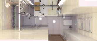
A small bathroom is not a problem
When decorating a small bathroom, you should give preference to snow-white glossy materials. With their help, you can slightly increase the visual perception of space.
Proper placement of plumbing elements will help free up several meters. So, it is better to install a shower stall instead of the usual bathtub, next to which a washing machine can easily be placed. Simple design techniques will help you achieve excellent results when organizing your living space.
Change minus to plus
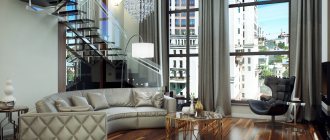
A significant ceiling height can be both a big plus and a huge minus when decorating a home. It all depends on how well the space is designed, how the poor proportions of the rooms are corrected, and how visual accents are placed. Great heights are contraindicated for small nooks: being inside the “well” is too difficult psychologically. Perhaps, in order for an apartment to turn into a comfortable home, it will require redevelopment, thoroughly calculated zoning, and serious work on the selection of finishing materials. However, the end result - a spacious room, saturated with air, with expanded boundaries - is worth the maximum effort.
Selection of functional areas
The main thing is to decide which functional areas you need. If the area of your studio apartment is average, about 37-38 square meters. m, but not more than 39 sq. m, you should choose only the most necessary functional areas, discarding the unnecessary ones.
If you don’t like long family lunches and dinners, then you don’t need a dining area; in this case, you can install a comfortable transforming table or a stylish bar counter in the kitchen. If you rarely have guests at home, you may not have a living room in your studio; it can be replaced with a more spacious bedroom, work area or children’s room, depending on your preferences.
If your apartment is a little larger, then it can accommodate more functional areas, or, on a larger area, you can make more spacious areas. Having decided on the functional zones, their individual significance for you and their quantity, you can leave more space for one zone and less for another. This will allow you to make the most of the large space of your studio apartment of 60-65 sq. m. m. This area is the most optimal for planning a studio apartment, because more space will give you the freedom to choose interesting design solutions, and you will not be limited by boundaries.
Bathroom
The grain of the wood creates a great textural and tonal contrast against the sleek gray tiles in the bathroom.
A contemporary vanity crosses the wall with geometric patterned tiles.
The geometric pattern also covers the wet area of the bath/shower, creating a single fabric.
Source: www.home-designing.com
New layout in the secondary housing sector
Khrushchev, Brezhnev, Stalin... Many families live in them for generations and what suited the grandmothers seems impossible for their grandchildren to live comfortably. Like it or not, sooner or later you will have to deal with the issue of updating the design of a two-room apartment.
Correction of Khrushchev
Perhaps the most unsuccessful Soviet housing from the point of view of planning. There is only one thing to please: the fact that in an apartment of this type there are no load-bearing partitions, so it will not be difficult to redesign the space. Most often, they try to make an interior design original like this:
- adding a loggia area to the living room;
- removing the partition between the kitchen and the living room;
- combining the bedroom with the living room.
Maximize the space by adding a loggia area to your living room.
Almost always, the area of the bathroom, which in Khrushchev-era buildings is simply super cramped, is also subject to correction. Its area is slightly increased due to the entrance hall meters.
Brezhnevka correction
The question is extremely difficult, since almost all the walls in the apartment are load-bearing. You can add space only by combining a bathroom or adding corridor areas.
Connecting the corridor area to the living space.
Stalin correction
“The layout allows, if not to combine rooms, then to make them two-tiered”
This is where there will be something to work on. The layout allows, if not to combine rooms, then to make them two-tiered. The height of the ceilings allows this. Stalinka apartments are perhaps the only housing where you can easily turn two rooms into three or create a luxurious studio-type apartment, which can be imagined as a mini showroom. But, ironically, the inhabitants of such luxury housing follow the beaten path and prefer to still connect the kitchen and hallway adjacent to one of the rooms in the design of a two-room apartment.
The height of the Stalin-era ceilings allows for a second tier.
Storage space
Two-room apartment 54 sq.m. did not provide room for a wardrobe. The solution was to place cabinets.
The cluttering effect was eliminated through the use of built-in appliances, the height of which is from floor to ceiling. The color fauna of the cabinet is filled with blue tones.
- What are video instructions for?
- RENT A CAR
- Electrical cable AVBBSHV
In addition, a chest of drawers was installed with an integrated countertop. The housing space was used as rationally as possible. As a result, the following were installed: a wardrobe on the wall above the sofa, a folding bed, drawers under the children's bed, and a niche behind the mirror.
Bathroom
The motif of round mirrors continues into the bathroom, this time with bright lighting. Smooth wall tiles create a soothing backdrop for the wicker laundry basket.
White accessories balance out the bathroom sink.
A shower cabin in a black frame will be a striking addition to a black heated towel rail.
Razor-thin toiletry shelves cut up the shower wall.
