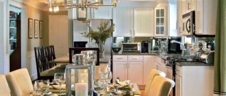
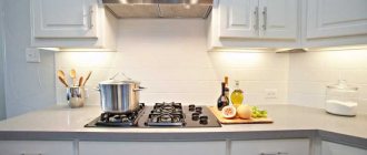
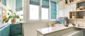
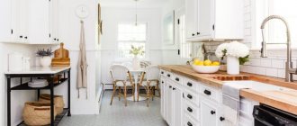
A large kitchen is the dream of many women. This is not just a room, but the center of the apartment - here we eat food, here we bring guests, here we have long intimate conversations. In the large hall you can place more cabinets for beautiful dishes and pots, and accommodate more family members. And if the kitchen is connected to the living room, you can give all the space to a small child, almost without being distracted from cooking.
But you need to know how to decorate a large room. How to arrange the drawers so that what you need is nearby, and where to put the refrigerator so that you don’t have to run far to get it? Where will the table look best, and will the bar counter get in the way?
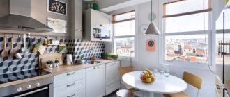
Modern kitchen design with large windows
The combination of red, white and black colors in the kitchen interior looks very beautiful
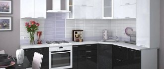
The combination of black and white colors in the kitchen interior will look very beautiful
How to design a large kitchen: the best ideas for effective interior design
You need to approach the choice of headset wisely. This is not a beautiful sideboard that opens on holidays, or a closet in a dark hallway, comfortable and strong, but simple. The kitchen should be functional, easy to use, and at the same time beautiful.
See also Original design techniques for a kitchen with a window, photo.
What should you pay special attention to when decorating your kitchen?
| General color tone of the room | Light, a contrast of soft beige and dark brown, or colorful, red cabinets, green sofa and polka dot curtains? There are many design options and you need to choose the most suitable color scheme, where it is pleasant to wake up in the morning with a cup of hot coffee and calmly drink cocoa before bed, resting from a long and hard day. Typically, bright colors are more suitable for a small room; in a spacious room, you can make only a few rich accents or stick to calmer and harmonious shades. |
| Set | Classic or modern? Natural wood or shiny gloss? What kind of lockers and their number? Here it’s worth thinking through both aesthetic and functional qualities, remembering the apartments you’ve visited, noticing convenient and inconvenient options for the location of lockers. |
| Apron | It should match the kitchen set and countertop, as well as the wallpaper in order to properly set off them. |
| Wallpaper | The main thing is the furniture, and everything else sets it off and complements it. It is better to choose light-colored wallpaper to visually enlarge the space, with an unobtrusive pattern. |
| Flooring | It is best to make tiles or panels from PVC, otherwise moisture, dirt and objects that frequently fall from the countertop can damage the laminate or wood covering. In a large room, it is worth making a durable floor along the countertop or in the cooking area and another, cozy one in the relaxation and eating area. |
| Furniture | It must match the style of the set, the table and chairs must be either classic or modern, otherwise there will be an unpleasant dissonance. In a large kitchen, a corner would be appropriate - a soft corner sofa in front of the table, which would be nice for the whole family to sit on. |
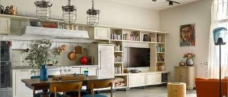
Design option for a kitchen combined with a living room
You can combine completely different colors in the kitchen
See alsoColor combinations in the kitchen interior
Recommendations for choosing design colors
Design experts usually say: the kitchen should have light, calm colors. Dark ones are impractical. Bright colors are always a risk. But the risk often pays off. This is confirmed by several examples where an unconventional approach to color schemes made the kitchen impressively beautiful.
From the above photos we can draw another unexpected conclusion: pure colors of furniture and decoration are not the best solution. It’s the “dirty shades” that win here, or more precisely, the softened ones. Then even the brightest color becomes appropriate.
If we move on to specific color solutions, then a joyful, upbeat mood should be expected from the following colors:
- white. From the housewife's point of view, a white kitchen is not entirely practical, especially if it is glossy. But we should not forget that the most valuable property of Total white is to soften any bright colors and balance the balance of shades. At the same time, sterile whiteness leads to headaches and eye strain;
- light gray. Interesting color. While preserving the advantages of white, it neutralizes its disadvantages;
- beige. The kitchen looks gentle, cozy, comfortable;
- creamy - perfect for cooking and eating;
- all the variety of yellow is the color of a great mood, happiness, a sunny day, even if it’s cloudy outside and the dull autumn rain is falling. Yellow cuisine stimulates a surge of strength, causes pleasant sensations, and stimulates the appetite. But it should be borne in mind that the rich yellow color has a negative effect on some people: it causes anxiety, tension, loss of strength;
- blue. Perfectly relaxes and calms the nervous system after a hard day at work. The effectiveness of therapeutic effects on the body and soul is comparable, according to doctors and psychologists, with a long bath or massage;
- pink. Pink cuisine calms, eliminates signs of anxiety, recharges with energy, gives a feeling of lightness;
- soft green - the most pleasing to the human eye. Psychologists say that green is associated with life, nature, and renewal. In the kitchen, green helps people with great physical or mental stress relax;
Calm, light colors in the kitchen.
The listed colors are suitable for almost all interior styles.
The following colors are taboo in the design of a large kitchen:
- poisonous acid - depresses, causes apathy and loss of strength;
- dirty gray - associated with dirt, sloppiness, bland food;
- brown - makes you want to quickly finish your meal and leave the room. Knowing this, many restaurants deliberately paint their walls brown. Suitable for those who want to lose weight;
- bright red - leads to overexcitation, disruption of perception of the surrounding world, which negatively affects food intake.
In conclusion, here is one color rule in design that is not advertised, but works flawlessly. It consists of three numbers: 60, 30, 10. This means that there should be 3 colors in the kitchen:
- 60% - the main color scheme, dominant in volume - walls;
- 30% - additional - kitchen set;
- 10% - accent - tabletop.
Color balance rule.
Violation of color proportions in the kitchen leads to unpredictable results. A striking example is in the photo below. I wonder who would agree to live in an apartment with such a kitchen.
I wonder how many people would like to cook and eat in a kitchen with such a design every day. Photo taken from open sources. Yandex. Images.
The color palette is a matter of taste, and therefore our recommendations are not the ultimate truth when designing the interior of a large kitchen. The main rule in choosing a color is to follow your own feelings and choose the color scheme that brings pleasure and gives a great mood to the owners of the house.
Linear way to plan a large kitchen
In this case, the kitchen set along with the refrigerator is located in one row - this arrangement option is acceptable if you have a long and narrow room, there is no way to make a corner, the countertop under the window will look out of place, and when installing the second row of cabinets it will no longer fit. A linear kitchen looks good in any room; it is laconic and does not clutter up the space. It is important to consider that the sink is not located next to the hob - this is inconvenient when cooking, since water splashes onto the stove and grease splashes into the sink. It is also not recommended to install the oven next to the refrigerator so that the latter does not heat up.
Kitchen design in white with pink chairs
Additional lighting is installed on the ceiling, and the kitchen floor is made of ceramic tiles
Unusual lampshades for chandeliers will perfectly complement the kitchen interior
See alsoUnusual kitchens
Two-row layout
An analogue of a linear kitchen, applicable for a spacious apartment, is a two-row kitchen. Such a project involves the arrangement of household appliances and cabinets according to the principle of symmetry.
One of the furniture walls in such a layout is quite capable of serving as a decorative element. It can open into a closet, cellar, or adjoining room.
When placing the headset on different sides of the window, the window sill will become an excellent place for drinking tea, reading, and viewing social networks.
Two-row kitchen layout
It is appropriate to place two rows of cabinets in a long and narrow room; in this case, all the walls can be hung with drawers, a passage to the window can be made in the middle, and part of the table top will serve as a dining table with high chairs. Another option is to place a kitchen table with chairs by the window, and place a tabletop with drawers in two rows along the walls closer to the entrance. This is a convenient option that every housewife will appreciate - all useful surfaces, sink, stove, refrigerator and microwave are located nearby.
You can put a TV in the kitchen and watch movies while cooking
A chandelier in the kitchen will harmoniously complement the interior
See alsoKitchen design 10 sq m in a P 44 series house with a box: arrangement options
Rules for comfort
Triangle rule
Every person who knows how to cook at least a little knows that in the kitchen there are three main objects around which all kitchen life revolves:
- this is a refrigerator from which food is taken out and into which excess is removed;
- this is a stove on which everything is boiled, stewed, fried, and in which everything is baked;
- This is a sink over which vegetables are peeled, in which they are washed, and in which water is collected.
Everything you need is at hand
To make it convenient for the person cooking, you need to make sure that an isosceles triangle is formed between these objects, and its sides should not be too long. Then moving between them will be easy and convenient.
In a small kitchen, the “triangle” rule can be neglected - everything is already at hand. In a large kitchen it must be observed.
Bright large kitchen in a private house
Availability
Everything you might need while cooking should also be at hand. Dishes? In the cabinet next to the stove, for example. Cereals and vegetables? In the bottom drawers of the same cabinet. Spices? Somewhere on a shelf. Everything should be close, otherwise the one who cooks will have to rush not only around the kitchen, but throughout the house in order to deliver the needed pan from the pantry or from another room.
Accessibility rule in the form of open cabinets
Large corner kitchens in a spacious room
A corner or L-shaped kitchen is a cozy option that reduces the distance between the hottest spots. In this case, the space is zoned into a working and dining area diagonally - in one corner there are sets, in the opposite there is a corner sofa and a dining table. This makes it possible to use more space, if, of course, the layout allows it. Corner drawers can be used effectively if equipped with convenient fittings, and in the corner you can install a large sink that is easy to access.
The combination of white and turquoise in the interior of a combined kitchen and living room looks very beautiful
It will be a pleasure to cook in such a kitchen.
Kitchen design is made in a modern style
See alsoKitchen design with a geyser: where to start the renovation and how to save space?
Thinking about lighting a large kitchen
It is important to understand that the lighting in the kitchen should be special. It is imperative to take care of high-quality lighting of the work area. To do this, you will need several spots with rotating devices or point diode microassemblies. Separate lamps, as bright as possible, should illuminate the sink, food cutting table, stove and oven. More subdued lighting is implied above the dining area. Some designers offer an original solution - a cozy floor lamp near the table.
For your information, with the help of light you can slightly change the feeling of space. If light sources are placed around the perimeter of the walls, the total area of the kitchen will appear larger; vertically located lamps will visually raise the ceiling. In this way you can give an already large space a feeling of “depth”.
Island kitchen layout
An island layout is a kitchen where some of the countertops, cabinets and kitchen equipment are placed in the center of the room. This part can be used for cooking and as a table with high chairs. In the latter case, the eating space is delimited from the cooking area. But there are some difficulties here. Firstly, such a layout requires a large room; squeezing past the island is inconvenient. Secondly, if you move a sink or stove onto the “island,” problems may arise with drainage, installation of a hood, and wiring of electricity. All these nuances should be thought through at the initial stages of repair.
Kitchen design is made in white color
Kitchen design made in chocolate color
See alsoLighting design for a modern apartment: a professional approach
Opening upper cabinets
Swing
This option is my favorite when it comes to upper cabinets. Simple, inexpensive, durable.
Folding
If you choose folding facades, then do not skimp on fittings. Cheap gas lifts will quickly become unusable.
Folding
Expensive, but a beautiful and convenient option! But if you are short, it will not suit you.
U-shaped kitchen layout
The “P” shape is suitable for small rooms where you want to save space. In this case, part of the tabletop near the window is also a table, towards which high stools are extended. However, this may be inconvenient for those who like to sit with their backs to the wall. Another option is a U-shaped kitchen in a spacious room. It is called peninsular - it does not occupy 3 walls and 2 corners, but forms a peninsula in the form of a bar counter or work area perpendicular to the wall. In this case, there is a separation of the working kitchen area, in which everything you need is at hand. In this option, it is important to make sure that in the future the nook does not interfere with movement, and you do not have to go around it again.
It will be a pleasure to cook in such a kitchen.
Wooden furniture in the kitchen will look very beautiful and environmentally friendly
Dark wood furniture will harmoniously complement the kitchen interior
See alsoDesign of a kitchen-living room with an area of 15 square meters. m.
Headset bending shape
The layout of a large kitchen-dining room is carried out taking into account the shape of the room allocated for it. Proper calculation of the furniture configuration will allow you to get enough space for maneuvering, cooking, washing the floor, and the passage of household members and guests.
From an ergonomic point of view, in a spacious kitchen it is better to install a set in the shape of the letter L or P. As for straight and angular options, they will be more appropriate in small apartments and summer houses.
Zoning a large kitchen: design techniques
- Visual zoning - the set is in some colors, and the wallpaper and furniture are in others;
- Different floor coverings - tiles or PVC in the working area, laminate or carpet in the dining area;
— Ceilings at different levels with LEDs can also emphasize zoning;
— In a long room, a good way would be to place the kitchen set in two rows in one part of the room, at the entrance, and the dining group in the other, closer to the window;
— You can “finish” the kitchen with a transverse bar counter, and then install a dining area.
Design option for a kitchen combined with a living room
The photo shows a kitchen design in a modern style
See alsoTypes of bar counters for the kitchen: options, sizes, materials, stylish accessories, design photos
Classic style
Signs:
- only symmetrical lines;
- bright hues;
- natural materials;
- graceful forms.
Elegant kitchen in classic style.
Note! This style uses only expensive natural (imitation) materials, for example, curtains made of natural fabrics, furniture made of natural wood, a crystal chandelier, and so on. A feature of the classical style was the use of a huge amount of decor (forging, drapery, stucco, carving, and so on). All interior elements should be in harmony with each other and create a solemn appearance.
In the classic style, only expensive and natural materials are used.
Country elements in modern design of large kitchens
“Country” means rustic, but in our understanding, “country style” symbolizes, if a village, then not a Russian, but rather a French province. This is a cozy interior in soft pastel colors, a lot of wood and beautiful openwork things. In contrast to the angular forms of modern fashion, country will never cease to be a trendy style.
Design option for a small forge with high ceilings
White color and wood will go very well in the kitchen interior
The combination of different colors in the kitchen interior looks amazing
See alsoHow to remove odor from the refrigerator at home easily and simply
Design styles for spacious kitchens
The design of a large kitchen in a private house or apartment can be decorated in different styles.
Classic
A site visitor who knows a little about art will immediately exclaim: there cannot be a classic style in the kitchen. After all, it does not fit, literally at all, with a refrigerator, microwave, dishwasher, cabinet door closers, i.e. with everything without which a modern kitchen is not a kitchen. All this is true. Modern technology destroys the image of old, respectable England, where this style came from.
For information: classicism in art originated in Ancient Greece. The first sprouts of the direction in architecture appeared in France, during the time of Louis XIV, in the interior of the classic, as a direction in design, it was formed in England. Therefore, the style is sometimes called English.
But you can use a microwave to imitate a wall cabinet, keep a food processor not on the countertop, but in a cabinet, close the dishwasher with an additional door, which has recently been done by all manufacturers of kitchen units, regardless of style, buy a gas stove, specially aged, disguise the refrigerator as a cabinet .
Classic style in the kitchen interior. Photo taken from open sources. Yandex. Images.
The main features of the classic kitchen style:
- the color is muted, not flashy. It can be white, beige, terracotta, mustard, dark red and green, faded blue;
- natural materials: copper, bronze, silver, wood, ceramics, glass, stone. Decorative fabrics: cotton, linen and silk go well with basic materials;
- no-frills decor: paintings with a simple still life or meal, family photographs in wooden, unpainted frames, various panels, embroidery, porcelain figurines, floor vases;
- floor - wooden or ceramic: tiles, porcelain stoneware. In this case, the tiles should be large in size;
- ceiling - white, matte with various plaster stucco moldings;
- walls - painted with stucco decor or covered with textile wallpaper. Additionally, you can sheathe the bottom with wood;
- furniture made of wood or “wood-like”, simple, good quality, reliable. A round table, chairs with soft seats and bent legs, a wooden set with panels;
- the light is warm, yellowish. Sources: chandelier with pendants and sconces. No built-in or hanging lights;
Classic chandelier.
- dishes - porcelain or metal, but aged.
Neoclassical
Neoclassicism is a style that does not exist in reality. The idea of large kitchen design mixing old and new originated in the USA, but quickly found imitators all over the world. Its essence is to combine royal style with modern materials and equipment. There is no longer any need to hide or disguise anything. On the contrary, modern kitchen equipment emphasizes the grandeur and monumentality of classics in decoration and furniture. Kitchens look modern and laconic.
Characteristic features of neoclassicism in the kitchen:
- symmetry and proportionality of the situation;
- elegant, but at the same time discreet decor;
- clear geometric shapes of the room, furniture and equipment;
- natural or natural materials in everything from finishing to furniture and flooring;
- table, chairs and cabinets, the same as in the classic kitchen;
- high ceiling;
- color palette of calm colors.
Neoclassicism in practice: beautiful and practical.
Loft
The design trend in the loft style originated in the USA, when plants and factories began to be actively moved outside the city. Vacant industrial buildings and warehouses began to be actively converted into housing and rented out. The new owners were not keen to invest in decoration. Therefore, the walls and ceiling had their original appearance: beams, pipes, communications, roof. This is where the loft style arose. Literally - attic, top floor or attic. Currently, there are varieties of style:
- industrial;
- glamorous;
- Bohemian.
Characteristic features of a loft style kitchen:
- brickwork;
- rough plastered walls;
- open utility network;
- high ceilings;
- any decor. It all depends on imagination and the amount of money;
- the furniture can be both antique and ultra-modern;
- floor - varnished boards, concrete or ceramic tiles with a texture imitating wood or concrete.
A tall plant in a pot will liven up the kitchen.
Color. White, gray, in small quantities black.
Ceiling. Plaster without grouting or leave in its original form. Beams made of wood or metal are attached below.
The walls are made of brick, white or red. They paint or plaster only if they want to separate the dining area from the workspace.
Kitchen set. Most often dark, plywood-like, with many metal inserts.
The decor on the walls is graffiti or posters from the last century.
Dishes. It can be any - there are no requirements.
Loft in the interior of the kitchen. Photo taken from open sources. Yandex. Images.
Country
Nostalgia for country life drives the desire to decorate the kitchen like your grandparents'. The main design elements in this direction:
- simple, rough furniture that imitates handicraft;
- natural materials: wood, textiles;
- an abundance of fabrics: tablecloths, napkins, waffle towels, covers for pillows and furniture, rugs knitted from fabric;
- a lot of embroidery - ornaments, floral patterns, checkered patterns;
- old dishes, including a samovar, large, pot-bellied teapots.
Country. Photo taken from open sources. Yandex. Images.
Provence
Provence is also country, only with French motifs. Distinctive features of a Provence style kitchen:
- pastel colors of walls, furniture, kitchen units;
- big windows;
- a lot of light, including due to lighting;
- old or artificially aged furniture;
- abundance of carvings;
- many indoor flowers;
- clay dishes;
- natural fabrics;
- many vases and figurines.
Provence style in the kitchen interior. Photo taken from open sources. Yandex.Pictures.
Minimalism
The essence of the style is in its name - nothing superfluous, only the most necessary, strict geometric shapes. Household appliances are built into the set. No more than three colors in the interior. Finishes of the highest quality. The walls are smooth and monochromatic. The apron is clear or colored glass.
Minimalism.
Art Nouveau style for a kitchen of impressive size
Modernity implies a rejection of excesses. Fewer monograms and carvings, more flat and bright surfaces, more usable space. Minimalism as part of a modern large kitchen design has a place in homes that value practicality. A spacious room does not mean that it must be filled with furniture; useful space does not force us to place souvenirs and decor on it. Everything should be in moderation, especially kitchen utensils. Fewer holiday plates pulled out every two years, less dust and more space are good principles for interior design.
Design tips from the experts
Increasing your kitchen space is not an easy task. Most often, professional help from a designer is required. Recommendations for expanding the kitchen space are as follows:
- Using all angles. A corner set is suitable here. Now there is a huge selection of functional kitchen furniture. It has become popular and fashionable. It is worth carefully considering each proposed option and not rushing to make a choice. Kitchen furniture has become more technologically advanced: drawers, countertops, carousel shelves, pieces without corners. Each such element contributes to saving the entire kitchen space. Don't underestimate the little things and details. Precise thought is an important condition for the successful design of a cooking room and saving every square meter.
- Use of open shelves. They give the kitchen a feeling of airiness and lightness. It is worth noting a large number of advantages in use:
- do not require much space;
- come in all sorts of configurations;
- fit perfectly into non-standard openings and fill any corner;
- increase the space, making it lighter and more open. There is no clutter effect;
- easy to use thanks to ergonomics: everything you need is at hand;
- convenient for storing items - jars with spices and herbs, kitchen utensils, cutlery.
An insignificant disadvantage of such products is that they need to be wiped much more often than shelves with doors. Considering how easy it is to do, the downside is really not that important.
- Using backlight. It is a must-have for a compact cooking space. Small lamps should be installed in kitchen structures. This will give the room additional volume, an atmosphere of comfort, coziness, and warmth. Working in such a kitchen is a pleasure. In addition to small lamps, you can use chandeliers and LEDs as lighting.
Features of the interior of a large kitchen in a fashionable loft style
This interior is a contrast between a new set and an old-looking wall, clean drawers and visually dirty brickwork. In such a room, you subconsciously reach for the familiar benefits of civilization, and a soft sofa with a clean tabletop seems especially cozy.
Kitchen design in cream color with ceramic floor
Kitchen design made in chocolate color
Color and materials in a large kitchen
Determining the color scheme will directly depend on the style you choose for decoration. Remember, in some styles you can combine no more than 2 color shades.
When choosing a color palette that is suitable for the design of a large kitchen, take into account the advice of psychologists - a calm color scheme sets a person up for emotional relaxation.
The color scheme is selected depending on the overall interior design.
Additional Information! Try to use natural materials; they will look harmonious in any interior, while remaining environmentally friendly.
Kitchens for a large kitchen: choosing a set
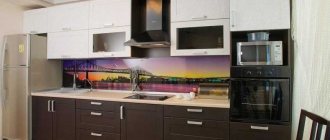
A kitchen set in a large room should be pleasing to the eye. It doesn’t have to be the most expensive, solid oak is chic, but if you are a fan of minimalism, then you should stick to modern styles. If in small kitchens the color and quality of the facades are the last thing you notice after the sunny weather outside the window and a delicious dish on the plate, then the one combined with the living room is a place that we boast to our guests, where you can sit and admire the surroundings. Fortunately, modern models have an endless choice of colors, textures and colors, both the cabinets themselves and the countertops, and you can choose any backsplash to your liking - from glass from an image of a city at night to light tiles with delicate roses. The choice is yours, you should like the kitchen, even if bright pink or, on the contrary, dark black cabinets seem ugly to someone, this does not mean that you should not do as your taste requires.
Choosing built-in kitchen appliances
Equipment built into furniture is a very practical solution. Of course, it itself should be compact and used on the farm. It is advisable to integrate all the equipment. For example, remove the oven inside the drawer, and use only the cooking surface instead of a conventional oven. A huge number of such devices can be found in household appliance stores.
An excellent option is a refrigerator or dishwasher built into the cabinet. This will save a significant amount of space, and most importantly, it will fit perfectly into the overall interior. It is difficult to find a better option for creating a harmonious environment than distributing equipment among cabinets. Therefore, this method is also used for arranging large areas. It is convenient, modern, simple, functional.
If there are open shelves, it is recommended to install small lamps above them, which will also add volume and airiness to the room.
Feng Shui cuisine
The fashionable trend of Feng Shui suggests that the interior affects the financial condition of the family living in a given house. Whether to comply with this or not is entirely your choice. Some tips:
- choose tones that are not harsh on the eyes (yellow, orange);
- Avoid dark blue and similar rich tones;
- combine wood with metal;
- provide good insolation;
- keep your desks in order;
- get rid of open shelves and sharp objects;
- isolate the area where you eat from the living room;
- do not combine the process of eating with something else (watching TV, talking, etc.);
- Avoid corner furniture and heavy curtains.
These tips are not the last resort, but many of them are quite logical, have been tested over the years and are quite useful in practical application.
Trending Design Aspects
Characteristic design elements must fully reflect the character. To achieve this, new trends are emerging that give kitchen culture a certain level of functionalism. One of the trending aspects is the installation of round-shaped furniture.
Installations without wall-mounted cabinets, as well as cabinets with easy pull-out drawers and door closers, also fit well.
It is possible to open the facades with one touch of a hand or foot (there are even such ones), and closing is carried out automatically by pressing. On such facades you will not find a classic handle; there is a regular slot. Quite often, facades have contrasting surfaces - this gives a unique style.
The lower blocks should be placed on high legs - this can give some lightness. Try to recess the base deeper. It is also a good idea to hang large blocks to provide additional spatial comfort for the feet.
One of the latest trends is the combination of the living room and kitchen. This is used even in the classic interior of a large kitchen. This makes sense unless you're worried about smells mixing in the living room and have good air circulation. To prevent odors from appearing in the living room, install a transparent, plasterboard or wooden partition. The actual area will remain the same, but the division will help solve problems with cooking aromas.
To give the design of a large kitchen a classic style, it is worth making a bias towards country.
The design is supported by stained glass windows, panels and other elements. To free up space in a large kitchen and make it even more spacious, use transformable furniture. Among them: various tables with a folding top, increasing the working area near the window, arranging the window opening with shelves. Functionality will be added by various storage systems for products under the ceiling, table or organized niche.
Make sure there is a sufficient number of seats, because in recent years it has become a central place for family and friendly communication. Now you can cook there, heat up food, just drink tea with friends or just chat.
There is also a trend of a straight solid line. The burners are arranged in a line, the sink takes on horizontal shapes, and the hobs and other utensils are located under hinged lids. The TV is also built into one of the cabinets, and the faucet is hidden in the wall. The basic principle that works in the field of design is that the less the kitchen looks like an ordinary one, the more stylish it is.
How to assemble a kitchen set
After the renovation is completed and you buy the kitchen set, you will need to assemble it. Unfortunately, representatives of the company from which you bought it will do this for an additional fee, therefore, it is better to learn how to assemble the headset yourself.
Step No. 1 – prepare the tools
In order to assemble a kitchen with your own hands, you will need to prepare the necessary tools:
- a screwdriver so as not to tighten the fasteners by hand;
- drill with a set of drills;
- jigsaw;
- hex keys;
- hammer;
- building level;
- pliers
- cutter;
- corners;
- centimeter tape measure.
Let's prepare the necessary tools
Step No. 2 – cabinet assembly
So, first you need to install cross-shaped fittings for hinged doors on the side surfaces. It “fits” onto the self-tapping screws.
Also, rails are mounted on the sidewalls, which are needed for retractable segments. This needs to be done at the very beginning, because doing it later will be problematic.
Cross fittings
Then, wooden dowels must be installed in the blind holes. These segments help achieve the following effects:
- assemble furniture much more evenly;
- increase the overall strength of the structure.
We connect cabinet segments with wooden dowels
It is better to fasten the dowels using glue.
After the dowels evenly fasten several parts together, you will need to use a hex key to screw in the screw that will finally connect them. A plastic plug is placed over the screw, which comes with the headset.
Step No. 3 – screw the legs
If the structure has legs, they will need to be screwed to the intended joint with the cabinets, and, if they have a regulator, the appropriate height for placing the furniture will be determined.
Screw the legs and adjust their height
In the case when you bought an inexpensive set of furniture, the legs will not be adjustable.
Step No. 4 – fastening fittings for wall cabinets and assembling pull-out segments
Add adjustable canopies to wall hanging cabinets. These canopies are installed on the upper corners of each cabinet.
The walls for drawers that slide out are assembled by analogy with cabinets, namely: they are first tightened with wooden dowels and then with screws.
It is necessary to assemble all three walls, and then install a piece of particle board on the bottom.
We fix the kitchen facade correctly and quickly
The facade is attached to the retractable segments of the headset as follows:
- a screw is screwed into it;
- the flattened side is installed in a hole in one of the sidewalls;
- Afterwards, a sleeve is installed in the holes on the sidewalls and rotated so that the flat part of the screw is captured.
Now guide rollers are installed on the lower sides of the assembled kitchen unit element, which are then connected at an angle.
Step No. 5 - installing the kitchen in place
To begin with, install the side cabinets. Remember that communications for washing are carried out through them, so do not forget to make holes in the walls for them in advance.
After assembling the kitchen, it's time to put it back in place.
After the subsequent cabinets are attached, they are immediately produced. height adjustment. If necessary, cuts are made in the boxes.
Once the cabinets are installed, secure them together using:
- self-tapping screws;
- furniture screed of intersectional type.
For a built-in sink, you will need to cut a round hole in the countertop in advance. This will need to be done before the countertop moves to its final location.
Before installing the sink, you must first cut out the countertop
Fastening the built-in stove is done by analogy, however, it is best to do this at the end so that the equipment is not damaged.
The tabletop itself, after all the cutting out of the parts, is attached directly to the wall. It’s okay if there is a small gap left, then you can hide it with a plinth.
If you have a corner kitchen, then you will have to join two countertops, using a metal strip that will hold them in place, and at the same time close the through gap.
Assembly of retractable kitchen segments
Wall cabinets are hung on the wall at a distance of at least 60 centimeters from the surface of the countertop. Holes are first drilled on the wall, onto which planks with hooks are attached, serving as a support for hanging cabinets.
The doors are attached to hinges that are pre-installed on the cabinet walls using self-tapping screws.
Step No. 6 - finishing work
Household appliances, hoods and other kitchen elements are installed in the assembled kitchen. This is done strictly according to the instructions, and it is better by the hands of specialists if you do not have the appropriate skills. But if you are confident that you can follow safety precautions, then go for it.
The final stage is the installation of equipment
How to make a kitchen set yourself, what designs are the most convenient and reliable? More details in a special article.
What materials should I use?
The list of materials for the production and finishing of kitchen units is quite wide. The facade can be made of wooden or metal materials. The tabletop is made from aluminum, chipboard, marble, granite, laminate, ceramics, and other materials.
If you are going to use metal objects, then remember that although they are durable, they have a high risk of being scratched. Using a laminate will ease the impact on your wallet and will not give the feeling of a natural material. Natural stone will give an atmosphere of reliability and high aesthetics, but it will have unpleasant marks from various liquids. When using artificial stone, the risk of damage is reduced, and if there are any defects, they can be easily eliminated.
The 21st century is characterized by the abandonment of materials such as plastic and laminate. Wood, tiles or metal are increasingly being used. With the help of these materials, it looks more like an upscale restaurant, with a more pleasant atmosphere for eating.
