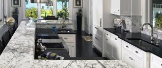
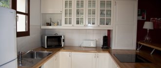
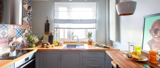
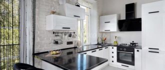
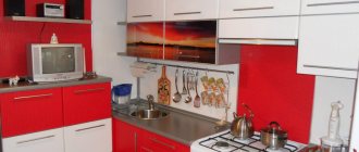
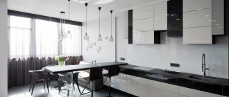
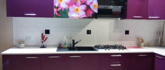
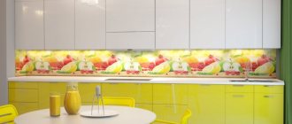
White color is a universal tool in the hands of a designer. With its help, they create classic, strict, dynamic, delicate interiors; it can be combined with any shades and styles. Despite all the advantages, a white kitchen with a white countertop is controversial. Let’s look at how practical this solution is and what design options are relevant today.
White kitchen with white countertops: advantages and disadvantages
White color is a symbol of joy, lightness, freedom, light. It contains all existing shades and is called achromatic, so it goes well with other tones. Previously, white was considered the color of aristocrats; only the richest homeowners could afford to have it in their interiors. It has been actively used in the kitchen in the last 5-7 years; before the advent of modern finishing materials, white was considered impractical and quickly losing its properties.
Advantages of white color in the kitchen interior:
- Visually increases the space. White has the ability to reflect light, making any room look more spacious.
- Combines with any shades. The universal color is often used as a background for bright interior details. The kitchen set and countertops in white will highlight the decoration and the rest of the furniture.
Contrasting combination
- Positively affects the psychological state. It has been proven that the abundance of light in the interior improves mood, speed of thinking, and even improves the functioning of the respiratory system. Helps you relax, calms you down, and doesn’t get boring over time.
- The best option for small kitchens and for those where there is no natural light source is a window.
Kitchen interior without window
Flaws:
- Gets dirty quickly. The kitchen is one of the dirtiest places in the house; the countertop is a work area and is a cooking surface. Modern materials and finishing compositions help avoid the absorption of fatty and coloring substances. But all crumbs, liquids, food residues are more noticeable on a light background than on any other. Constant monitoring of cleanliness is required.
- If used incorrectly, color can create the appearance of a sterile intensive care unit instead of a warm homely atmosphere. It is necessary to choose shades and lighting wisely, combine white with other colors to create a harmonious interior.
Contrasting details create dynamism
For those who want to create a completely bright kitchen, designers recommend using contrasting plumbing fixtures. Also built-in household appliances of a different color, decorative elements, for example, cabinet handles, textiles, paintings or photos on the walls.
Details bring the interior to life
Tips for choosing countertop colors
According to color science, every color has an impact on people whether they want it or not. When choosing a color scheme for your kitchen, you need to remember the basic principles:
- to increase appetite and good mood, you should choose orange or turquoise;
- to create a natural environment, preference should be given to blue and green shades, which also have a calming effect on those present;
- to visually increase the kitchen space, it is necessary to provide a countertop in light colors: they go well with cold shades and are ideal for kitchens whose windows face the sunny side;
- if the kitchen is located in the north side, you should choose beige shades or peach color for the countertop;
- To create a classic design in the kitchen, you need to choose white color, which creates an atmosphere of cleanliness. However, it needs to be diluted with other colors so that the room does not seem sterile;
- A yellow tabletop will attract the attention of everyone present, which is sure to lift everyone’s spirits.
Decorating ideas
As finishing materials for the walls and floor of a white kitchen in combination with a light countertop, you can choose dark, textured materials or choose a decor that sets off the color of the countertop and furniture.
Ceiling
A light ceiling in the kitchen is a classic, relevant at all times. There is another advantage of white color - it does not press visually and creates a feeling of infinity of space. The ceiling covering in the kitchen is:
- Glossy. Used in small spaces when you need to create a volumetric effect. The canvas has reflective properties and fills the kitchen with radiance.
Glossy multi-level ceiling
- Matte. Traditional option, suitable for all interior styles. The only negative for the kitchen is that if greasy or colored stains get on it, it will be difficult to remove them.
Matte ceiling
A colored ceiling together with a white kitchen is used if you need to zone the space. A multi-level design is created, where color accentuates certain areas, for example, a recreation area or a dining area.
Two-tone coating option
To decorate the ceiling use:
- traditional whitewashing and dyeing;
- plasterboard structures;
- stretch fabric.
Walls
Light kitchen walls with a light countertop are an excellent, harmonious combination. To prevent the kitchen from merging into one white spot, it is recommended to diversify the shades. For example, make the color of the countertop and apron snow-white, and the walls in creamy tones.
The walls are creamy
If you need a light, spring kitchen, bright walls will help create a joyful atmosphere. Use lilac, light green, yellow.
Green walls - bright interior
For a calm environment or classic interiors, universal tones are used: gray, beige, brown, dark green, deep blue.
Gray walls - classic furnishings
Modern urban interiors go well with black. Part of the wall can be decorated with a slate board for notes and photos.
For walls in the work area and for the apron, easy-to-clean coatings are used: ceramic tiles, porcelain stoneware, acrylic, natural and artificial stone, glass. The remaining walls can be decorated with waterproof wallpaper or paint that is resistant to external aggressive environments.
Floor
A light floor creates a special atmosphere of cleanliness and freshness, but if the kitchen is completely white, the effect of a hospital ward will appear. The interior needs to be diluted with contrasting elements, for example, appliances or decorative details.
Tiled floor to match the interior
Designers suggest choosing shades that are a tone or two darker than the wall coverings or furniture fronts. Over time, when the flooring wears out, the difference will not be very noticeable. An excellent option is to imitate natural finishing materials, such as marble, wood or stone.
Marble floor
It uses moisture-resistant, durable materials that are not afraid of drops of fat, the juice of colored foods, and are protected from falling heavy or sharp objects. Suitable: ceramic tiles, porcelain stoneware, moisture-resistant laminate, artificial and natural stone. There should not be large gaps between the elements; it is not recommended to use light grout.
Curtains and textiles
Textiles occupy a very important part in the design of classic interiors, and especially kitchens. It is better not to overuse it with lush, heavy and massive curtains. They accumulate dust, absorb odors, and are not very safe near the stove.
But in the kitchen, luxurious tablecloths, decorative napkins, and beautiful sets of potholders and coasters will be more appropriate than ever. Choose towels and other accessories from simple textured fabrics and decorate them with embroidery, fringe or tassels.
If there is a sofa in the bedroom, pay attention to classic jacquard or tapestry upholstery. The main thing is to choose fabrics that are easy to care for and clean, and you can add elegance with the help of decorative sofa pillows.
Which material to choose
An interior with a white countertop in a small kitchen can be entirely decorated in tone and complemented with bright details. For a large area, it is recommended to use contrasting colors that will help zone the room and detail it.
Contrasting flooring and details
Kitchen set
Cabinet fronts are made of MDF, chipboard or natural wood. They are coated with a special compound against moisture and temperature changes. The shade of the material from which the facades are made may match the color of the countertop or be slightly darker.
The tabletop itself is made of acrylic, wood, natural stone or MDF. The dense surface is resistant to mechanical damage, washes well, and can withstand high temperatures.
As contrasting elements, chrome-plated plumbing fixtures in copper, gold or silver are used here. Handles on cabinet doors support the shades of the fixtures. For some styles, a black sink, faucet, and small decorative elements are appropriate. Contrasting details look stylish and complement the light interior.
Black integrated sink
Furniture facades are:
- Matte. Suitable for traditional styles and urban, brutal interiors.
- Glossy. Look good in modern, laconic styles. The surface of the facades has a reflective effect, helping to fill the kitchen with light and volume. Great for small kitchens.
Lunch group
The countertop on the table or bar counter is most often made from the same material as the countertop in the work area. Horizontal surfaces in the same color scheme, including the window sill, look good.
If the dining area is large, you can make a tabletop made of glass or other material of contrasting color on a light table base. Artificial or natural stone and wood are widely used.
Classic kitchens in light colors
A kitchen made in a classic style will never lose its relevance. She will immediately say one thing about her owner - he knows how to feel style and see beauty.
Such an interior is not overloaded with a large number of details, it is simple and laconic, but at the same time it is decorated with interesting and simple accents, it always looks cozy and, if necessary, even festive.
The color of the walls in a classic-style kitchen is white, beige, olive, vanilla, and cream. But the furniture can be of both light and dark colors.
Opt for the following headset colors:
- pearl;
- olive;
- peach;
- chocolate;
- lactic.
And there should not be overly saturated, flashy colors of kitchen furniture in classic designs.
A set made of solid wood or wood-painted material looks best in a classic-style kitchen.
Despite the seeming “boring” and commonplace, the color range of natural wood shades is very wide:
- Red tree;
- nut;
- pear;
- oak;
- pine;
- bleached oak.
One of the disadvantages of light kitchens in a classic style is their high cost, since natural materials are sometimes expensive.
But the undoubted advantage of classics is that it is an indicator of the owner’s sense of style and status. Most often this style is used in spacious apartments or country houses.
Which apron to choose
The work area requires a protective material that will protect the wall from drops and stains. For light facades and traditional designs, choose matte shades to match the countertop. In small kitchens, glossy surfaces are used; they visually increase the space.
For modern styles, a black apron would be an excellent solution if this color is repeated in the decor or decoration. A transparent glass protective coating on plain wallpaper to match the walls looks stylish and laconic.
A bright, plain apron with a geometric or avant-garde pattern will help enliven the interior. Gradients, mosaics, stained glass, and tiles of multi-colored elements are used. The color should match the decoration of the kitchen area and be repeated throughout it.
Patchwork
Imitations of natural materials are relevant: marble, wood. For some styles, brick or stone masonry is appropriate.
Materials for the apron: ceramic tiles, glass, acrylic, stone. They should be easy to clean and retain their original appearance for a long time.
Features of the classic style
For all its traditionalism and rigor, classics in the interior are much more diverse than it might seem at first glance. There are dozens of interpretations of the canons and origins of this style in the world, related to regional characteristics, era, and fashion trends.
Initially, classical interiors are a heritage of Greek and Roman ancient traditions. Luxurious decoration, stucco molding, marble columns, massiveness and simplicity - this is what inspired European classicism of the 18th century.
But not just antiquity, because numerous historical styles of the 17th-19th centuries are also called classics. This is the luxury of Baroque, and lush Rococo, and the laconic English style, and the elaborate Empire style. There are also narrower national and local trends: for example, Russian Baroque.
All these different and sometimes contradictory styles are united by small nuances and details. Classic interiors are large and open spaces, clear symmetry, consistent geometry and composition, and the presence of distinct centers. The interior is always built around the main element - a sofa, bed, fireplace or dining table.
The simplicity of lines and laconic forms are fully compensated by luxurious materials and lush decor. For decoration, natural stone, valuable types of wood, gilding and stucco molding, bronze, copper, luxurious fabrics, precious metals, and inlay are used.
Decor ideas
White tulle in the kitchen goes well with light kitchen furniture and countertops, adds lightness and airiness to the interior, and looks neat.
Light tulle
If the window is on the sunny side, it is recommended to use darker curtains; the color is chosen in accordance with the rest of the kitchen interior; it can be bright or calm. The shade of the fabric must be repeated in the interior to maintain harmony and a unified style. For example, the color of the curtains can match the carpet on the floor or the rug on the kitchen sofa.
Yellow is repeated in decoration and furniture
Natural fabrics in the kitchen area absorb all odors, so that there are fewer consequences, an excellent hood and ventilation system are required. Mixed fabrics or synthetic ones are more often used. Long floor-length curtains are appropriate in kitchens and living rooms where there is no furniture near the windows. Use roller or Roman blinds, short, translucent tulle.
Classic curtains
Roller blinds
Selection of furniture and equipment
To prevent modern appliances from standing out against the background of the classic kitchen interior, choose models with a vintage design. Manufacturers offer various colors; there are options for oven bodies that match the color of the facades of the set. As an alternative, black technology is used, as a contrast it looks harmonious.
Equipment to match the color of the facades
The optimal solution for classic kitchens is light-colored furniture. For implementation, wood painted in shades of white, smoky or light beige is used, as well as tables and chairs made of light wood. Upholstery made of tapestry, jacquard, satin, velvet will add luxury. We recommend fabrics that match the pattern on the wallpaper.
Simple design option with white furniture
Combinations with a white countertop
A light countertop creates an elegant, neat and well-groomed look. When choosing a companion color, it matters which side the kitchen is on - southern or northern. For the south, shades of cold colors are used: blue, gray, purple, green. For the north side, warm colors: red, yellow, beige, brown. The priority is given to colors of natural origin, in particular imitation wood, marble, stone, sand and sea tones.
Beige
Calm beige and its shades are natural tones that help you relax and unwind at home. The beige facades of the kitchen unit in combination with a white countertop look harmonious with gilded chrome parts and black decorative elements. It is proposed to decorate the interior with objects made from natural materials - baskets, vases made of valuable wood, natural fabrics (linen, matting, cotton).
Ocher and yellow
Yellow cabinets combined with light countertops and trim add bright, positive energy to the kitchen. The bright shade must be repeated in decoration or furniture to maintain the overall harmony of color. They can be combined with natural materials and hand made decorative items. Warm yellow shades increase appetite. The dynamics will be supported by light walls, spot and unobstructed natural lighting.
Blue
Blue facades with a white countertop are combined with natural finishing materials: marble, brick, ceramics, wood. Blue and white wall decoration will help with zoning. This combination will be complemented by silver appliances, a chrome faucet, glass or porcelain dishes.
Blue
A blue set with a light countertop is suitable for south-facing kitchens and requires enough lighting so as not to appear too cold. The blue and white combination is suitable for small kitchens with small windows; it perfectly reflects light. Combines with glass decorative elements and chrome-plated sanitary ware. Bright details in furniture upholstery and decorations will soften the cold impression and dilute the strict atmosphere.
Grass green
Another natural shade for interior decoration, which allows the eyes to rest and the mind to clear. The white and green combination of the set and tabletop is suitable for plumbing fixtures and chrome-gilded decor. Green looks good with black matte handles on the facades and the same decor. It is proposed to complement the furnishings with wooden furniture.
Grey
The white and gray combination is a stylish option for a laconic interior. You can add warm notes to the decor using wood or stone; for modern urban styles, metal parts and black decorative elements are used along with gray. Matte gray, imitating concrete or stone, is trendy today.
Powdery
A light, deep powdery shade paired with a white countertop helps visually expand the space. Color adds coziness and combines with chrome surfaces and glass. To create an individual design, use laconic monochromatic furniture and finishing with graphics.
Black
The classic, strict combination of black facades and white countertops can be made soft and homely if you use natural materials for interior decoration. Contrasting furniture, finishing combined with wood. Light and dark marble with golden veins and chrome details looks luxurious.
Furniture for kitchen
The choice of kitchen furnishings depends entirely on your preferences and lifestyle. The minimal classic set consists of the furniture set itself and a dining table.
Refuse chrome, glass, transformers and glossy acrylic facades. Classic collections never completely go out of fashion, so they can be found in the catalogs of most manufacturers.
Massive round, oval or square tables on large carved legs and with the same carved decor look good. They are complemented by dining chairs upholstered in leather, velvet or jacquard. More modern interpretations make it possible to replace the dining area with a high and wide bar counter adjacent to the suite.
Interior style options
White kitchen interior can be combined with various styles. It adapts to the decor of both a studio apartment and a respectable cottage.
Minimalism
The style is characterized by straight, laconic surfaces of the facades; glossy and matte finishes are used. Countertop with integrated sink and discreet faucet matching the color of the work area. A minimum of decorative elements, roller blinds or light tulle on the windows. Built-in appliances, maximum free space, straight lines. The materials are easy to clean and vandal-proof.
Classic
Balance in the interior, clear lines, natural materials are used. A conservative, restrained, classic kitchen is combined with a white countertop, the furniture is distinguished by carved facades, and grilles can be used on the doors of some cabinets. A countertop made of natural stone looks luxurious and matches the decor. Furniture upholstered in dense fabrics - jacquard, tapestry, velvet, satin. Chrome and gold details add charm. Many natural materials are used - wood, stone, ceramics.
Modern
Characterized by a combination of straight lines, natural curves, and natural materials. Thin legs of a furniture set made of wood or metal, a lot of glass, mirrors and chrome parts. Contrasting colors are most often used. Plastic, streamlined shapes, openwork forging, stained glass elements. Art Nouveau loves a lot of light, spotlights, beautiful antique lampshades, sconces, table lamps. Ornaments, drawings with plants, and patterns are used.
Loft
Suitable for large, spacious kitchens with high ceilings. White color here is combined with black, brown, wood shades, and brickwork. Natural or artificial stone can be used to decorate the walls. There are metal parts: furniture legs, hood, plumbing fixtures. They can be chrome or matte, both white and black. Zoning of a large kitchen-living room is carried out using finishing materials on the walls. Furniture materials: wood, leather, matting.
High tech
White color is used very often. It is characterized by an abundance of technical innovations, built-in household appliances, and maximum automation of all processes. Plain coverings of walls, facades, furniture upholstery. The shapes are smooth or geometrically regular. Lots of light, LED strip spotlights are used. No decor is used, maximum graphics on the walls, paintings, photo wallpapers in avant-garde or urban style. Materials: acrylic or stone for countertops, wood, plastic, metal, leather for furniture.
About white kitchens in various styles
White is universal, so it can be seen in both Classic and modern designs. Let's look at how it will be used in different styles:
Romanticism
- pearl shade of white, decorative elements, handles.
Baroque
- tables and shelves with silver or gilded details, order elements, and other Renaissance decor.
Rococo
- stylized shells.
Classical
- milky shade, moldings on furniture, carved elements, glass inserts on hanging elements of the set.
Neoclassical
- solid furniture, which does not contain expensive and complex elements.
Provence
- furniture, doors with wooden frames, craquelure as decoration.
Modern
- headsets, lamps, asymmetrical and smooth lines.
High tech
— facades, furniture with metal elements.
Minimalism
— laconic accessories.
Eco style
- white with splashes of light beige/light green.
Country
- walls, lamps, curtains.
Working triangle rule
The working triangle rule was calculated by German scientists more than a century ago. Even in those distant times, experts calculated what the distance between the refrigerator, stove, and sink should be, so that housewives would spend less free time on cooking.
Modern style welcomes minimalism in everything
Modern kitchen interior is quite affordable
In modern kitchen interiors, this rule is still relevant and is in great demand. After all, it allows you to make the room functional, practical and easy to use.
Warning ATTENTION: when arranging the working triangle, you must ensure that unnecessary objects do not get in the way.
The refrigerator is placed at a distance of 1-2 meters from the sink. The distance between the stove and the sink should be no more than 1.8 meters. And the total distance between the main points of the working triangle should not exceed 3 meters.
With the right approach in a modern style, the kitchen will be practical, easy to use and maintain.
Hand Right IMPORTANT: the optimal area of the working triangle should be no more than 5 square meters.
Of course, this rule applies to spacious kitchens. In a small space, the work triangle will be much smaller. The main thing is not to narrow these distances to a minimum, as this will complicate the process of preparing delicious dishes.
Materials for the manufacture of modern kitchen units
Modern furniture should not only look aesthetically pleasing, but also be made from durable, environmentally friendly materials.
These include high-quality MDF facades.
The boards must be well protected with film, plastic, veneer or covered with enamel.
Lighting and backlighting
Lighting in a classic kitchen traditionally consists of several sources. In the center of the composition is a luxurious chandelier, which is placed either clearly in the center of the room or above a large dining table. Choose multi-stage and multi-tiered designs with crystal pendants or chandeliers in the form of massive candlesticks.
For local lighting, sconces and floor lamps designed in the style of a chandelier are suitable: candlesticks, pendants, decorative textile lampshades. Modern neon or LED lighting is almost never used, but you can illuminate your work area with neat built-in spotlights.
Apartment design in Scandinavian style (80 photos)
