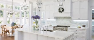
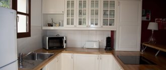
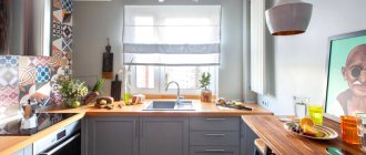
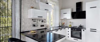
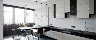
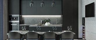
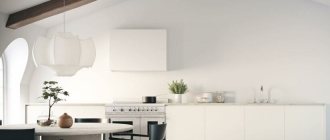
Monochrome design looks stylish in large and small spaces. Contrasting colors fit harmoniously into any interior, emphasizing its features and hiding flaws. A white kitchen with a black countertop has its advantages, disadvantages, and design rules, described below.
White kitchen with black countertop
Pros and cons of dark countertops
The transformation of the kitchen is facilitated by the correct selection of combinations. Dark elements against the background of a white room dilute the feeling of sterility and add harmony to the design. It is recommended to maintain a presentable appearance with frequent cleaning.
A light kitchen with a dark countertop has its advantages:
- Versatility. Monochrome design easily fits into any interior - classic, modern, country and others. Using a black and white balance, it is difficult to make “coloristic” mistakes when decorating a room yourself.
- Expansion of space. By decorating the ceiling, floor, and walls with light materials, you can visually enlarge the room. This creates a weightless effect, causing glossy surfaces to “float”.
- Aesthetics. Dark color in the interior looks very elegant.
- Lighting the room. White surfaces reflect light, giving a feeling of spaciousness.
Flaws:
- Impracticality. Spots, dust, and stains are more noticeable on black. White color indicates traces of fat and food particles.
- The combination is not for everyone. Those who like warm colors are put off by the sterile effect.
Accents
If you still think that such a contrasting duet lacks bright accents, you can use a couple of them, it is only important to remember a sense of proportion.
A colored stripe on the apron – parallel to the tabletop – would be appropriate here. If you use a single-color skinali, you can make a drawing in some corner or side - closer to the edge. It should be neat and unobtrusive to only emphasize the character of the interior, but be the center of the composition.
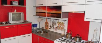
Flashy utensils can be used as bright accents - red silicone spatulas, potholders, handles of frying pans and pots, household appliances, the bodies of which can also be red.
In addition to red, any color can be harmonious in a black and white kitchen. It is he who will set the mood for the entire interior. Sunny yellow will make even such a kitchen playful. Blue or gray - colder and even more restrained. Green will add freshness. By choosing the shade of accents, you choose exactly the mood that you want to give to your kitchen and, of course, to yourself.
Material for black countertop
An incorrectly selected product base can lead to discomfort, frequent cleaning, cracks, and chips. The raw materials for the countertop must be strong, wear-resistant, durable, have an additional protective layer in order to maintain technical characteristics for a long time,
Marble
Experts recommend choosing a countertop made of natural stone. The material is strong and hides dirt. Marble, like granite, can last more than 20 years without losing its technical characteristics and presentable appearance. It is resistant to temperature, moisture, and abrasive cleaning agents. But marble products are heavy and require additional reinforcement of the base.
Marble countertop fits original into the design
Tree
Lacquered wooden countertops look presentable, expensive, beautiful, and have high performance characteristics. Beech, oak, and walnut products are resistant to temperatures and moisture, and do not lose their appearance from their influence.
Chipboard is an inexpensive but durable basis for wood-based products. Special impregnations significantly improve performance characteristics. The material resists wear and mechanical damage well.
MDF has a unique texture, thanks to which it is possible to make non-standard pieces of furniture with complex decorative finishes. It is recommended to protect the material with fire-resistant glass.
Plastic
Plastic countertops are inexpensive, but are inferior to other varieties in terms of performance characteristics. Under the influence of washing liquids with acid and chlorine, they become dull, change color, and stains appear. White kitchens with dark countertops made of plastic are recommended to be additionally protected.
Glass
Special processing of raw materials improves the performance characteristics of the material. Glass products look beautiful in any design. They are highly durable and resistant to mechanical damage.
Reference! It is not difficult to care for a glass tabletop; it can withstand high temperatures and humidity. The disadvantage of the material is considered to be soiling, slippery surface. A monochrome pattern will complement the product in an original way.
Porcelain tiles
The material is a worthy alternative to marble, is resistant to mechanical damage, high temperatures, and has increased strength. Good technical characteristics allow porcelain stoneware products to last a long time and maintain their appearance regardless of external factors.
A dark countertop breaks up the monochrome of the room
Apron for a white kitchen with a black countertop
The design of the part of the wall between the work surfaces and wall cabinets is done in different ways. An apron can be a complement to the overall interior or a bright accent. The material for it needs to be durable and non-staining.
Dark or light
The choice of color design for the apron depends on the interior design of the room and personal preferences. The use of dark material will require the installation of additional lighting. A light apron will add airiness to the design and visually deepen the space. Milky, beige materials are suitable for this.
Reference! Contrasting color materials will help diversify the monochrome.
Tiles, MDF and other finishing options
A common backsplash material is ceramic tiles. It comes in different shapes, sizes, plain and patterned, smooth and textured, glossy and matte. MDF and chipboard are used after special processing that improves technical characteristics.
Glass, metal, and ceramic mosaics look original. The cost of this finishing option is high, but the surface is heat-resistant, strong, and durable.
Using natural stone to decorate the backsplash will be a winning option, provided that the countertop is also made of this material. Otherwise, you should carefully select colors, try different varieties, and combine them. Basalt, marble, granite, and other types of stone are used.
Tempered glass splashbacks are highly durable and temperature resistant. They are practically scratch-resistant, easy to clean, and can withstand abrasive cleaning agents.
The apron can be the same color as the countertop
Material options for manufacturing
The countertop must withstand elevated temperatures, humidity, mechanical stress and be safe for health. It can be made:
- Made from solid wood. Suitable for modern and traditional style, comfortable to touch, environmentally friendly and warm. Wood can be easily restored if damaged - painted, varnished, sanded. The tabletop can be made of solid wood or consist of individual lamellas. To prevent the wood from overheating and absorbing moisture, it is protected with iron strips. It requires careful handling, but its appearance is worth it;
- Made from laminated MDF or chipboard panels. This is a tabletop covered with plastic. The MDF base is more stable than chipboard. It does not emit substances hazardous to health and is resistant to scratches, humidity and elevated temperatures. Also, when choosing a material, take into account the tightness of the seams. The plastic coating can be matte or glossy, plain or printed;
- Made from natural stone. Looks noble in any style. This is the most durable and expensive material. The stone has a large selection of dark shades. The most common are granite and marble. The stone surface has a lot of weight;
- Made from artificial stone. The same durable and noble material, but costs less than natural stone. The weight of such a countertop is much less, since it is made from mineral chips;
- Made from acrylic. The tabletop has a solid structure, therefore it is resistant to moisture and high temperatures. If scratches occur, the surface can be easily restored by cleaning and polishing. Acrylic is not afraid of chemical compounds and does not require special care. You can depict a stone pattern on it or combine different shades without obvious transitions at the seams.
Kitchen facades with a dark countertop: matte or glossy
Kitchen furniture dictates the main trend of the room. The choice of color scheme for the kitchen set is important, but attention should also be paid to the treatment of the facade. Matte surfaces do not shine, they hide dirt well, small scratches on them are hardly noticeable.
Glossy facades shine, reflecting the sun's rays, adding light and airiness to the room, and visually expanding the space. The surface is easily washed from any type of dirt and does not lose its ability to repel the sun even after regular use of detergents.
For your information! By choosing suitable colors, you can combine furniture with glossy and matte surfaces.
Photos of kitchens
No matter how many words are said, nothing can explain better than photographs. We have selected a number of photographs that are loaded with inspiration and various ideas.
How do you like the article?
Headset shape and layout
Having decided on the color scheme for the kitchen, you should think about the location of the cabinets. Common types of kitchen layout:
- straight;
- corner
Each form has its own advantages and disadvantages. It is recommended to choose according to the size of the room and personal preferences.
Straight
Linear layout is relevant for small rooms. It saves space and becomes the basis for design solutions. Bold experiments with color schemes, wall decoration, and the choice of chandeliers take place precisely in this layout. The island shape of the arrangement allows you to use the space with maximum efficiency.
Corner
The kitchen set is installed along adjacent walls, allowing you to reduce the distance between household appliances and the work area. Used in medium to large rooms, using corners.
The L-shaped, U-shaped arrangement allows you to highlight the dining area and create a bar counter. When choosing a form, it is worth looking at the original photos.
Corner furniture layout allows you to use corners
Selecting wallpaper, curtains and decor for a light kitchen with a dark countertop
It is preferable to choose a light wall design; dark accent patterns and graphic designs are acceptable. Photo wallpapers look original, but the color scheme should be chosen in accordance with the overall design solution.
A kitchen with a black countertop will be well complemented by light curtains with an unobtrusive geometric pattern, plants, and horizontal stripes. It is not recommended to choose contrasting colors for such products - they will spoil the overall perception. Appropriate decorative elements are stucco moldings, moldings, overlays.
Important! The use of mirrors will add light and airiness to the room, making it visually larger. You can decorate the walls with cutting boards, ceramic and porcelain plates, and trays.
Cons of color
Many people do not like pastel colors because:
- they are boring and cannot create a festive mood;
- delicate, light colors require constant care;
- the cost of design in beige is significantly higher than using other colors.
We can only fully agree with the third argument - the interior of a kitchen in beige really requires significant financial costs. But you can argue about the first two “disadvantages” - it all depends on the tastes and preferences of the apartment owners.
What style should I use?
Monochrome design fits organically into any design if the proportions are respected. Details of the overall composition complement the interior and make it complete. The customer chooses a classic or modern interior style. Designer advice will help you organize your space correctly.
Classic style
The monochrome design of the kitchen emphasizes the strict design well. The work surface and dining furniture, made in dark colors, organically fit into the classic design of the room. In such an interior, voluminous moldings, carvings, and stucco moldings will not be out of place.
It is better to cover the facades of household appliances with thematic panels. The checkerboard design of the floor covering and apron will add originality to the interior. Adding a third color will help remove the sterile effect of the room.
Classic style kitchen
Modern directions
The industrial loft style allows you to combine a white background and black details. You can make countertops, hoods, panels of household appliances, and lamps dark. Bright accents - a yellow or red apron, greenery,
Modern – classic design combined with smooth lines and natural materials. The monochrome atmosphere will be complemented by a non-standard form of furniture, an original chandelier, and neon lighting.
Minimalism is a laconic style. The lack of decor is compensated by the play of contrasts. In small rooms, the tabletop and apron are made dark, in large rooms - the facades of furniture and household appliances. The third color and bright details will add coziness.
Technological high-tech style - a laconic interior with glossy facades, a dark work area and a glass apron. To distinguish it from minimalism, you can complement it with stone, voluminous prints, unusual fittings, and LED lighting.
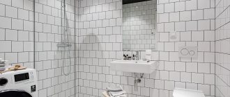
Kitchen in minimalist style with monochrome design
Scandinavian style
The Scandinavian interior uses light colors, natural materials, and simple shapes. The furniture sets are simple, without unnecessary decor. Designers use matte or glossy surfaces to correct the shortcomings of a room. On the facades of household appliances, a combination of primary colors is possible. Aprons are gray or match the walls. You can dilute the sterility with wooden inserts.
Successful examples in the interior
Today, many people choose sets with black countertops for their kitchen space. Such details do not always look gloomy and depressing, especially if they are correctly used in the interior.
One of the most spectacular and stylish color combinations is the combination of black and white. Dark countertops of different textures look chic in tandem with the snow-white facades of kitchen units. Such combinations can be emphasized on other surfaces, for example, adding a white apron with black patterned curls to the furniture, or laying white tiles with dark lines on the floor.
In this type of environment, warm lamp light is desirable. It is better to choose metal fittings.
Black countertops with a glossy surface look impressive in tandem with a chocolate-colored wooden set. To make this combination look non-trivial, you can choose glossy countertops and reinforce them with metal cabinet fittings. The result is an interesting combination of classics and modern motifs in small details.
A classic corner kitchen in a milky shade will sparkle with new colors if you back it up with black stone countertops and an apron made in the same color and texture. Against the background of such a tandem, the light finish of the kitchen will look impressive.
To prevent the black parts of the set from seeming like black sheep in the interior, it is worth hanging dark metal lamps with large light shades - they will echo the apron and tabletops.
Black countertops will look good in tandem with a kitchen set in matte ash tones. Dark details will dilute the “boredom” of gray colors. The furniture composition will be more impressive if you complement it with shiny metal fittings.
It is better to select a refrigerator for such a set with a silver surface. The kitchen should be decorated in soothing light or pastel colors.
Not just white: a combination of brown or black countertops with other colors of the set
The color scheme of kitchen furniture puts the main emphasis on the overall style of the room. You should choose it carefully, taking into account the overall finish, the shade of the wallpaper, and other parameters. Among the common options:
- grey;
- beige;
- blue;
- black.
Grey
A gray kitchen set makes the room presentable, although many people consider the color boring. A rich dark countertop, contrasting details, a wooden floor - details that will make the kitchen original. Proper design will relieve the feeling of ordinary gray furniture.
Beige
The color is less easily soiled and has many undertones, which is why many housewives prefer it. Beige adds coziness, warmth, and tranquility, while white adds coldness and sterility. The classic design is complemented by a brown tabletop, delicate curtains, and light flooring. Dark fittings match the beige surfaces of the furniture.
Blue
A blue kitchen set will stand out as a bright, contrasting spot among a snow-white kitchen, attracting the attention of guests. The design does not require additional elements, decor, selection of curtain colors, or flooring. It is not recommended to add too much blue.
The blue set accents the attention
Black
A dark kitchen set with the same countertop looks gloomy. A bright white apron and workplace lighting will help alleviate the feeling of discomfort. Black color makes the room dull, so it is better to choose cabinets with a glossy surface that will reflect the sun's rays.
Monochrome kitchen design is often used. You can eliminate the effect of sterility in the room by harmoniously incorporating a third color, complementing the interior with bright details, and choosing a warm shade of the floor covering. A white kitchen with a black countertop is a great option to avoid color mistakes.
Color combinations
To make monochrome look advantageous, you need to maintain a balance of white and black. The contrasting composition should not look sterile or aggressive, so the combination is used carefully. Dark occupies not only the horizontal work surface, but is also found on facades, walls or in decor. Primary colors are selected in proportions of 70 to 30% or 60 to 40%.
Black and white design Source remoo.ru
In a large kitchen, three walls are made in light colors, one in black. Designers recommend covering the accent area with monochrome photo wallpaper. Wallpaper with gray patterns will organically fit into a white room. Large prints (ornaments, geometry) will make the design heavier, so they are used only on one surface.
Accents in kitchen design Source yandex.by
Design options for a light kitchen with a dark countertop Source hdwallpaper20.com
A white and black ceiling is appropriate in the interior of a cooking room. To prevent dark parts from concealing the height, we recommend using glossy material. Built-in lights reflect off the surface and distribute lighting evenly.
Glossy coating on the ceiling Source yandex.by
The severity of a white kitchen with a black countertop is diluted with neutral shades. Transitions between dark and light are filled with gray. The room uses warm wood tones on the floors and in the decor on the walls. For a cold room it is appropriate to include beige and yellow, for a sunny room – transparent blue.
Warm interior with black countertop Source liveinternet.ru
The white and black monochrome of the kitchen will benefit from the use of accents. Against the background of light furniture facades and walls, a red chair, orange print or blue dishes look original. In a simple interior, isolated bright details look harmonious and complete the design composition.
Red details in design Source mebelvs.ru


