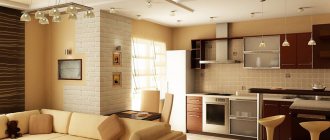
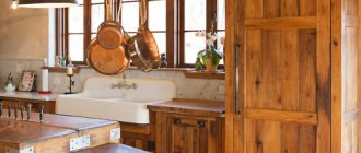
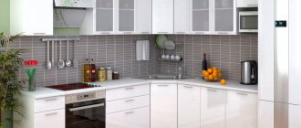
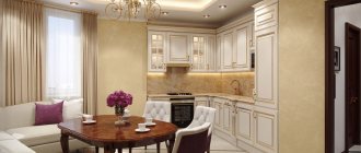
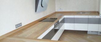
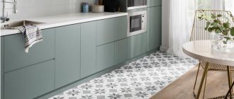
The interior of the kitchen-dining room can be bright and rich in decor, minimalistic and modern, or elegant and pro-French. The interior of a kitchen with a dining room can be either combined and open, or separate. Zoning in modern versions is often created by a kitchen island; sometimes colors, accents, and finishing materials help in this matter.
How to place it correctly?
The dining area in the kitchen should not overlap with the working area, but should be located in a bright, spacious place. There are several options for its placement, but first you should estimate how much free space you will need to comfortably use the dining area:
- The size of the table is determined simply: there should be 60 cm for each intended seater. That is, to comfortably seat 4 people, you will need a rectangular table 120 cm long and 60 cm wide, a square one 90*90 cm, and a round one with a diameter of 1.1 m.
- The depth of the seat is 70 cm, in this position the chair is fully extended. That is, from the table to the wall there should be at least 70 cm, preferably 90.
- The minimum width of the passage if the chair is pulled out towards the room is 55 cm (from the pulled-out chair). This way a person can walk behind the person sitting without disturbing him.
The photo shows an interior with a dining area in the country
Assess the scale of your kitchen and proceed to choosing the location of the dining set:
- In the center. Only happy owners of large kitchens can afford to set up a dining area with a table in this way. This is not only convenient, but also justified - when the set is located along the walls, the central part is empty, and the dining group will fill this gap. A kitchen island, one of the sides of which is used as a bar counter, can also cope with a similar function - this method is useful if the house has a separate dining room. The combination of a dining area with a U-shaped kitchen set looks impressive.
- Near the wall. This is a salvation for small kitchens or apartments, where this arrangement is most advantageous - for example, in narrow or walk-through layouts. A rectangular dining table is moved to the wall with the long side if the kitchen is not wide and you need to leave room for a passage, or the short side if space allows and you need to seat more people.
- Near the window. Decorating a dining area near a window opening in the kitchen is one of the most advantageous options. First of all, it's light here. Secondly, during your meal you can look out the window instead of the TV. Thirdly, such a layout solves the problem of irrational use of space.
- In the corner. By pushing the table into a corner you will save space without losing capacity. Usually a corner sofa is added to it, which allows you to seat more people than on chairs. An additional bonus is the increased storage area due to the compartments in the couch. Also, a dining area in the corner is convenient in rooms up to 10 sq. m, in order to remove the food eating area from the cooking area as much as possible.
- In a niche. Any architectural features of the house can and should be used! For example, a kitchen sofa can fit comfortably into a niche, which will save space. The only negative is that the seat will have to be ordered according to individual sizes.
- In the bay window. Having a bay window is the dream of many house and apartment owners! If you are lucky enough to have one in your kitchen, create a place for eating there. The main options for implementing the idea: a round table with chairs, or a sofa/seats around the perimeter of the window with any shape.
In the photo there is a round table in the kitchen-living room
Design style
Stylistic decisions play an important role in the design of any room. First, they choose a direction for interior design and only after that they choose colors, furniture, and decorative details. There are no restrictions on the style of the dining room at all. However, it is often “tied” by the interior to the zone that is closest “in spirit” - the kitchen. It looks more impressive if the rooms are located next to each other. Popular trends include minimalism, high-tech, loft, chalet, art deco, classic, fusion, ethnic, Scandinavian, Japanese, oriental style and French Provence. Let's talk about several design options in more detail.
Classical
In a classic style, the interior composition looks royally magnificent and chic. This direction does not accept cheapness, imitation or practicality. Classic always strives for luxury, which is deliberately displayed. The walls are covered with wallpaper, richly decorated with floral patterns. The color scheme is dominated by white, brown and its shades. In large rooms, a massive, elongated table with rounded corners made of precious wood is installed. It comes complete with elegant chairs on twisted, curved legs. They are upholstered in soft velvet or other expensive textiles. In colors, choose deep noble tones or neat designs on a gold, chocolate, bronze background. Wall decoration is limited to hanging portraits in frames or landscape paintings. The ceiling is richly decorated with stucco, and a multi-tiered, heavy crystal chandelier is installed in its center. The doorway is decorated with full columns or pilasters.
Gothic
The traditional Gothic style dining area is reminiscent of an austere palace dining room. The same one where pigs roasted on a spit were served, wine was drunk from goblets encrusted with precious stones, and they ate to the songs of troubadours. In spacious rooms, the ceiling is vaulted and decorated with beams. The walls are decorated with photo wallpapers with engravings depicting heroic scenes from the life of knights. In simpler interiors, they can be draped with fabric with a luxurious floral pattern. The table should be large, made of durable oak. Chairs are used without upholstery, with carved backs. If the table has the shape of a rectangle, then several chandeliers are placed in a row above it. By the way, the light bulbs on them are placed in such a way as to create a resemblance to the candlesticks that illuminated meals in the dining room in the Middle Ages.
Gothic prefers dark, gloomy tones, so the style is not recommended for use in cramped spaces, as the palette will play a cruel joke on the perception of space.
Provence
The dining area in Provence style has a special comfort and softness. The color scheme is dominated by white and pastel shades. The windows are covered with colorful curtains. Beautiful landscapes or a whole photo gallery of family photographs are placed on the walls. It is better to choose a round table, since Provence prefers soft lines. It can be artificially aged by painting one layer of white over the previous tone. Before lunch, the table must be covered with a festive tablecloth. A couple of elegant vases with fresh flowers are placed on the windowsill. The walls are covered with wallpaper with delicate, floral patterns. The chairs are upholstered in pink, turquoise, yellow, mint or olive with small flowers. If there is a bedside table or closet nearby, then they must be decorated with decorative plates on stands, miniature sculptures, vases, and boxes.
Moroccan
Moroccan style belongs to the group of oriental styles. In domestic interiors it looks very exotic. There is a small wooden table in the center of the dining area. Remember that eastern peoples eat little by little and spend most of their time on philosophical conversations. Next to it, two sofas with colorful upholstery are installed in parallel, which are casually “sprinkled” on top with decorative pillows with flirty tassels at the ends. The windows are decorated with multi-colored mosaics. Decorated plates and panels are hung on the walls. The floors are covered with colorful hand-made rugs. If the dining area needs to be separated from the kitchen or living room, then decorative partitions are used, which can be decorated with thematic patterns with curlicues. An original design solution would be to place groups of Moroccan lamps on the ceiling, which will emphasize the oriental flavor in the interior.
What furniture to choose?
The main components of the dining area are a table and chairs. The latter can be replaced with a sofa, armchairs, or daybed. Despite the fact that the kitchen has two functional spaces, it is better that they are connected to each other. The connecting link is style, color, decorative elements, finishing materials.
- For a classic kitchen set, choose a dining area with a simple shape and a neutral shade. Or play with the contrast of colors, but add gold decorations to the chairs, similar to the decorations on the facades.
- For a white kitchen in a rustic style, a dining area with a simple round table covered with a tablecloth and wooden chairs would be a good match.
- Under minimalist glossy cabinets in a modern style, choose a glass tabletop and fashionable plastic chairs.
- A leather sofa, a slab tabletop, and metal elements look appropriate in an industrial loft design.
In the photo there is a dining area in the kitchen in the studio
The chairs can be absolutely anything - however, it is not necessary to assemble a set of 4-6 identical items. You can put completely different models, also related to each other in style, shape or size.
The table, on the contrary, should be selected carefully:
- Square. Saves space, it’s good if, if necessary, it folds out into a rectangular one. The correct shape allows a group of 4 people to sit comfortably. Inconvenient in narrow spaces.
- Rectangular. Versatile, suitable for narrow, wide, small, large and even irregularly shaped rooms. Convenient to place against the wall to save space.
- Round. It has no sharp corners, which makes the model safer. Compact, streamlined. But it is inconvenient to place against a wall or in a corner, but it is perfect for a central location.
- Oval. It has all the advantages of a round one, but benefits in size. Suitable as a replacement for a rectangle.
Instead of chairs, soft sofas are suitable. According to their shape, dining areas with a table are divided into 2 categories:
- Angular. The L-shaped sofa option with or without a back is the most versatile of all possible, suitable for zoning. Although sofas take up a lot of space compared to chairs, they are more spacious. This applies to the number of seats and the possibility of additional storage.
- Direct. This bench is simpler, cheaper, more compact. If you add 2-3 chairs, you can save the space of the room without losing seating.
The photo shows a minimalist design with a bar counter
Glazed tiles
An excellent option for finishing the dining area. It has a stylish design and a pleasant glossy shine. Will highlight any interior style. The advantages of use include special strength, a smooth surface without a relief pattern.
The disadvantage is the high cost. Before carrying out repair work, you will need to carefully calculate consumables to avoid unnecessary financial expenses.
How to highlight beautifully?
The design of the dining area in the kitchen, different from the surrounding environment, allows you to add a designer twist to the interior. The most popular ways to highlight a dining area are by decorating the walls or floor.
The easiest option is to change the color of the walls, creating the right accent without spending extra money. The main condition for the color scheme is contrast. In a light kitchen, dark or bright will attract attention; in a dark kitchen, bright or light.
It is not necessary to use monochromatic colors; take a closer look at prints or entire frescoes in the form of photo wallpaper. The right panoramic images will help expand a small space.
It happens that the accent wall differs in texture. To do this, cover it with stone, tiles, slats, brick, fabric, leather. Or create an eco-friendly phyto-wall with live culinary plants.
In the photo there is a phytowall in the interior
The second fastest way to separate zones is a carpet on the floor. The main thing is that it is the right size - a little larger than all the furniture that is located on it. The shape should follow the shape of the countertop.
At the renovation stage, you can lay out two types of flooring: tiles in the cooking area and laminate in the dining room. Or choose 2 different colors of tiles or laminate.
Color selection
Warm shades should prevail in the color palette of the dining area. Studies have shown that they stimulate good appetite and improve mood. The dining room can be decorated according to the principle of similarity or contrast. As the main tone, it is better to choose white or one of the pastel shades: peach, pink, yellow, gray, walnut. Its neighbor in the spectral circle is chosen to play the role of the second color. The third shade will be bright, which is acceptable, because it is used little (only in accents). If the kitchen windows face the sunny side, then you can dilute the natural “warmth” of the interior with blue, lilac, green, and turquoise.
How to organize lighting?
Light also helps to zone the space. But if such a task is not necessary, independent lighting of two areas is at least convenient - during a meal you do not need such bright light as when cooking. Therefore, by extinguishing it you will make the atmosphere more comfortable.
Three ways to organize lighting depending on the location and size of the table:
- Ceiling. Suitable for any dining area, but the number of lamps varies depending on the size. Square/round table - one large lampshade, long rectangular/oval - 2-3.
- Wall. If the table is located in a corner or against one wall, place sconces or adjustable directional light lamps above it.
- Floor. To avoid wiring, install a tall floor lamp with a large extension nearby.
Tip: Food will look more appetizing if there is a warm spectrum lamp on top.
The photo shows a blue design
Advantages and disadvantages of kitchen zoning
The advantage of dividing the kitchen space into a working and living room area is that the hostess will be close to the guests all the time, taking part in the general conversation, without being distracted by absences from the next room.
The disadvantage is that even the most powerful air purification device will not help get rid of food odors. When household kitchen appliances are turned on, the TV will be difficult to hear. And you will have to clean the kitchen, where family members are constantly present, much more often, so as not to be considered a slob.
What decor would be appropriate?
Highlight a wall without changing the lighting or decoration. Suitable decor for the dining area:
- Paintings. Suitable images are abstractions, still lifes, landscapes.
- Photo gallery. Post pictures with your family and friends.
- Watch. Choose a proportional size.
- Dishes. From different countries or decorative in the same style.
- Flowers. Attach the planter to the wall or ceiling.
The photo shows bright chairs and tableware
The tabletop itself is decorated with paths, napkins, flowers in vases, and beautiful dishes. Throw soft pillows on the sofa or chairs for decoration and comfort.
In the photo, decorating the wall with plates
Decoration
Posters or paintings are a great reason to decorate the wall next to the dining table with them. Still lifes with images of fruits, vegetables, elegant coffee cups, and cakes will complement the overall picture.
- An urban landscape with a bistro or some kind of abstraction is ideal for the living room.
- An original solution in the spirit of modernity is to use an image of a window that illusorily reveals a view of the canals of Venice or the lavender fields of France.
- Quite often you can find mirrored surfaces in such an area, adding light and reflecting the objects on the set table. The illusion of chic abundance is created.
- The walls can be decorated with vintage clocks, appropriate inscriptions, and plates with images.
- The placement of shelves on the walls, built-in shelving, and buffet counters is encouraged.
- Decorated with beautiful tableware, all kinds of dishes, and souvenir crafts, they organically fit into the design composition.
By adding bright accent chairs, you can enhance the stylistic direction of the dining area.
Decorative items on the table itself can be quite rich in color, such as:
- Napkins for plates;
- Flower vase;
- Runner.
What to consider in a small kitchen?
In order to save space in a small area, abandon the traditional option in favor of a low bar counter or peninsula. They are comfortable to both cook and sit at.
The photo shows a bar counter with a table
If you can’t imagine a dining area for a small kitchen without a table, use compact furniture. It is best to place it in a corner - a small bench will not take up much space, but will please you with its capacity.
For narrow kitchen spaces in Khrushchev, discard the sofa, place a long table along the wall and light chairs.
In the photo there is a tabletop on the windowsill
