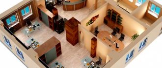
A well-thought-out environment affects the productivity of employees and the internal microclimate in the team. In addition, the arrangement of furniture in the office should be convenient for ordinary visitors and regular customers of the company. Large corporations entrust this difficult task to well-known advertising agencies. In order to cope with this task on your own, without the help of a professional designer, you should take into account many factors: size, shape of the commercial premises, acoustics, degree of illumination.
How to choose a design
The choice of style and method of furniture placement depends on many aspects. The first is the type of activity of the company, the area of the premises and the number of employees. If a company receives clients in an office, it is necessary to choose a design that will make visitors feel relaxed.
The correct organization of the workspace is carried out taking into account the tastes of not only managers, but also all employees.
Most offices use modern design styles - ergonomic and laconic. This is a justified choice, since there is no need for empty decor at work. But there is no need to move to complete asceticism: after all, people work in the office who work much more efficiently in a comfortable, rather than “Spartan” environment.
Finishing work, selection and arrangement of furniture in the office are carried out in the same interior style. Everything should be in harmony with each other - color shades, furniture configuration and materials, in order to subsequently avoid an uncomfortable atmosphere.
Color solutions
The top manager's office is a special room where important business decisions are made. Therefore, it is important to think through the color palette in such a way that you can focus on solving the most important problems.
Designers recommend using natural shades to the maximum: greenish, gray, brown and beige. This not only adds style to the room, but also prepares visitors for work.
The predominance of pastel colors alone is undesirable, as they create a romantic atmosphere that is far from satisfying work moments. It is much more correct to play on contrasts. For example, light beige walls go well with dark furniture. The same can be said about upholstered furniture. Comfortable armchairs and sofas, upholstered in dark brown or black leather, create an atmosphere of respectability and pleasantly contrast with light-colored furniture.
Calculation of the amount of furniture
To calculate all the options for arranging desks in the office, you need to consider:
- office size;
- number of tables and employees;
- ease of access to cabinets and archives;
- placement of light sources and sockets.
Proper planning of the interior arrangement of furniture in the office should include the dimensions of the space so that nothing interferes with the passage of employees and access to the shelving.
Information. According to the standards established at the legislative level, the distance between tables should be at least 2 m, and for one employee who works at a computer there should be at least 4.5 square meters. m.
Features of the interior of the manager's office
When decorating a residential building, designers pay attention to amenities, but the interior of the executive's office must be designed in accordance with strict principles. The main features are presentability, comfort and individual style. This is where deliberative moments take place and important tasks of the company are solved, so the environment should be conducive to these actions.
Executive office in classic style Decor on office furniture
Options for arranging office furniture in the office
The arrangement of tables in the office is carried out in accordance with the rules:
- workplaces are organized in such a way that employees do not sit facing each other;
- tables are not placed near the stairs, under voluminous chandeliers, or ceiling beams - this creates stressful feelings for the staff, which reduces the employee’s performance;
- chairs are not placed with their backs facing each other, it is important that there is a partition, wall, closet, free area (spacious passage) behind the employee’s back;
- The optimal place for the manager's desk is diagonally from the entrance door to the office.
Depending on the specifics of the company’s activities, workplaces can be divided using special partitions.
Dependence of table shape on placement option
| Configuration | What rooms is it ideal for? | Where is it better to put |
| Circle | Ideal for square rooms. | In the far corner from the door, in the center, which visually reduces the space. |
| Oval | Rectangular, elongated rooms with enough free space. | In the center |
| Rectangle | For premises of any layout, configuration. | Near the window on the side of the wall, so that the person sitting has a view of the door, a view of everyone entering and leaving. |
| Square | For rooms of any size, including small ones. | Side to the window, near the wall on the side |
Workspace organization
Modern offices are located in a variety of premises, ranging from old and historic buildings to redeveloped factories and specialized centers. Depending on the characteristics of the premises and the type of organization, the arrangement of office furniture and the layout of the workspace will depend.
The modern market offers options for office desks in a variety of configurations, from simple rectangular to complex curved and safe shapes.
The effectiveness and appropriateness of a particular option is determined by the direction of the company's activities and the need for employees to constantly interact with each other.
The necessary elements should be at hand for employees - cabinets, cabinets and shelves. Convenient and accessible location of office furniture will ensure high productivity.
Open plan
Or Open Space. The idea of creation belongs to Frank Duffy. In 1962, he proposed such a layout in one of his student papers. Modern office options with open space differ from the original ones, but retain the main features:
- there are no partitions between tables;
- separate offices - only for management.
All offices, regardless of their size and style, have the same requirements.
The main thing when designing a modern business space is to create the most comfortable, ergonomic, spacious room with functional workspaces and a stylish interior. There are 4 types of workplace design in Open Space:
- Team-oriented 'bullpen' or “team-oriented” room – desks are set up so that employees can hear and see each other, suitable for team projects, activities that require constant close interaction of the work team.
- High-panelled cubicles (workspace with partitions) - the common office space is divided by partitions that create “cells” for each employee, suitable for call centers, enterprises where employees do not need to constantly contact each other.
- Low-panelled cubicles (with low partitions) - in this design option, a seated employee can see colleagues and the rest of the office space; this method of office design creates a kind of personal barrier that provides psychological comfort, but does not block the way for employees to communicate.
- Clusters or “cluster” space - the tables of one work group are placed with low partitions between each other, each “cluster” group is separated by high partitions, the method of organization is suitable for projects on which several teams of different directions are working.
To achieve the desired result, it is important not only to buy furniture for the office, but also to take care of creating a stylish interior, a favorable working atmosphere and think through the layout of the premises, providing all the amenities for the company's employees.
This type of space organization promotes close communication among employees, building relationships, workflow, and prevents the spread of office gossip. The fact is that all employees are in full view of their colleagues and superiors, which should motivate them to work effectively. It also gives motivation to move up the career ladder to get a separate office.
Large office premises accommodate a large number of people, so its space needs to be used more wisely.
In fact, open space has as many disadvantages as advantages:
- noise is created in the room;
- employees feel uncomfortable due to lack of personal space;
- Relations between colleagues are heating up.
This method of organizing office space is not suitable for all companies.
Options for arranging furniture in the office have a direct impact on the trajectory of movement of employees to the main areas of the office. The travel routes for each employee should be as short and convenient as possible.
Office layout
Traditional way of organizing office space. The room is divided into offices and waiting areas for visitors. Each office can have from 1 to 4-5 employees of the same/related profiles. The advantage of this type of space organization is comfort for workers. A quiet environment is maintained, which is conducive to work.
If more than one employee works in an office, its own “microclimate” is established: colleagues choose methods of interaction that are convenient for them, and arrange the workspace in a way that is convenient for them.
The most stylish office design ideas come from the right use of color and lighting.
Disadvantages of this method:
- high cost - erecting partitions, building, buying or renting a room with an office type layout is much more expensive than organizing an Open Space;
- employees do not interact with each other; to get help from an employee of another department, you need to invite him to the office or visit his workplace;
- management cannot control the work process of all groups of employees;
- Depending on their personal qualities, individual employees may not get along in the same office or, on the contrary, devote most of their working time to personal discussions.
When decorating the interior of an office space, it is recommended to use the most neutral, calm colors that have a beneficial effect on the human psyche.
Mixed type
A layout option that combines the advantages of the two previous (office and open) types and minimizes their disadvantages. With a combined organization of office space, some workplaces are located without partitions, and some are located in offices. This is the optimal solution for companies with a wide range of activities, in which there are many employees in different fields.
Contrasting color accents should be used carefully, and neutral and unobtrusive tones should be chosen as the main tone.
This option may be suitable for advertising agencies, where it is necessary to organize the working area of the creative team, as well as organize separate offices for bureaucratic employees and receiving clients.
Choose mobile office furniture. It is better to choose tables, chairs and cabinets with wheels.
Leader's place
Increasingly, managers are abandoning separate offices and arranging their workplace according to the Open Space principle, but with some differences. The boss's desk can be behind a transparent partition to provide a 360-degree view of the office. Or there may be no fencing at all, and the zoning of the area may be conditional (for example, the table is located on a small podium).
Well-chosen office furniture influences the proper layout of the workplace and ensures comfort and convenience in the room.
This method of placing the manager’s desk gives him the opportunity to better control the work process, and also helps to simplify contact between senior employees and ordinary employees.
A room that does not have rectangular shapes creates favorable conditions for the effective work of a manager and affects the general atmosphere in the company.
The classic option is to locate the boss’s desk in a separate office. This method is suitable for specialists whose activities involve a large amount of paperwork or other work that requires perseverance and concentration. Also, the office space layout is ideal for bosses whose responsibilities include regular working contacts with managers/representatives of other organizations and receiving citizens.
For the head of an enterprise, you should purchase expensive furniture that is made from high-quality and reliable materials using modern technologies.
Visitors area
Many companies are abandoning the classic reception area in favor of an intuitive organization of space. Some use bright signs so that the visitor does not have difficulty choosing a direction. In large office organizations, where a large flow of clients regularly passes through, electronic queues are introduced, and the information necessary for the visitor (which window/office to go to, the order in the queue) is displayed on the display and duplicated by voice.
Furniture in the office plays a big role. Sometimes it can affect negotiations with potential partners or clients.
The classic reception desk remains in organizations where 1-2 employees can handle the flow of clients.
Furniture for the client area should be new, not shabby. Sofas and armchairs are arranged in rows, with their backs facing each other or along the walls. It is very important to organize a children's area with separate seats and leisure options for the child (coloring book, drawing board).
Office furniture is a key component of a modern company. After all, the office is the main place where information accumulates in any company. Office furniture is considered an important image element.
What useful things and accessories can be placed in the waiting area:
- A TV with one video series (music videos, popular films, federal/cable channel) or the ability for visitors to independently switch programs. In this case, the remote control remains with the manager/receptionist, and the sign indicates who the visitor can contact.
- Tables with the press are a somewhat outdated, but still popular leisure option for clients in the waiting area.
- It is important that the correspondence is new and not shabby.
- Chargers, places to install laptops.
- Vending machines with coffee and food.
Every office, even the smallest one, should be cozy and comfortable.
Small office environment
In a small space, it is important to follow the principles of ergonomics. Modern styles, for example, hi-tech or minimalism, are most suitable. To visually enlarge the office, be sure to use mirror elements. These can be ceiling or wall panels, but not ordinary ones, but tinted or decorated mirrors with patterns.
In a small room, you can use shelving and smart boxes, which will act as a partition for work areas.
If space is limited, work tables can be placed with their outer sides close to each other and light partitions can be added. They will block the view of seated employees to colleagues who are located on the other side of the fence. This option is suitable for the smallest offices, where it is impossible to organize full aisles between desks.
It is not recommended to place a large number of plants, paintings or clocks in a small office. Limit yourself to a whiteboard or presentation screen.
Office for a male manager
If a woman's office is grace and elegance, then the features of a man's office are rigor, prestige and stability. Luxurious furniture made from high-quality materials will testify to the wealth and excellent taste of the owner.
Designers recommend decorating an office in the spirit of classics - this style will always be held in high esteem, and to make the interior individual, it is worth adding decorative elements that indicate the owner’s hobbies. As wall decoration, you can use embossed wallpaper with a textured pattern.
Walnut furniture for the office Greek ornament on furniture for the office
The design project of the manager's office should be drawn up together with the owner of the room. Against the background of dark brown wallpaper, chairs with white upholstery, a wooden table made of solid walnut, large panels or paintings on the walls will look advantageous.
Light panels on the wall in the office
Executive office with panoramic window
You can lay laminate on the floor in a color contrasting with the cabinets. For lighting, it is recommended to use both sconces and ceiling chandeliers that match the given style of the office.
Executive office in pastel colors
Carved office furniture
Arranging office furniture according to Feng Shui rules
According to Chinese teaching, office space should be organized in a special way:
- do not place tables so that there is a door behind the employee’s back; if it is impossible to arrange the furniture differently, you must first place a large object, and then the workplace;
- It is forbidden to place tables in the corner;
- In offices without windows, be sure to place plants or display landscapes;
- You cannot place tables so that workers are in a position of confrontation - sitting facing each other;
- the table should be turned with the outer side towards the aisle, the wall is located behind the employee’s back; if you sit facing the wall, fresh ideas will not come;
- mirrors should be placed so that employees do not bump into their reflections while working;
- the table is not placed on the line between the door and the window;
- the boss’s place is located at a distance from the entrance;
- if the room is of a non-standard shape, it has more than 4 corners, the “extra” need to be adjusted - put large pots with plants in them, hang bamboo sticks;
- tables are not placed opposite sharp corners of the room perimeter or other furniture.
The Feng Shui environment encourages workers to be active while working.
From a Feng Shui point of view, offices located near elevators and stairs are less suitable for work.
Small room decor
The area of an office space is one of the most important factors influencing the arrangement of furniture. Designers recommend decorating a small commercial space in a minimalist style.
In a small office, the best furniture will be small tables of strict geometric shapes with rounded corners, comfortable light-colored chairs, light tulle curtains or blinds. Creating high-quality lighting in a commercial space requires special attention. When you plan to use only one lighting fixture, it is necessary that it be located in the center.
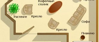
When drawing up a plan for arranging furniture, it is necessary to take into account many factors: the number of places to work, the presence of air conditioners, the direction of door movement, the location of sockets.
It is not always possible to achieve complete comfort for all employees, but it is possible to minimize the inconvenience. For example, connect an extension cord or turn the table around so that sun glare does not appear on the monitor screen.
How to avoid mistakes
First of all, you need to focus on the type of activity of the company, the number of employees and nuances from personal interaction. You should not artificially create work teams from people who are not on the best terms. Their jobs should be separated, at least symbolically.
When arranging furniture, consider the comfort of each employee. Extra things, waste papers, objects cluttering the aisles not only interfere with work, but also interfere with the free flow of qi energy, which brings success to your business.
You need to choose furniture only after all the calculations have been made.
Before arranging tables and cabinets, it is worth considering all possible layout options and taking into account the possibilities of rearrangement for the future.
Types of structures
The cost of any table depends on the material, model, functionality and design. The most environmentally friendly raw material is wood. This table can be restored and will last quite a long time. Chipboard is often used in the production of cabinet furniture. It is inferior in environmental properties to wood, so when buying a table made of chipboard, you should look at the certificate of compliance with safety standards.
A standard desk is a regular rectangular shape with a tabletop and several drawers. Outwardly, it looks like a school desk. The model may differ in the size and location of the drawers. Often models have a convenient arrangement of drawers and shelves at the bottom of the countertop. This design allows you to organize a workplace even for two children.
The standard model is considered the most budget-friendly desk option for a student. The furniture of this group is made of wood.
A computer desk is considered the most convenient option. Today, the educational process is impossible without a computer. The model usually has a retractable panel for the keyboard, a specific place for the monitor, a shelf for the printer, disks, and drawers for school supplies.
In order for the child to be able to easily place the necessary items at hand, a distance of 60–80 cm is required. The distance from the eyes to the monitor must be at least 40 cm. Therefore, the best choice is considered to be a model with a tabletop of 80–100 cm.
When purchasing such a table, you need to take into account the free space that should remain after placing computer equipment. Parents consider the downside of the table to be the child’s constant presence in front of the monitor screen. Therefore, corner options often become the priority choice of a desk for a student.
An L-shaped desk with drawers and shelves is functional and practical. It is very popular in small spaces. Occupying an unused corner, it practically does not reduce the usable area, perfectly combining a computer and a desk.
Corner models make it possible to divide the workspace into two parts: place a computer on one, and freely engage in lessons and any creative processes on the second. This table is more convenient and has a price that is slightly higher than the usual options. The price may vary depending on the availability of a retractable cabinet, the complexity of the design and the materials involved in the assembly.
If you are planning a purchase that will last quite a long time, you can purchase a transforming table that fits perfectly into small rooms. It has the ability to adjust the height of the table, adapting to the growth of the child at different stages of his growth. The more features a table has, the higher its price. Options in this group can not only adjust the height and tilt, but are orthopedic and can also be folded, saving space in small spaces. In order for the product to last a long time, it is better to choose a model made of wood or other durable materials.
A desk for the home, combined with a bed, is considered the best choice of furniture for a room with small dimensions. It is a complex two-story structure. On the first floor there is the table itself with drawers and shelves, and the bed is on the second. This model can expand the play area of a children's room.
Photo gallery: office furniture and furniture for the client waiting area
Rules for working at the computer
Rule one. Selecting and adjusting the table and chair
First of all, we must have a proper table and chair with height-adjustable legs. It is advisable that the back of the chair be bent forward so that you can rest your back on it, rather than sitting slumped in a chair.
You need to sit straight, so that there is a right angle between your hip and back. There is no need to cross your legs under the chair; your foot should rest on the floor and stand on a stand.
The elbows should be placed on the table in a horizontal position, that is, there should again be a right angle between the elbow and forearm.
And take your left hand away from your face! Get rid of this bad habit already!
Rule two. Monitor placement and lighting
These rules for working at a computer are especially important for the eyes.
The monitor should be positioned so that you can reach the screen with your outstretched arm and look directly at it. Eye level should be at the level of the upper part or slightly lower, but in no case higher, so that there is no additional strain on the eyes.
Previously, my monitor stood on a special stand, but now I have abandoned it, and when I sit down at someone else’s computer with such a stand, I immediately feel discomfort. Before, I didn’t notice that I was sitting incorrectly.
Lighting is equally important. The monitor is like a table lamp, shining into our eyes with the same intensity. And after just an hour of working at the computer, your eyes get tired, your eyelids may turn red, and pain and burning may appear in your eyes.
The monitor must be placed so that daylight does not fall on it. And the room illumination should match the screen illumination.
It is better to close windows with blinds.
You should avoid painting walls white, which additionally strains the eyes.
Rule three. What should the keyboard be like?
The keyboard should not be located very far from the edge of the table. This can cause your arms to experience excessive tension and cramp.
It is advisable to use an ergonomic keyboard with a curved shape, with a division for each hand and with a wrist rest to relieve the burden on your hands.
Keep your arms parallel to each other, making sure your elbows are at right angles to your forearm.
Rule four for a computer mouse
Use an ergonomic mouse, a wireless mouse that is conveniently shaped to fit your palm, so that your hand maintains its natural position.
Be sure to use a mouse pad, preferably one with a gel pad that reduces pressure on your wrist. When working with a mouse, your hand should be positioned parallel to the table top.
In general, it is better to use the mouse as little as possible, use keyboard hot keys. Especially when working in text editors, I often observe that many people use the mouse when it is much more convenient to use the keys to move through the text and other editor commands.
Basic rules for working at a computer - sitting directly at the computer, we looked at
But there is one more very important rule
Rule five. Regular rest
This rule of working at the computer is perhaps more important than others. If for some reason the previous ones cannot always be performed, then rest must be arranged in order to relieve the load from the back, wrists, and eyes.
After every hour of work, take a 15-minute rest. At this time, you can drink some tea (but not at the computer!), and even better, do some physical exercises, including for the neck, arms and eyes.
- Clench your hands into fists, hold for 10 seconds and release.
- Bend your fingers back, hold for 10 seconds, relax.
- Look into the distance, preferably at some green object, for example, at the greenery outside the window, then look at the tip of your nose. Repeat several times.
- Close your eyelids and make several rotational movements with your pupils clockwise and counterclockwise.
I usually do eye exercises according to Norbekov, it perfectly relieves tension from the eyes and even improves vision!
And I try to do more exercises for the neck, at least the “giraffe” exercise.
If possible, do 30 squats.
As you can see, these five rules of working at the computer are completely simple, do not forget about them.
Follow the rules of working at the computer and rest often!
It’s also important to get away from the computer in time and go to bed! Things are not going well with this yet, but I’m trying. Do you know how much sleep an adult needs?
Do you know how much sleep an adult needs?
Be healthy!
Author Olga Smirnova
