head of design studio
If for you the kitchen is the heart of the home, then this article will definitely be useful to you! You will learn how to make your kitchen functional, aesthetically pleasing and comfortable. Take a comfortable seat, a lot of useful information awaits you!
Many standard apartments were designed even before household appliances became widely used. In those days, dishwashers and coffee machines were not in demand. Perhaps this is the reason why kitchens are so small and completely inconvenient. How much are Khrushchev buildings worth? They were designed when there weren’t even normal refrigerators! Therefore, today in such apartments the refrigerator is placed in the hallway or even on the balcony. In modern homes, kitchens are spacious and comfortable.
A typical kitchen should have a typical furniture arrangement. The fact is that in such a room it is simply impossible to place furniture the way you want. And the architect thought through everything in advance at the stage of designing the house. Of course, you can engage in amateur activities, but you’ll just have to immediately forget about comfort.
Read more
Kitchen layout
Kitchen set shape
Almost always, in all apartments, it is the layout of the kitchen that decides what shape the kitchen set will be. Designers distinguish the following forms: straight, L-shaped, U-shaped and with an island. Below we will analyze each option in more detail and discuss the nuances.
Direct kitchen
If the room is small, then a set of this shape will not be the best solution. The problem is that it has a very long working triangle perimeter. The perimeter of the working triangle should be understood as an invisible triangle, the vertices of which are located on the refrigerator, sink and hob. The mileage that the housewife covers during the cooking process will depend on its length.
But what about those who have a small kitchen?
So, in such situations, it doesn’t matter what form of headset you buy. Because the working triangle, whatever one may say, will be small. Owners of small kitchens have one problem - they cannot fit all the necessary items.
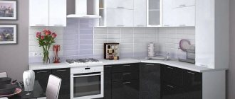
L-shaped (corner) and U-shaped kitchen
The best solution. Everything the housewife needs during the cooking process will always be right at hand. And such kitchen sets have additional corners in which you can put all sorts of little things.
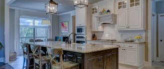
Kitchen with island
This kitchen set looks gorgeous! But it is considered the most inconvenient. The workspace is not integral and because of this, cooking processes need to be constantly moved. Many people completely forget about the existence of the island and do not use it for its intended purpose. After all, it’s not very easy to constantly clean everything back and forth.
The distance between the hob and the sink directly determines how convenient it will be to cook. After all, this space is considered a work area. It is desirable that the length of the working space be 90 cm. It will also be good if it is not crowded with anything, as is usually the case.
Choose the solution you like and implement it!
So, let's summarize. We have presented you with many ideas for arranging a ten-meter kitchen, from which you can choose the style, layout and color scheme that appeals to you. But to create a beautiful, functional and comfortable space, you will have to not only find a model, but also seriously work. And in order to get a result that is 100% consistent with expectations and the money spent, it is better to contact the professionals from the Fundament Group of Companies and order a turnkey apartment renovation in Moscow. This service includes not only the development of a project, the implementation of the full range of construction and finishing works, but also the selection of materials, furniture and kitchen equipment in the style of the future interior. This means that the renovation will definitely be successful!
Arrangement of equipment in the kitchen
Fridge
This item is used most in the kitchen! It is advisable that it be located at the end of the kitchen unit. It should be located either in close proximity to the dining area or near the entrance to the kitchen. The most functional solution is a built-in refrigerator. This option will be appropriate in any style kitchen! If you plan to decorate your apartment in a loft or scandi style, it is best to place the refrigerator separately from the kitchen unit.
Sink
Almost always the sink is placed 50 cm from the refrigerator. While cooking, it will be convenient for the housewife to remove food from the refrigerator. And if the product needs to be washed, the sink will be right at hand, and if not, then it can be placed on the countertop between the sink and the refrigerator.
Dishwasher
If the family consists of several people, then it is recommended to choose a dishwasher with a width of 40-50 cm. This is a spacious option for washing large dishes, for example, a saucepan. If the family is large, then you should take a dishwasher 10 cm larger. Of course, such a dishwasher will not be appropriate in every kitchen.
Coffee machine
It is advisable to place the coffee machine somewhere between the refrigerator and the sink. After all, you will need to use products that are best kept in the refrigerator.
Oven
More than half of our clients place the oven at chest level - this is the most comfortable distance that can be. It is especially recommended to choose this height for those who have an oven with a microwave function. A simple oven can be installed under the hob, and at chest level you can place something that will be used more often. Let's say a cupboard with goodies 
Washing machine
It is not always possible to place a washing machine in the bathroom or in the hallway. If the machine will be placed in the kitchen, then the best solution would be to choose a built-in model. If the machine is free-standing, then you should hide it with a facade. This way it won’t seem superfluous in the kitchen.
Hood
For those whose kitchen is decorated in a loft or country style, you should choose free-standing models. If the kitchen is in a modern style, then the optimal solution would be a built-in model. In addition, when installing the hood, there will be additional small shelves. It will be convenient to store all sorts of small things on such shelves.
Hob
When installing the hob, you need to retreat 85-90 cm. This space is the working surface. It is in this space that the hostess will cook! If a white hob is appropriate in your kitchen design, then it is recommended to choose this option. The fact is that a black hob is very impractical.
Chopper
This thing will definitely appeal to those who have never heard of it before! If there is any leftover food, fruit or vegetable peels, or tea leaves, then all this can be crushed in a few seconds! There will be no odors in the trash can! You can also forget about the existence of clogged kitchen drains. And all this thanks to the chopper!
Water filter
It should be remembered that there must be space for a filter under the sink. Reverse osmosis systems are quite large. But now you can buy faucets with 2 holes. These are the most convenient models, because you don’t have to drill anything for them.
Which curtains to choose for the kitchen
When choosing curtains, you need to decide what their function should be primarily - decorative or protective. If the kitchen is located on the ground floor or faces the sunny side, neighboring windows, light transmission is more important. In other cases, attention is paid to the decorative function.
The same performance characteristics are important for curtains as for wallpaper. They should not unduly obscure the space. The color scheme must be in harmony with the overall design.
On a note!
Curtains can be classic, Roman, or roller. Instead, it is permissible to use horizontal or vertical blinds.
The size of a ten-meter kitchen is not large, but it is not critical either. Here you can place all the necessary equipment, furniture, and create comfort for the whole family. Modern materials will ensure maximum functionality and attractiveness of the interior. The main thing is to arrange and combine everything correctly so that the decoration, furniture and appliances do not stand out from the general concept and do not look like an alien element in the kitchen.
Opening upper cabinets
Swing
I consider this option to be the best of all existing ones. In addition, it is the most inexpensive.
Folding
This option does not accept cheap and low-quality fittings. Low-quality gas lifts are quickly damaged and they cannot hold the doors wide open.
Folding
These doors open very beautifully and easily. But there is one caveat - their price. And they won’t be very comfortable for short people.
Convenient kitchen design
Heights, dimensions, ergonomics
Lower cabinets
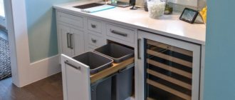
Often the lower cabinets have a height of 90 cm. But I note that the models have legs that can be adjusted. For tall people, I advise you to raise the level of the tabletop higher. You can add height with a thick tabletop. It is recommended that the lower drawers have pull-out mechanisms. Such mechanisms are convenient for holding various small items.
Working surface
The entire cooking process takes place on the work surface. I recommend that it be located between the sink and the hob. 90 cm – length of the working surface. But also the length can be 115-130 cm.
Upper cabinets
35 cm is the typical depth of upper kitchen cabinets. But as for the height, the owners themselves determine it. Often, the upper cabinets have a height of 60, 73, 90 and 120 cm. Modular kitchens have 2 standard heights - 73 and 90 cm. Nowadays, ceiling-mounted models are popular. In such kitchen sets, the height of the upper cabinets is up to the ceiling. These kitchens look gorgeous, but they are completely uncomfortable.
At what height is the hood?
This interesting question is difficult to answer not only for us designers, but also for kitchen makers. Often the optimal height is 60 to 75 cm. But in reality the answer is very simple. The hood should be installed at a distance so that your head does not touch it while cooking. I advise you to place it 5 cm higher than the tallest member of the family.
Work triangle rule
Typically, such kitchen spaces have a square or rectangular shape. Their small area allows you to place interior elements in various ways, visually highlighting the eating area and work space. The most popular options for decorating the interior of a kitchen with an area of 10 square meters. meters:
- straightforward;
- 2-row;
- angular;
- U or L-shape with an “island”.
Each has its own characteristics, we will tell you about them in more detail. In the case of a single-row arrangement of the work area, all household appliances and furniture are placed along the wall, and the dining table (usually a “transformer”) is placed in the center.
For square-shaped rooms, the best solution is a 2-row configuration, when equipment and furniture are located on opposite walls.
Equally important is the observance of the “working triangle” rule - a kitchen with a refrigerator, hob, and sink should be designed so that the elements are located as close to one another as possible and are easily accessible.
In such a room arrangement, the dining table is located in the middle of the room or near one of the walls. In the first case, it should not have sharp corners; ideally, it should be oval or round.
Work triangle" in kitchens with different layouts
The rule of the “work triangle” must be observed in the kitchen.
Corner placement of household appliances and furniture is an excellent solution for rectangular rooms. The rule of the “working triangle” allows you to use free space rationally and as efficiently as possible.
In addition, it is possible to place one or more spacious cabinets in the corners of the room. And due to the space of the wall with the window, it is possible to expand the working area - deep cabinets for a variety of kitchen utensils, dishes, canned goods, etc. can be easily installed under the window sill.
Modern style
in the interior of a small kitchen
I really love kitchens built into niches.
They look stylish and solid. So, we have already discussed the functionality and ergonomics of this room, let's move on to the appearance. In modern kitchens, the first thing everyone pays attention to is the smooth fronts. MDF facades are especially popular now. They can be matte or glossy. In terms of price, the most inexpensive options are plastic facades. They are very similar to painted MDF, but their price is much lower.
Modern kitchens very often lack handles. They have special push-up fittings, with the help of which the doors open. Today, facades with integrated handles are especially popular; they have a neat and small recess in the facade.
Lots of modern kitchens!
Neoclassical style
and kitchen design 10 squares
So, everything is simple with the functionality of neoclassical kitchens - in this they are identical to modern kitchens. But there is something that distinguishes them from each other - facades. Neoclassical kitchens have panel fronts with simple handles.
If the facades are smooth, you will get a kitchen set in a modern style.
Neoclassical kitchen is here!
Ideas for a kitchen apron
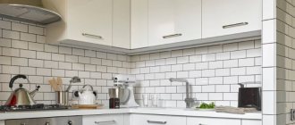
Tile splashback
In my opinion, tiles are the best choice for decorating a backsplash. Even after years, such an apron will be in demand! And today there are so many different types of tiles that there shouldn’t be any difficulties with choosing! There are such interesting options as mosaic, triangle, hog. A choice for every taste!
Tempered glass apron
When decorating a kitchen, a tempered glass backsplash gives you a lot of different ideas. This apron will definitely appeal to lovers of minimalism, because plain painted walls can be hidden behind transparent glass. You can also hide wallpaper behind such an apron. For kitchens in the neoclassical style, this is the best option. There are also aprons with photo printing, but they are rarely seen in interiors.
Wood effect apron
Those who are tired of the asceticism of a modern-style kitchen will definitely like a wood-effect apron.
Previously, laminate was used as an apron. Laminate is a very practical material that is easy to care for. But its seams are afraid of water and can swell greatly. Nowadays, many people choose wood-imitation tiles instead of laminate. Lots of ideas for an apron!
Materials and design
There are always nuances with the choice of finishing materials for the kitchen, regardless of its area. It is necessary to take into account temperature fluctuations, humidity, odors, and potential contamination. After all, the kitchen is the only room in the apartment where these problems are constant and inevitable.
Ceiling design
The leaders among ceiling structures are plasterboard and suspended ceilings. Drywall is good for multi-level systems, zoning and complex built-in lighting. But choose sheets impregnated with a special moisture-proofing compound and paint the surface with washable paint.
Stretch ceilings do not require additional treatment or protection. They are not afraid of water and stains, and you can wash them with a regular sponge and detergent. Glossy films will add volume to a kitchen of 10 sq.m. and reflect light well, creating a soft diffused background.
Wall decoration
The simplest and most cost-effective solution is to paint the walls with water-based washable paint. They are easy to care for, and when you get tired of the color or if it suddenly gets irreparably dirty, you can refresh the repair in a matter of hours on your own.
If you prefer wallpaper, choose washable non-woven fabric: it is more expensive, but it is easier to care for and will last much longer than paper. Pay attention to the tiles, especially in the area above the stove, sink and work surface.
Floor finishing
A classic for floor finishing is tiles with an anti-slip and wear-resistant coating. It is easy to clean, can be of absolutely any color and texture, and will fit into different interior styles. Gloss traditionally increases the space, and a matte or textured coating easily imitates natural stone or other materials.
If you think tiles are too cold and not cozy enough, feel free to buy laminate. Just choose moisture-resistant series and carefully treat all joints and junctions so that an occasional puddle is not scary for him.
Lighting
For a comfortable atmosphere in the kitchen you need diffused or reflected light. And for zone lighting, neat compact sconces or built-in lamps are suitable.
Pendant chandeliers look good above a dining table, while spotlights provide more even lighting and help elongate the room. The upward flow of light visually lifts the ceilings. The main thing is to avoid overly massive structures that take up space in a small kitchen of 10 sq.m.
Textile
It’s almost impossible to do without textiles in the kitchen, because decorative tablecloths and napkins here acquire quite practical significance. Colorful pillows for a sofa or chairs are an interesting and convenient accessory. And curtains will save you from street dust and hot sun rays, especially while you are standing at a hot stove or oven.
But when choosing fabrics, do not forget about fire safety: do not use materials that easily catch fire, flare up quickly and emit toxic components. At the same time, kitchen textiles must be wear-resistant, because they will have to be washed regularly and often.
Kitchen design 2 by 3 meters: beautiful ideas (80 photos)
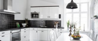
White kitchen
Design ideas
Lovers of white kitchens clearly don't worry about cleaning! So, I'll tell you how it is! Light kitchen sets do not require frequent cleaning. Everything here is the same as with furniture of other colors! After preparing food, clean up after yourself and wash the facades a couple of times a week. And nothing more! If you want a practical kitchen set, then feel free to combine options. It is better to make soiled lower facades under light wood. And the upper facades can be made in one color. But if you are a real “cleanliness maniac,” then I advise you to order facades with a wood or stone texture. I recommend avoiding monochromatic options; it’s better not to even waste your time choosing them 
Lots of white kitchens!
Color solutions
With an area of 10 m2, it is necessary to use light colors to visually expand the space. Bright and dark colors are used only as “blobs” and accent elements.
If the windows face north, it is better to use warm colors. When facing south, choose cold ones. The furniture should be darker than the walls and ceiling, as well as the floor.
Grey colour
10 squares in kitchen design
This color has a very interesting history. Once upon a time it was considered sad and did not like to be used in interiors. But today this color is in trend. You can find it very often in design projects! With it, the interior becomes serious and a little strict. And gray with bright colors looks very noble and stylish!
There are gray kitchens here!
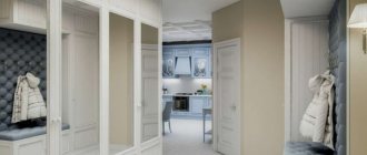
Beige kitchen
interior design 10 sq m
I believe that beige can be safely called the best choice for decorating the interior of an apartment. Neutral, pleasant and natural color. Many natural materials are of this color. By the way, almost all the offices of our design studio in Moscow are decorated in shades of beige. For example, I like the gray-beige color best. This is the most versatile and practical shade. Plus it looks great with many colors. By the way, our designers have made an interesting selection of kitchens in beige tones. Watch and get new ideas 
Beige kitchen ideas!
What materials are best to use in kitchen renovation? Is parquet or laminate acceptable? What's the best way to decorate an apron? I recommend an interesting article about finishing materials. Go to the “Tips” section, there is a lot of useful information there!
Kitchen zoning 10 sq. m
To create convenience and comfort in the kitchen, you need to properly divide the area. First you need to decide on the number of zones and their location. It will be much more convenient if the workspace is located near the pipes, so you can easily connect the sink, dishwasher and washing units. With a standard layout, the work area is located on the wall adjacent to the bathroom.
If you prefer to locate your work area near a window, then additional pipes are required to connect household appliances to the sewerage system and water supply. In addition, electrical wiring is needed to connect the electric stove.
An important point is a spacious passage between pieces of furniture, otherwise it will create a feeling of cramping. Zoning can be emphasized if you use:
- Light. Lighting fixtures located around the perimeter of the room perfectly highlight the work area. It is good to hang a chandelier above the dining table.
- Color. Finishing materials for the work area are emphasized by shade or texture. You can use a contrasting finish on the wall where the work area is located, brickwork, or photo wallpaper.
- Floor and ceiling. The first - using a variety of materials (tile tiling, laying laminate), the second - can be multi-level.
Accessories for the room play a big role, but they need to be used depending on the style of the interior.
