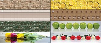
Please note that there are many more different materials, as well as shades of the apron, than there are directly materials for creating the tabletop.
For this reason, first you will need to choose a tabletop, and after that it will be much easier to choose an apron for it. Their color scheme does not necessarily have to match, but they can be combined - yes. There are many different options here - a spectacular and bright work surface will perfectly match the shade of neutral walls.
What to combine the tabletop with?
When the material and design of the facades are chosen, it seems that there will definitely be no problems with the countertop. After all, you can always take something universal, like white or gray, and you won’t go wrong. But such a decision does not always turn out to be correct, since some, at first glance, unexpected combinations will look more impressive. Below we will talk about possible design options.
Universal solution - white or gray
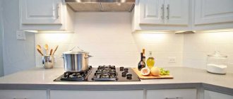
The easiest option is to choose a white or gray work surface. These are basic colors that are combined with all shades and will harmoniously fit into any interior color scheme.
If the shade is heterogeneous and has inclusions or a pattern that imitates natural materials, then this is also the most practical solution in terms of care.
It is better to choose a white or gray countertop if the overall color scheme of the interior is already rich in tones and needs to be diluted with neutral elements.
Matching headset color
In fact, achieving a perfect match in the tone of the facades and the working surface is very difficult, since they are often made of different materials and have different textures.
It is easiest to choose a countertop if the kitchen is pure white or black. The last option is very controversial from a practicality point of view.
A less popular solution is a colored plastic tabletop. It’s not easy to find them ready-made, but you can order them. In this case, you can ideally match the shade to the color of facades made of a similar material - plastic or acrylic.
The color of the individual elements of the headset
If the design of the set contains facades of different colors, then you can choose a tabletop to match its individual elements: upper or lower facades, separate cabinets, open shelves or an island.
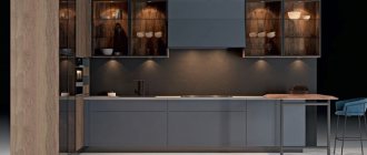
Black upper cabinets go well with a black countertop.
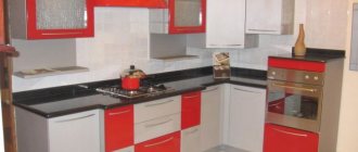
Colored, bright combinations and the combination of facades and wood-look countertops look interesting.
Black countertop: pros and cons
Black, like white, can be chosen in most cases. It goes well with any colored facades and can serve as an accent against the background of a white or beige kitchen.
There is an established opinion regarding its practicality: stains, drops of water and any debris on its surface will be more noticeable than on any other. This is partly true, but if it is a necessary and important part of the concept of your interior, then give preference to matte options with a heterogeneous texture. For example, black countertops interspersed with stone chips or with a marble pattern will be more practical to maintain.
What are they made of?
Thanks to well-chosen materials, the countertop and apron will not only become the main decoration of the kitchen, but will also make life easier for their owners. After all, dirt, grease stains and other contaminants most often form in this work area. Since the work surface and apron play a protective and decorative role, it should be made of materials that are easy to clean. Typically, countertops and backsplashes are made from:
- ceramics;
- artificial stone;
- glass;
- metal
Interesting article: Designing an apron for a kitchen made of white bricks
Ceramics
Ceramic countertops and backsplashes are considered the most popular. The shapes and sizes of tiles can vary greatly from each other. Their size varies from 10 by 10 cm to 25 by 40 cm. Hexagonal and octagonal slabs are also relevant.
The tile work surface has:
- high mechanical strength;
- aesthetic appearance;
- ease of care;
- practicality;
- resistance to moisture and sudden temperature changes;
- variety of colors and patterns.
The tile can have a smooth, embossed, or rough surface.
Its main advantages include the fact that greasy stains are quickly removed from the surface using any folk remedies or using household chemicals.
Glass
Finishing a working area made of tempered glass is used in modern interiors - Loft, Minimalism, Hi-Tech. Their surface can be matte, transparent, or patterned.
Important! Tempered glass looks incredibly stylish with LED lighting.
The advantages of glass surfaces include:
- convenience and ease of care. This material does not absorb odors, is easy to wash and clean with various means;
- ease of installation. You can cope with the installation of glass surfaces on your own, without resorting to the help of specialists;
- affordable price.
Stone
Stone countertops and aprons are most often made of granite, marble or acrylic. Durable characteristics and beautiful texture make these materials popular among designers.
Working surfaces made of stone are a solid slab or separate parts about 2 cm thick. This material is different:
- resistance to high temperatures;
- chemical resistance;
- long service life;
- beautiful appearance.
Metal
Metal working areas in the kitchen can be made from:
- galvanized steel;
- of stainless steel;
- chrome plated.
Their surface can be polished, matte, with imprints, engravings and any other decor.
The advantages of metal surfaces include:
- resistance to mechanical damage. Metal is quite difficult to scratch or damage;
- resistance to temperature changes;
- high performance.
What colors are trending?
As part of the trend towards minimalism and eco, natural materials and their high-quality imitations remain in fashion. Neutral, achromatic tones are in fashion - white, gray, cream, graphite, all in a matte finish.
Surfaces with high-quality imitation of natural materials with a pronounced texture are relevant. This could be an imitation of concrete, inclusions of stone chips, veins of marble, or a rough and clear pattern of dark wood.
Another trend is thin countertops to match the furniture. They seem to dissolve in the overall design of the kitchen, and the entire design of the kitchen set looks monolithic and solid.
Pastel colors in the kitchen
Pastel colors of the kitchen apron will make the interior more friendly and fresh. To prevent the pastel color of the work panel from looking too faded, combine it with white or wooden cabinets, floors, ceilings or blinds.
The blue color of the walls in the kitchen calms, repels insects, and reduces appetite, so it is good for those losing weight.
The pink color of the walls, in turn, refreshes and makes the interior more delicate.
Color options depending on material of manufacture
Modern production makes it possible to obtain almost any shade and any imitation of natural analogues from artificial materials. Therefore, the widest selection of designs is available among countertops made of MDF, laminated chipboard and plastic.
The predictability of shade and pattern makes it easy to choose the right option for other interior elements.
For example, when choosing a tabletop to match an apron or floor with a wood pattern, it is important to get the same shade and texture. It is very difficult to achieve an exact match when using solid wood, since natural wood must be regularly treated with special impregnations that extend its service life, as a result of which it changes its shade. Therefore, a tabletop made of veneered MDF or chipboard may be a more practical replacement.
The shade of a wooden tabletop is determined by the type of wood. The most common options are oak, ash, walnut, and bamboo.
Dark kitchens with countertops made of dark brown wood, such as walnut, with a pronounced wood grain are at the peak of popularity.
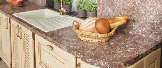
If you are planning to order a work surface made of quartz agglomerate or natural stone, then you should keep in mind the complex shade and unique pattern that distinguishes natural material. It must be coordinated with the overall interior design.
If the stone is a bright shade with a pronounced pattern, then it is worth leaving it as a central, accent element, without overpowering it with other colored details.
Please note that bright, rich colors look more noble and stylish when used with natural materials. For example, red granite will a priori look more beautiful and noble than even the highest quality imitation.
Red granite or onyx with orange, ocher or burgundy wavy stains will stand out against the background of the overall neutral color scheme of the interior and will become its exquisite decoration.
This may also be interesting to read: Which countertop is best for the kitchen? Wood, chipboard, artificial and natural stone
White
White color is universal when decorating a kitchen space. Since people most often place the main emphasis on the work area, namely the apron, its color should be chosen very carefully.
Important! If you choose white, it goes well with any colors.
Having decided to install white furniture in your kitchen and make a snow-white apron for it, pay attention to the following options:
- White mosaic apron. A very interesting and original solution. Suitable for simple and rustic destinations - Country and Provence.
- White ceramic tile backsplash. The most popular type of finish.
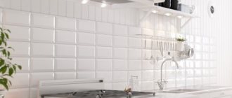
- Brick tile backsplash. This finish is at the peak of its popularity. Imitation brickwork is suitable for any style, both modern and classic. Brick tiles can be glossy, matte, voluminous or embossed.
- White apron made of plastic panels or glass. By itself, such a finish will look boring, but if you add colored lighting underneath it and choose a bright set, this option will become quite original.
- White wood apron This method is suitable for eco, modern, and Japanese minimalism styles. The wood will have gray or brown veins, which will make the work area unusually aesthetic.
A bright kitchen with a white countertop will look beautiful with an apron of any color and texture. For retro styles, you should opt for plain tiles.
Interesting article: Elegant kitchen backsplashes made of white tiles, as well as 5 more popular colors!
In classic interiors, work areas are most often decorated with stone. Its colors vary in grey, beige or marble tones.
But for a kitchen in a modern Minimalist or High-Tech style, you should choose a skinali under a white countertop, that is, a bright plain screen or backlit glass. A mirrored apron will also look relevant in such interiors. It will perfectly harmonize with the snow-white set.
Gray gloss and pearl
Do you want to enjoy the nobility of shades and textures in your own kitchen every day, and at the same time show your guests your ideal taste? Give preference to French gray with warm echoes: with it, classic facades will look both modern and unobtrusive.
A companion for glossy facades will be mother-of-pearl mosaic on the apron. A light glow passing over its surface will add sophistication to the atmosphere.
Stone facing a working wall in the kitchen
Which stone is suitable for a working wall in the kitchen? Typically granite, quartz or marble is used. Everything must be protected by impregnation, after which the surface becomes resistant to staining and high temperatures. Natural stone looks elegant and matches almost any style and color of the kitchen. Thus, you can choose both light and dark facades for it, depending on the color of the stone. In any case, it will look expensive and rich.
Common mistakes
Everyone makes mistakes. But it’s better to learn from the mistakes of others - and to warn your own in time. We talk about some of the pitfalls that accompany the design of the apron area.
Dark tones combined with grainy texture
It looks incredibly impressive, bold and always relevant. But here’s the problem: any stains are clearly visible on such a surface, and grease and soot literally eat into the top layer of the tile. Get ready to scrub them endlessly - or immediately look towards other shades.
Snow-white seams
Many owners, when laying ceramic tiles on a backsplash, want to highlight the contrast and purchase an ultra-white fugue for grouting. Of course, it immediately makes a pleasant impression and favorably emphasizes all the advantages of the chosen tile. However, over time, even waterproof grout loses its color and the seams acquire an unattractive gray tint. Therefore, it is optimal to immediately make a choice in favor of options that are not clearly contrasting.
Poor quality installation of the protective screen.
It can lead to very sad consequences when condensation from violent boiling gets onto the back side of the glass apron. As a result, the surface will become foggy instead of transparent, and if insects also crawl there, then you will have to forget about any aesthetics altogether.
Lay out the apron before installing the headset
It would seem convenient to first cover the wall with material, and then calmly hang the cabinets on top. However, this “seemingly” in practice turns out to be the fact that the furniture can rest against the tiles. If the set was made to order, this is fraught with a new fit. Therefore, the ideal algorithm is as follows: install the set - lay out the apron. And everything will be wonderful!
Azure gray and light wood
If you dream of a non-trivial kitchen, but pastel shades are close to you, pay attention to the combination of a wood-colored apron (light ash or beech) and azure-gray facades. Combinations of azure color are full of light charm and soft exoticism. It harmonizes perfectly with the apron, the warm shade of which adds coziness to the kitchen.
This complex color has not yet become boring: it is just gaining its popularity.
Decorating an apron with glass panels
Glass is characterized by smoothness and strength. These two options are ideal for a kitchen apron. Glass can be matte or glossy. It also has the function of applying any image that you find on the Internet or choose from a wide range of ready-made pictures.
Our recommendation is to choose a plain or textured wood or marble pattern. Since during operation there will be many objects that separate the overall design and the integrity of the composition will be lost.
A glass splashback has its advantages and disadvantages. Let's look at them.
- A glass apron is ordered complete with a kitchen set. This means you don’t have to spend additional time purchasing materials and installing them.
- Due to its homogeneous texture, glass is easy to clean from dirt. And even if the appearance is neglected, after spending a little time, you can return it to its former luster. In addition, unlike tiles, glass does not have joints containing porous material. This means that the option of ingrained dirt, which can no longer be removed, is excluded.
- Wide range of designs and ornaments
- No texture. Sometimes the texture looks richer and more interesting. In the case of glass, it will not be possible to create a beautiful relief. Only imitation.
A significant disadvantage is the cost of glass. But high-end tiles will also come out at the same financial level. Therefore, it is in your power to weigh the pros and cons of such a decision.
Lilac
Refined colors - pink, sky, ash, white - go well with a delicate lilac kitchen.
You can also choose a darker shade - the purple kitchen set will perfectly complement the black mosaic tiles on the wall in the work area.
The combination of lilac kitchen cabinets with a dark gray work area looks beautiful, especially if you install household appliances to match. This is a universal, discreet option that does not attract unnecessary attention.
A lilac kitchen set goes well with a blue apron. The contrasting game creates an interesting effect, and the kitchen seems more spacious and voluminous. The lilac-blue color combination looks more beautiful with a light countertop.
