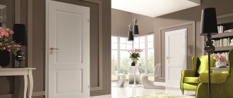
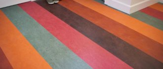
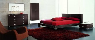
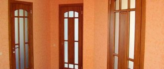
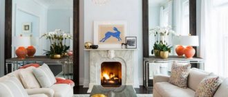
When entering a room or any other room, the door immediately catches your eye, you need to make the right choice so that everything looks harmonious. Usually, such problems arise when renovating residential premises; you can make a choice on your own, without the help of a specialist, you just need to have simple logic and taste. When planning renovations in an apartment, one of the most important issues that owners need to solve is choosing a combination of the color of the doors to be installed and the colors future floor covering. Depending on your preferences, you can choose one of the options for combining the floor and interior door in the room:
- single color scheme;
- contrast.
In this article we will analyze the advantages of each option, consider the features of the main color schemes, supporting them with appropriate photos demonstrating the possibilities of modern apartment design.
How to use a door to create the perfect interior in a room
The concept of an ideal interior includes a combination of everything in the room. All details must be in harmony and create comfort in the room, otherwise the task can be considered a failure. You need to choose doors based on the color of the floor, furniture, and various decorative items. By the way, decorative items can dilute the color scheme and allow for the most unusual solutions, completely changing the style.
Conclusion
Creating harmony in a room using colors allows you to achieve the desired effect at minimal cost. In this case, any element, including the baseboard, carries a certain load. We talked about the general rules for selection and combination, to which you can make your own adjustments.
The video in this article will provide an opportunity to expand your knowledge on this topic. If you have any questions while reading the publication and after it, please ask them in the comments, we will be happy to answer them.
What color should the doors be installed: to match the floor or not?
In most cases, owners, especially people of the older generation, try to adhere to a single style solution - so that the color scheme of both the floor and the internal doors roughly matches. As a last resort, white interior doors are chosen - because they are neutral and can be combined with floor coverings of any shade.
However, it is worth remembering that a modern interior does not provide for any strict restrictions on color, the main thing is a harmonious combination of shades: warm with warm, cold with cold.
- Warm colors include honey, light and dark brown, orange and light green.
- For cold ones - gray, combinations of blue, black.
When planning the stylistic design of a room, you must be guided by the so-called “three-color rule,” which provides for the presence of only three main color elements in the design of the room.
How to choose interior doors to match the color of the laminate
That is, if the floor is dark, the furniture is beige, then the third color is intended exclusively for the interior door.
Principles for choosing shades
Shades for combination are not selected randomly. To combine them, you can use several rules, which we wanted to introduce you to.
Principle 1 – similarity of shades
Several shades are used, but within the same range only the degree of their saturation remains different. And so that the picture does not turn out to be too boring and monotonous, minor additions of a fundamentally different color are used, which can “maintain neutrality” or be an accent. That is, one color predominates, and it will be the main one.
Let's see how it looks with specific examples:
Principle 2 – matching shades (complementarity)
Complementarity is the compatibility of colors in the spectral circle opposite each other. To determine such shades, the Swiss artist and art critic Johannes Itten came up with a conventional color wheel that designers use.
If you fit a triangle, square or rectangle into it as shown in the photo, you will get a harmonious combination of shades that can be used in the interior.
Basic types of color layouts
| № | Photo for clarity | The principle of color combination |
| 1. | Contrasting triad | If the triangle is regular, the combination is called a contrasting triad - you can see its variations in the picture. |
| 2. | Complementary split | An acute triangle forms a complementary split when two colors are close to each other and there is only one shade between them, and the third is their complete opposite. |
| 3. | Square pattern | A square combines four colors equally spaced from each other. That is, they will all be complementary. |
| 4. | Double complementary | In a rectangular scheme, there are two close and two opposite pairs of colors, which is why this scheme is called double complementary. |
There are also more complex multi-color schemes that combine 5-6 shades, but you need to be careful, it’s easy to make a mistake. These schemes are used mainly by professional designers.
Gallery of interiors made according to the rules of color arrangement
3
Rule 3 – opposite colors (contrast)
The contrast scheme is bright and win-win, very comfortable for vision. It contains both analogue and complementary colors, which must be very carefully placed. Everything is simple here - for each color, the contrasting color is the one opposite on the color wheel. There are also subtleties here - for example, when a warm shade is contrasted with a cold one.
Important! Some colors should be used with caution, as they can negatively affect our emotional background.
Psychologists have long attached labels to each color, but a plus can be extracted from every color disadvantage:
- black and purple visually reduce the space, but are ideal as an accent and add a graphic touch to the interior;
- brown in large quantities (a woody texture loved by many) drives melancholy, and without bright accents this color leads to depression;
- red promotes high blood pressure and nervous tension, but in small quantities it will make the room cheerful;
- gray is the color of sadness, but perfectly balances the most aggressive shades;
- blue – causes drowsiness, and therefore is great for the bedroom;
- blue is uncomfortable and cold, but in combination with warm shades it brings harmony to the interior;
- white can equally well both cause discomfort and lift your spirits - it all depends on its shade and quantity.
Important! These colors always require contrast, thanks to which they will sparkle with new colors and look more optimistic.
Let's see how contrasts are played out in the interior:
A special harmony is created by related and contrasting shades. Related ones include those that contain the same proportion of the main color. They are within one quarter of the circle - the 3 closest colors. Contrasting, as already mentioned, refers to opposites. The most contrasting are 3 pairs of colors: green-red, purple-yellow, blue-orange. And related-contrasting shades contain the same share of the common color that unites them. They are separated by a whole quarter of a circle - three shades.
Important! When arranging colors, you can use not only colors from adjacent quarters, but also from opposite ones (two pairs).
This is precisely what results in the double complementary combination discussed in the previous chapter. If only two colors are used, then they are complemented with the same ones, only either more darkened or more blurred.
Beautiful combinations of related and contrasting colors:
Would completely different colors be appropriate?
Sometimes, looking at photographs of various interiors, you can come across rather unusual color combinations. Moreover, sometimes it is even impossible to imagine that completely different colors can be successfully combined. Doors and floors help to recreate the completeness of the designer's plan, and therefore their sometimes exotic colors will come in handy.
Options for such original solutions are presented below in numerous photos:
Choosing a color scheme
A room made in red tones should not contain cold colors, they will ruin everything. A good solution would be a white floor and a door with a reddish tint. There are skirting boards around the door with the same color as the door. Furniture should be chosen from a small list of woods; beech, pine, and cherry are good choices. The color of the furniture may differ by 1-2 tones from the door, no more. In addition to the floor, the walls and ceiling will also be white, this will ensure a harmonious combination of colors. A room made in this style will lift your spirits if you keep it clean. To make everything look even better, it is recommended to place the baseboards along the entire length of the room; the color of the baseboards should match the door.
Important aspects
There are a number of other elements whose shade can affect the tone of the skirting boards:
When relating each of them, pay attention to the rules similar to those used in the previously described situation.
To assemble a single composition of doors, baseboards and flooring, you need to pay attention to a number of parameters:
Important! Although the defining basis of any interior is carried out taking into account your own preferences, there are certain rules that must be followed.
Skirting and platbands
When choosing dark or light doors, the baseboard can serve as a connecting element that does not match the color of the floor. The role of the baseboard in decor is precisely to smooth out the discrepancy so that it looks beautiful. Light floors and dark doors are a popular combination, in which case there are two options:
- the plinth continues the floor, wraps around the door;
- The baseboard continues the color of the door.
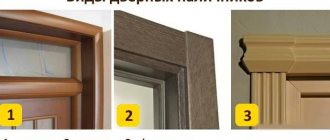
Most often, platbands are purchased along with the door, or rather, they are included in the kit. The use of platbands is recommended when choosing a dark floor; this will highlight the doorway. If you are not satisfied with the colors that come with the door, then you need to buy new ones. New trim must completely match the color of the threshold or furniture in the house; it will look harmonious. Therefore, the question of what floor color will suit light doors is not relevant, because the colors are dark or white.
Dark wood species
Among the finishing materials used in the design of the door structure, preference is given to wood imitation finishes. It doesn’t matter whether artificial wood material or natural wood is used.
If the choice falls on a dark-colored interior door leaf, the most preferable options are: smoky oak, walnut, wenge, rosewood, etc.
The most popular shades on the door market are walnut or oak. Interior doors in these shades are combined with the color of the flooring and elements of the furniture ensemble. Light shades help to visually lighten the room, eliminating bulkiness. Wenge color is also in high demand. The door leaf often imitates the pattern of natural wood. It is important that the pattern of a particular texture looks the same everywhere and in the same direction, contributing to the integrity of the design.
Selection of intermediate link - plinth
In Soviet times, the plinth was not yet so important for the visual distinction between walls and floors. Its task largely boiled down to closing the gaps that inevitably arise when laying the floor covering, and, as a rule, the color of the baseboard and the floor covering matched.
Today, the role of skirting boards in a room can hardly be underestimated. Thanks not only to the rich range of colors, but also to the significant variety of shapes and materials used, plinth has become an important element of the interior. Currently, it is customary to match this element to the color of the door, and not the floor, as was practiced in the past. Such a solution offers great opportunities in terms of providing a combination of different color schemes. In some cases, you can “play” well in contrast with the door.
Width
In order for the frame to look truly beautiful and harmonious, it is important not only to choose its color, but also its size. Therefore, finally, let’s look at how to choose the width of the baseboard for the floor
The rules for choosing the width are quite simple - the height of the ceilings is taken into account. Below is a table of the dependence of fillet width on ceiling height:
| Width | Room height |
| Up to 45 mm | No more than 2.5m |
| 45-80 mm | 2.5-3m |
| From 80 mm | Above 3m |
Of course, these figures are conditional, i.e. It is not necessary to observe them with millimeter accuracy. However, it is still advisable to adhere to the fact that the fillets look “in their place.” This is especially true for rooms with low ceilings, where wide slats look completely out of place.
Here, in fact, are all the nuances of choosing floor skirting boards
Otherwise, you need to pay attention to the design, which should be combined with the style of the interior. https://www.youtube.com/watch?v=pp8hRxrZLWg
Basic rules for combining floor and door colors
As you know, experiments with expensive things are only good if they are paid for and carried out by someone else. For the majority of people who do not want to spend extra money and time on choosing a harmonious combination of floor and door colors, they should use the general rules formed on the basis of many years of experience in interior design.
They are quite simple and do not require strict adherence - everything is done “on the spot”, with the possibility of making certain adjustments.
- If the area of the room is small . The color of the doors and floors is selected in the same tone. This approach is due to the need to create the effect of visually increasing the square footage of the room. With a contrasting combination of these elements, the exact opposite result is achieved - the room will visually appear smaller.
- Corridor and narrow spaces . Contrasting colors in this case helps to visually expand narrow corridors. The monochromatic color of the floor and doors creates the effect of a narrow tunnel, which negatively affects the perception of the room by the human eye.
- Large premises . When walls do not significantly limit the flight of design ideas, it is always easier to realize your plans. You can choose the classic combination - white doors/dark floor, or play with the opposite contrast. You can also implement an unusual solution: install the plinth and door casing in a single color scheme, thus clearly distinguishing the floor and walls.
When choosing to install glass interior doors in your apartment, you should take into account that the transparent fabric does not combine well with a light floor covering - it creates an oversaturation of light. This effect negatively affects the overall visual perception of the interior and its individual elements.
Which interior doors to choose for an apartment: types, description of advantages and reviews
Combination options
If interior doors are installed in the hallway and are chosen in a dark color, a correctly selected shade will help highlight and emphasize the interior.
Be sure to look at the compatibility of the shade with the existing design and the notes prevailing in it. The following combinations are recommended:
- With a smooth color transition . A variety of the palette of colors used is achieved, without sharp differences in color. A door leaf in oak or walnut color should have a similar appearance as the rest of the interior, trim, furniture, and other details.
- With complete color blending . This method is represented by a situation where the door leaf and other objects in the room have a common shade. The design of the room excludes contrast and inconsistency of color. Everything is reduced to just a few harmonious shades.
- On achromatic contrast . The basic principle of the method is the predominance of sharp differences. The technique is used by creating accents on any of the interior items, for example, at the entrance to a room. The canvas is also combined with some other interior detail, and everything else is done in neutral colors, coordinated with each other.
Recommendations
To make the home improvement process a little easier and faster, you need to make choices based on the following points:
- The door color should match the floor
- If the size of the room is below average, then it is best to do it in light colors or bed colors.
- Medium-sized rooms will look good with an Ivory door, white flooring and dark leather furniture.
- Do not combine opposite shades; blue and red are suitable here. Simply put, these are warm and cool colors.
- First of all, buy laminate, only then think about choosing a door, wallpaper, and baseboards.
Using these simple rules, you can make your work easier. The design solutions described in the article will be relevant for the next 8-15 years and are perfect for everyone, if you are not going to radically change colors in the near future.
